March: Artists Books
Holding Time
This month we dive into artist books. I love them for their simplicity and the way they let the art take space, where materiality becomes language and the book transforms into an artwork in itself. My first ever artist book was by Karel Martens, and I still cherish it to this day. That experience shaped the way I look at books: not just as containers of information, but as objects with their own voice. Of course, the tradition of artist books has been shaped by extraordinary figures like Irma Boom and Sophie Calle, for me the queens of the genre, who understand that the page can be a space of radical expression. There are so many remarkable artist books in the world, but these are the ones I could afford to bring into my library and select carefully for you.
I also wanted to move beyond the mainstream and explore works that approach the book as an object and an idea. That led me back to Kodoji Press, a publishing house I discovered at the NYC Art Fair. I have spoken about them before because I genuinely wanted to stand at their table all day, their approach to print and editorial objects is deeply inspiring. Nat and Eveline previously featured one of their publications in past curations, which says a lot about the resonance of their work. I’m also including pieces from Other Means, whose conceptual and graphic rigor consistently expands what a book can be. Another highlight is the collaboration between Étienne Murphy and Marion Paquette, a project where materiality and form are handled with exceptional sensitivity, creating a dialogue between mediums.
This curation moves between painting, sculpture, and collage, and everything that inspires me right now!
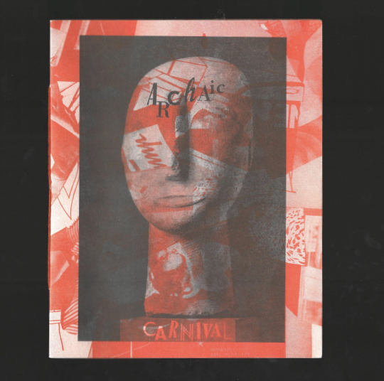
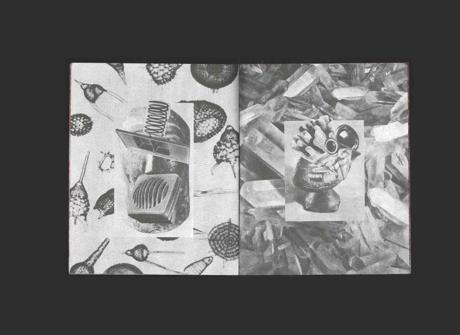
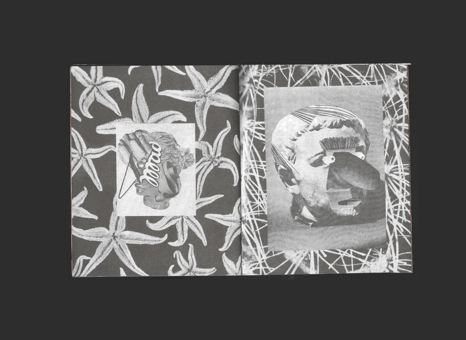
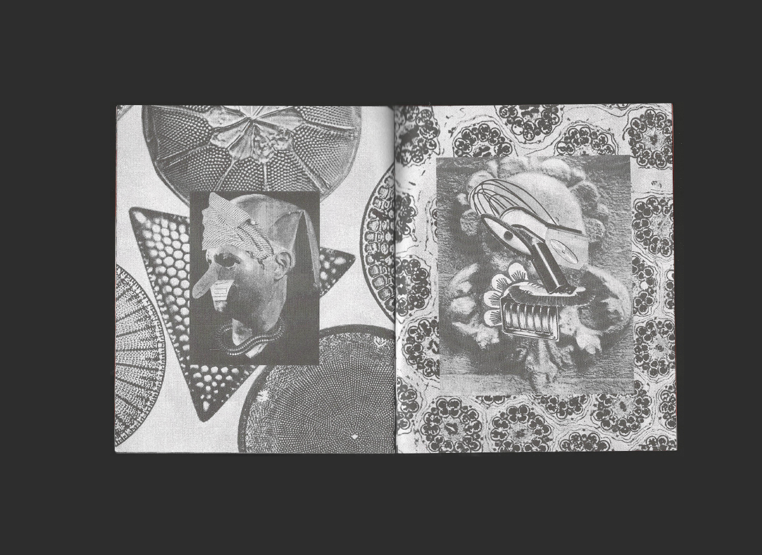
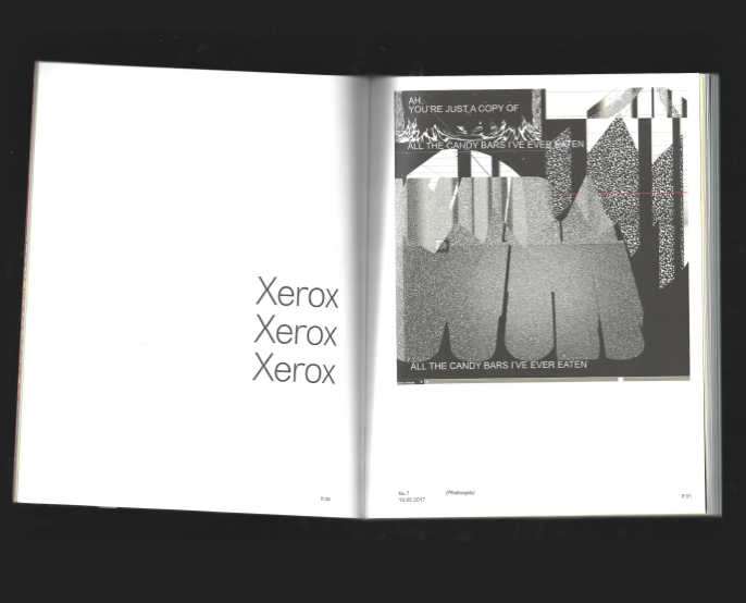
Archaic Carnival
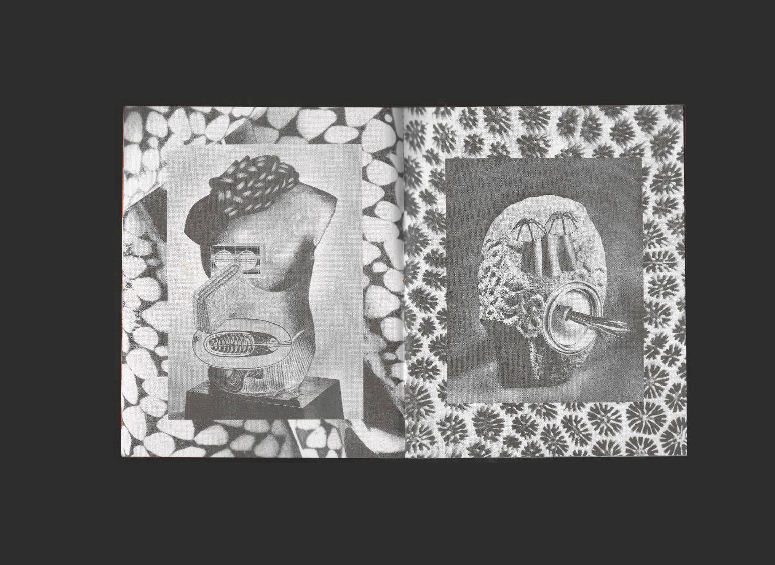
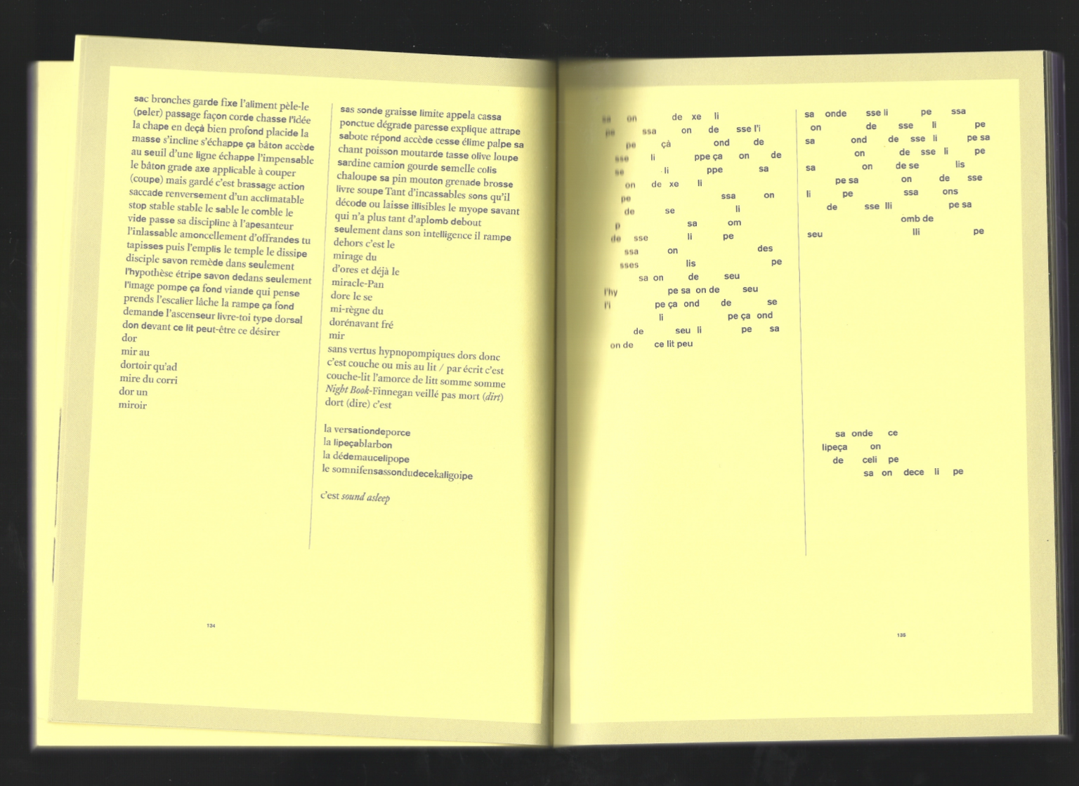
I don’t even remember where I found this one, but I was immediately drawn to its simplicity. A classic paperback format, printed in black and white on orange paper. The book revolves around collage: each spread presents a composition placed at the center, paired with a pattern derived from a completely other image.
The gesture is minimal, yet very effective in revealing the artist’s work. What I find most compelling is the relationship between the spreads — the way each composition resonates with the next as the pages turn.
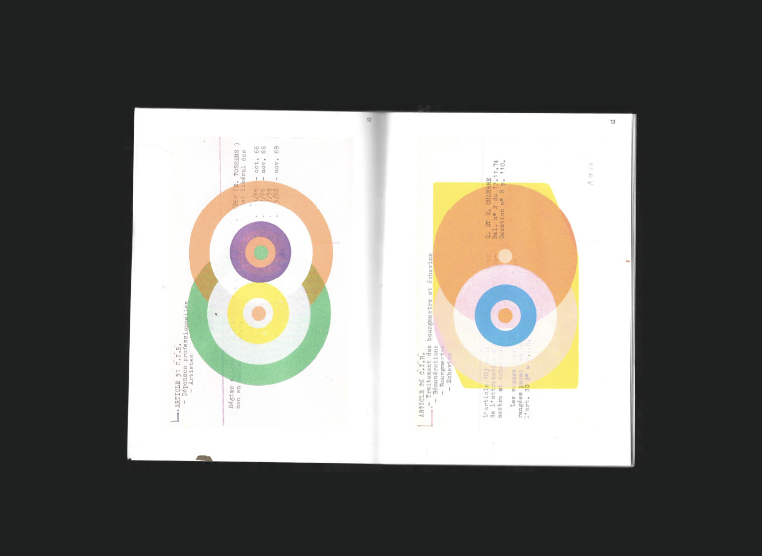
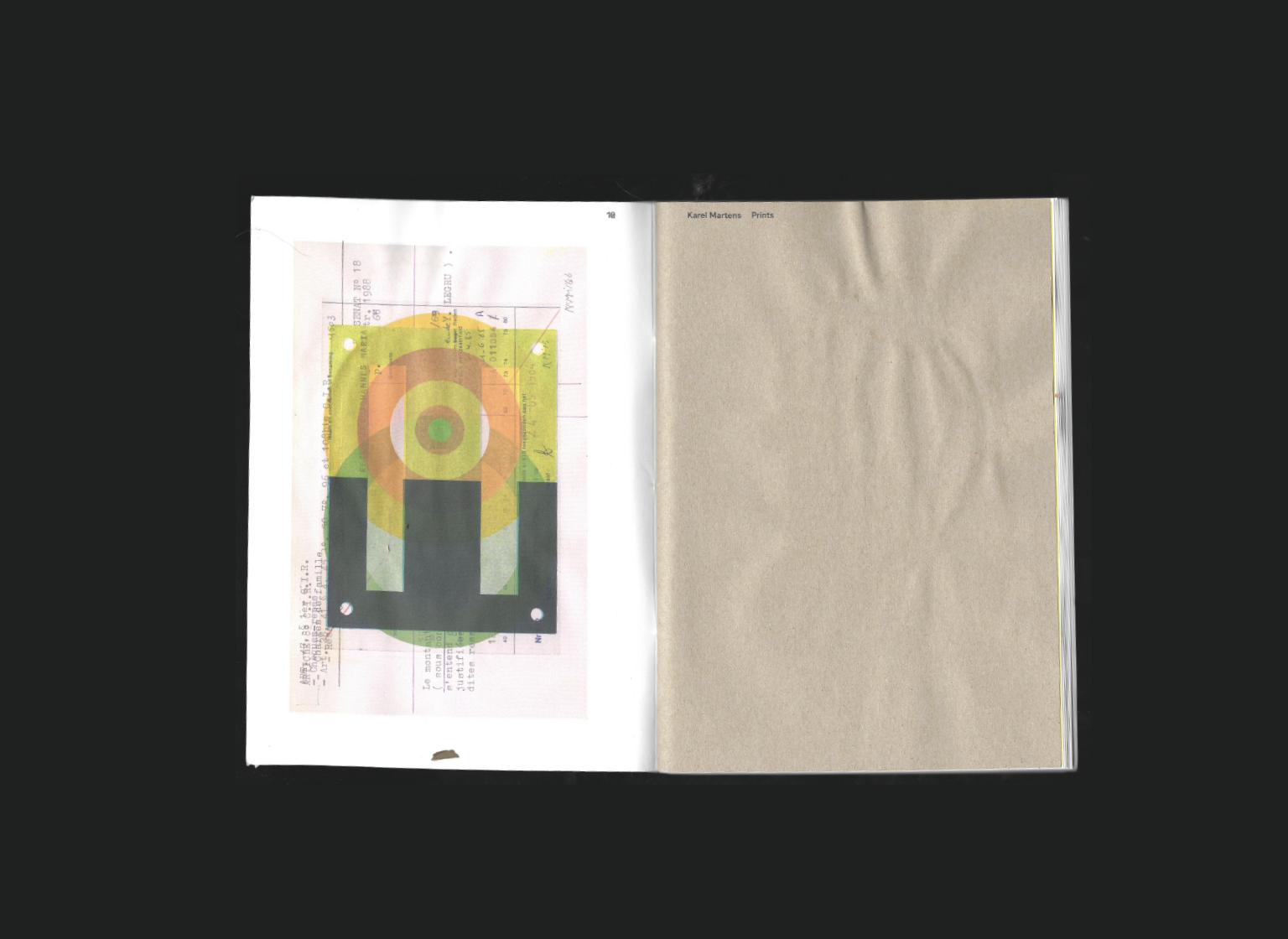
Karel Martens Prints
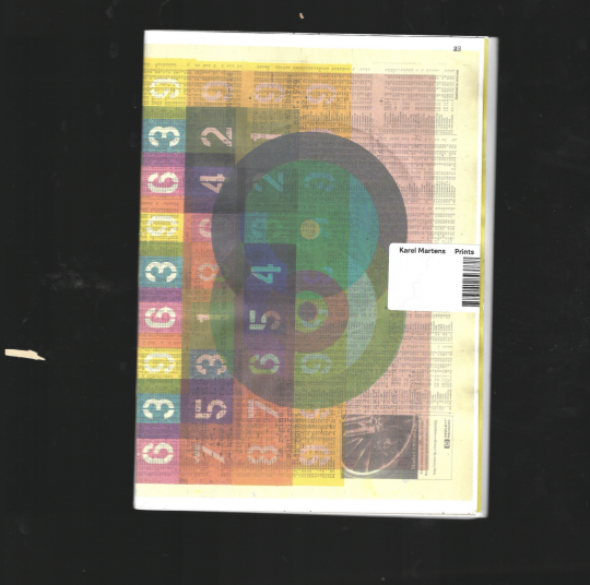
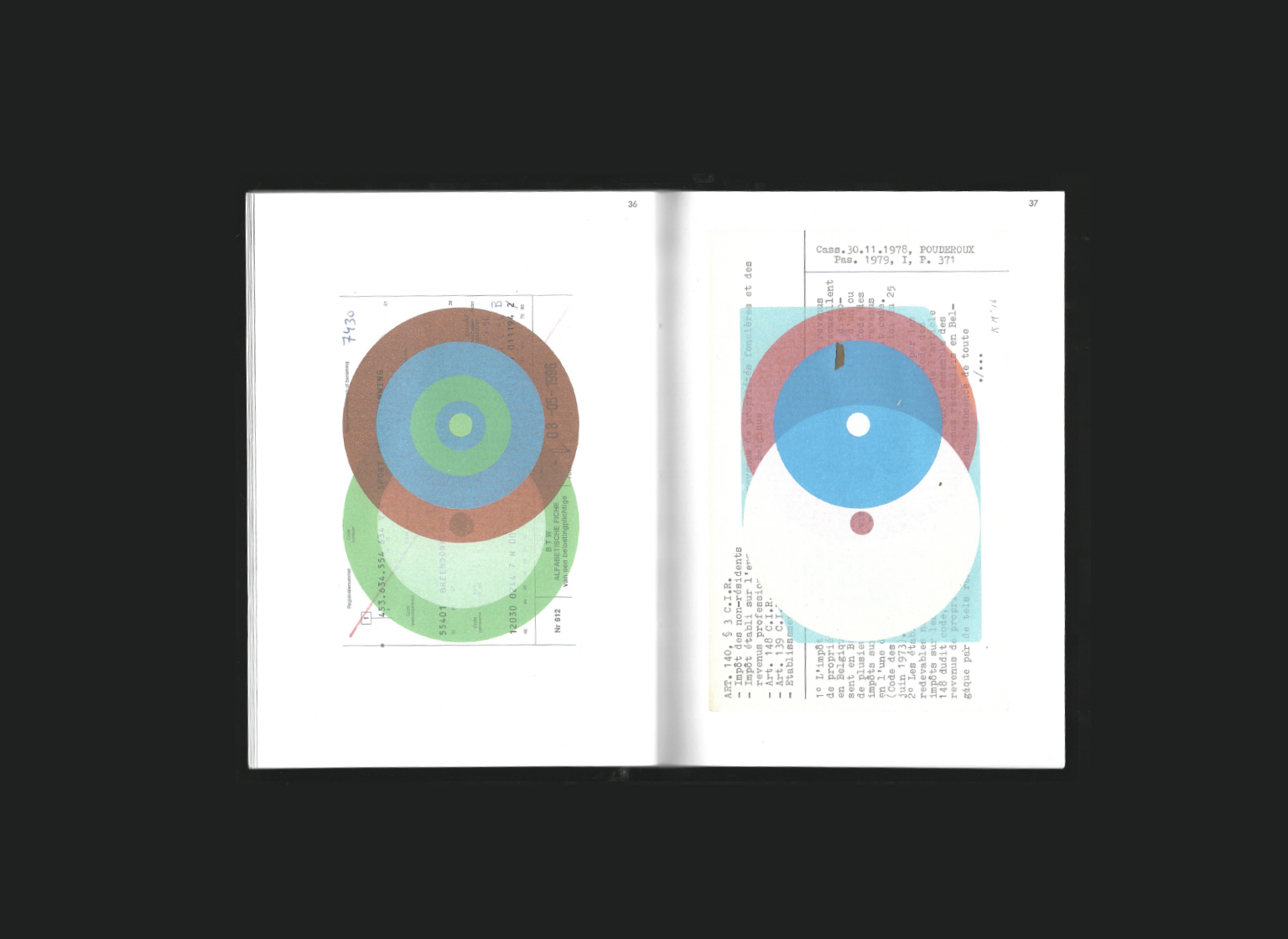
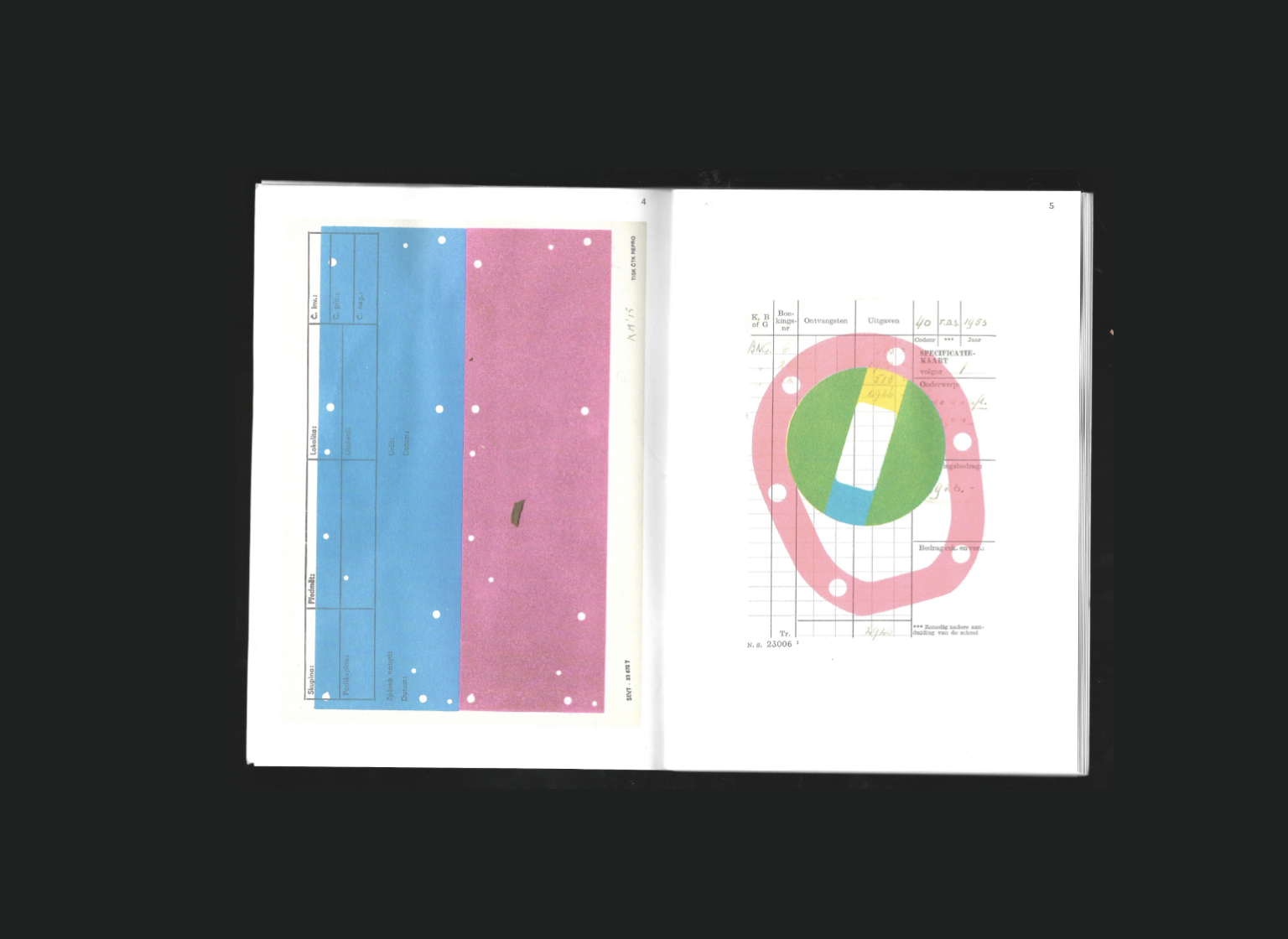
This was actually the very first artist book I ever bought, and of course, it’s by Karel Martens. One of the founding fathers of the practice of visual design, he makes you feel that every choice matters: simple colors, humble scraps of paper, minimal forms — yet somehow the result feels magical. I’ve always found it so fascinating how the colors interact on infographic‑like paper, such as receipts or electoral maps: it’s just so beautiful and intrinsically graphic design‑ish.
The materiality of this book is wonderfully modest: two sheets of kraft paper to stand out against the other page composition, with the project and artist’s name . A paperback that doesn’t need anything more, the saturated colors alone command attention and draw you into the spreads.
Finally, the book is closed with a small label, a barcode repeating the title, a quiet homage to Martens’ love of subtle details, where even something as mundane as a barcode becomes a beautiful design element.
To this day, this book remains one of the most cherished in my collection. It’s a perfect example of Martens’ genius: how visual design can be playful, poetic, and deeply precise all at once, and how simplicity can reveal infinite possibilities.
Title
Karel Martens - Prints
Publisher
Roma Publications
Year
2016
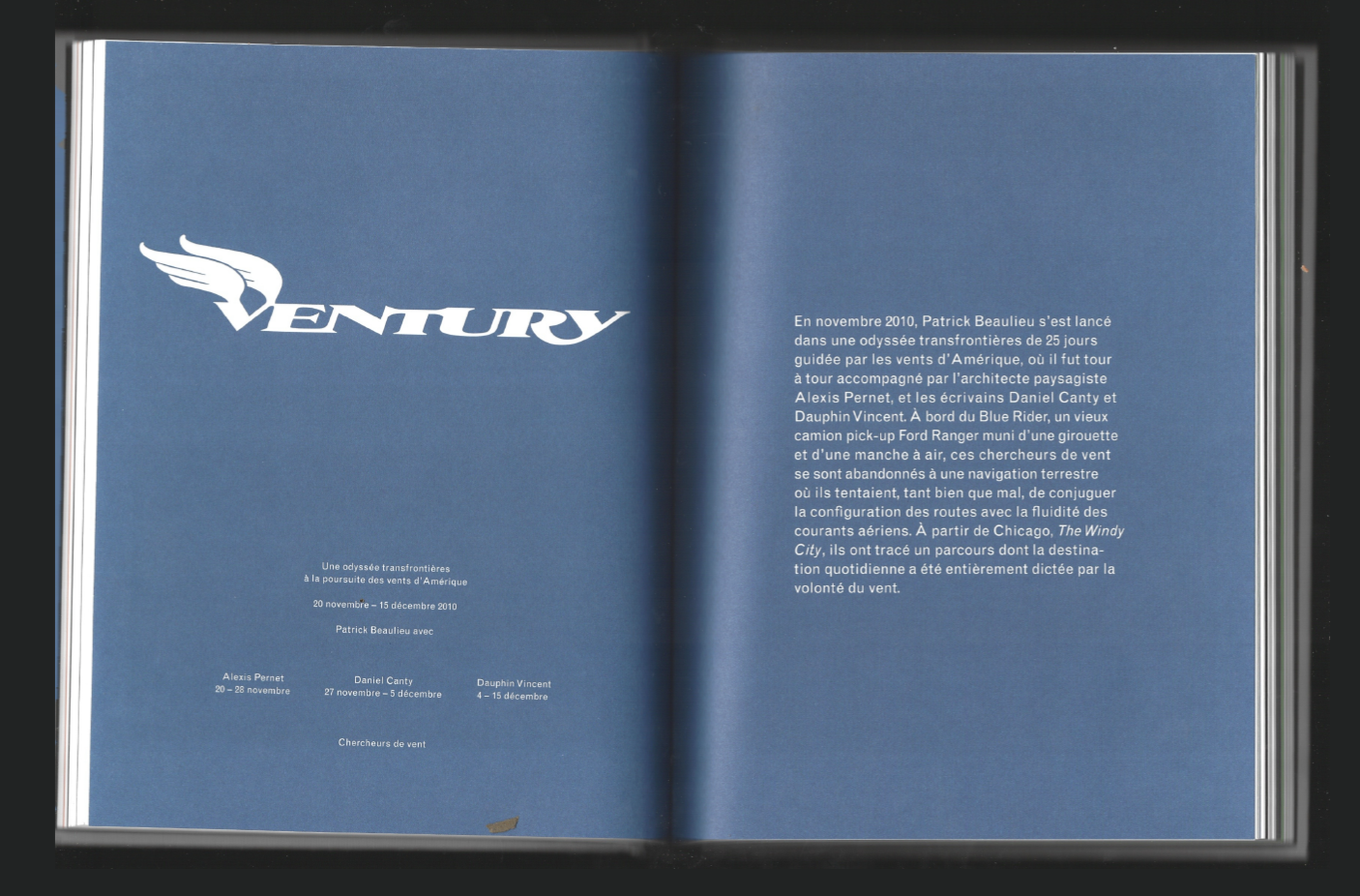
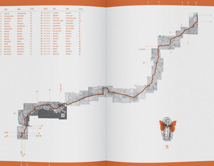
VVV Trois Odysées Transfrontières
When I was at university and this book came out, I was blown away by its concept and treatment at the time. Daniel Canty is a Montreal-based artist, similar to Sophie Call in terms of format. Each of his books is a collaboration with a designer, creating a complete work that serves the content visually.
This book inspired me to create a book myself, following the same theme: a geopoetic book (guided by a map in a poetic way). Divided into three sections documenting a trip to Vegas, moments are collected, photos shared, and texts explain the journey. Each section has its own aesthetic while maintaining a cohesive universe throughout the book.
The graphic design by the brilliant Studio Feed is incredible, the layouts are original, playful, and precise. I’m obsessed with the map at the beginning, which sets up the story to be uncovered. The unique logos and type selected for each chapter, inspired by the universe of the journey, are just amazing.
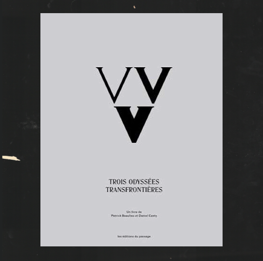
Title
VVV Trois Odysées Transfrontières
Author
Patrick Beaulieu, Daniel Canty
Design
Studio Feed
Year
2015
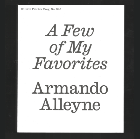
A Few of My Favorites
This book by Other Means is a big inspiration for me at the moment. I had seen the cover a few times, but when I finally had the chance to explore it, I just loved how the artist is represented in the book and how the works are laid out throughout. The art at the beginning comes with just a few texts, and as you move through the book, you feel the theme and the chronological progression unfolding. By the end, there is more text to explain and complete the narrative, finishing with a full section about the artist.
I love how the book is large, giving the paintings and illustrations room to breathe, with amazing use of color. The typography is also really interesting, the intro text size is consistent throughout, giving the feeling of continuous reading, like a conversation that explains the work smoothly.
Title
A Few of My Favorites - Armando Alleyne
Design
Other Means
Year
2021
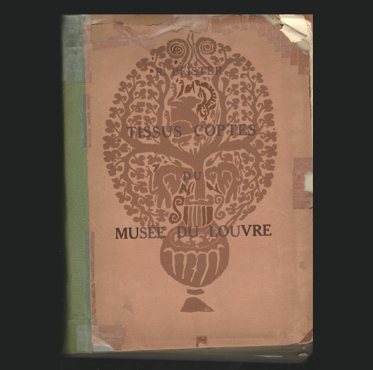
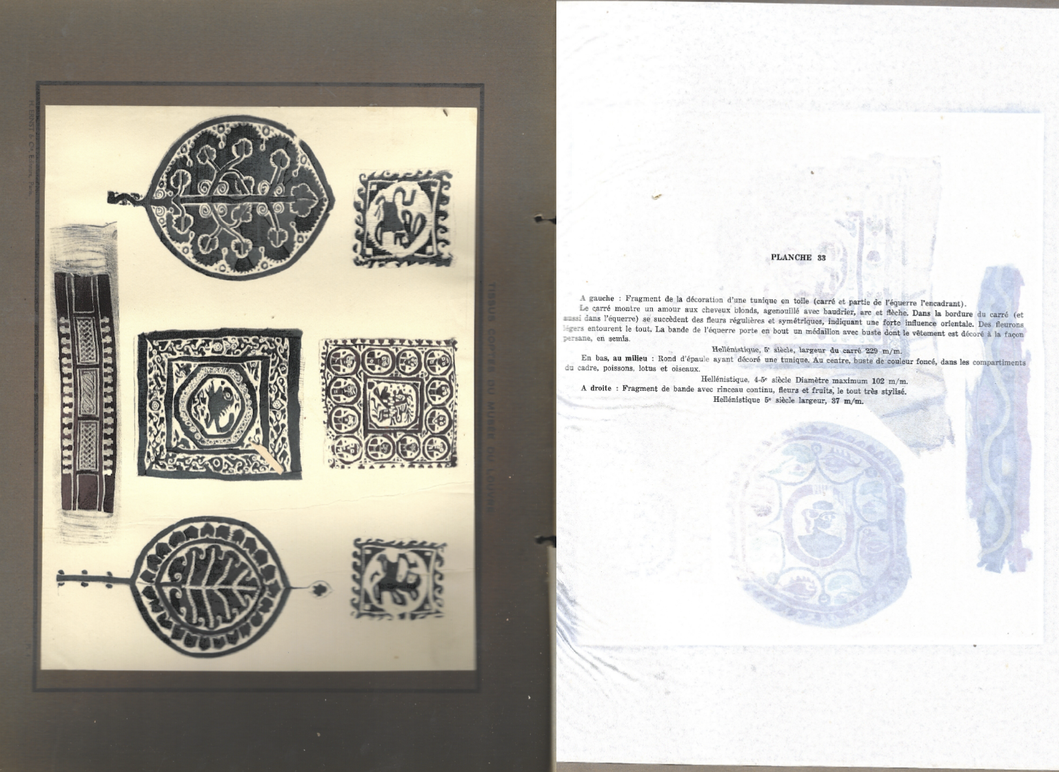
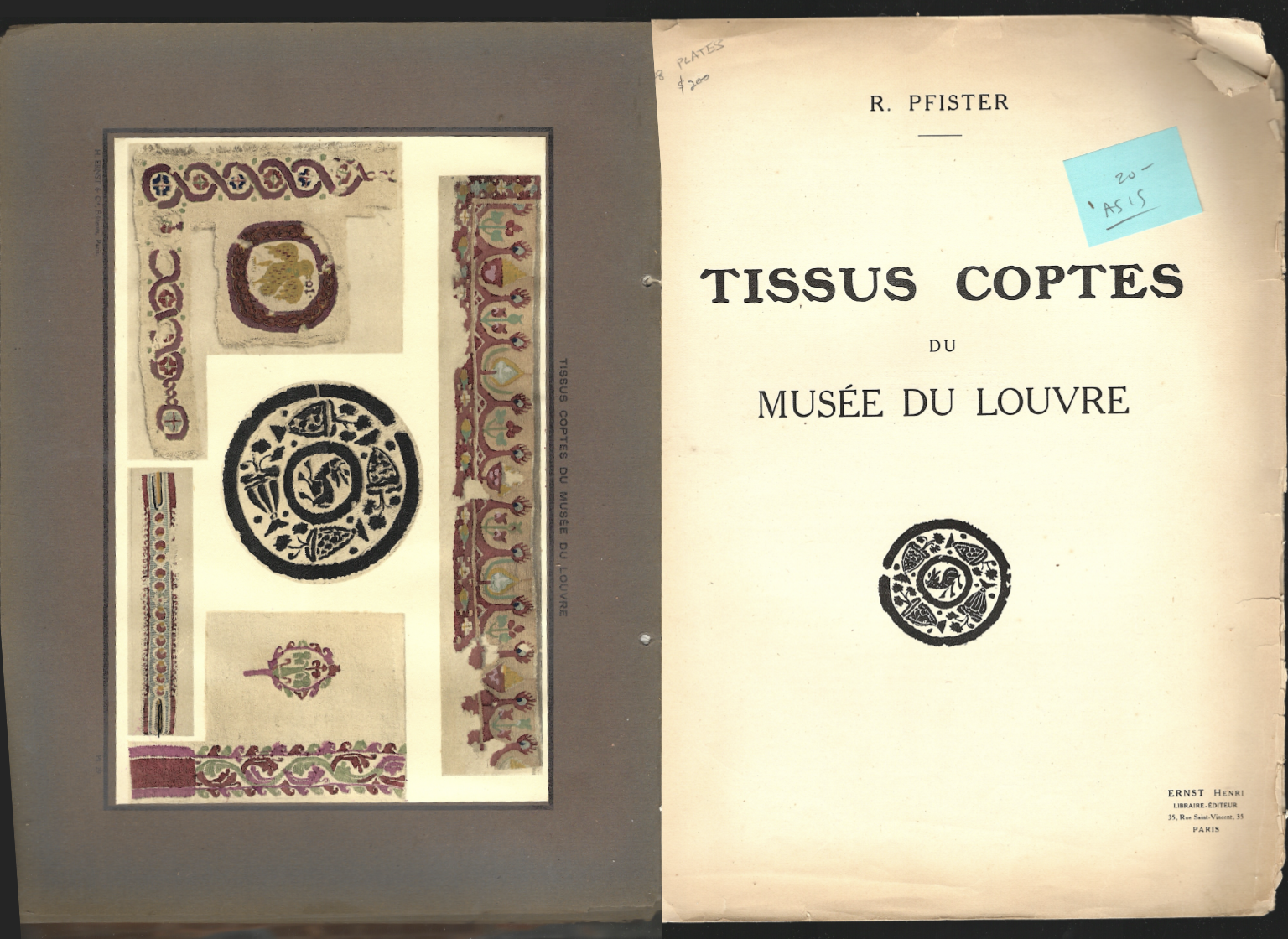
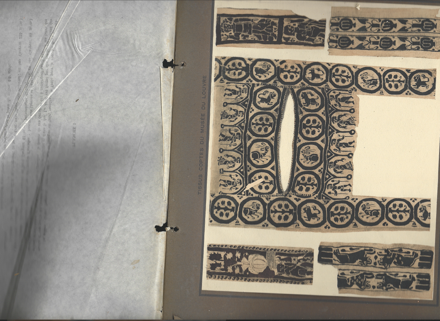
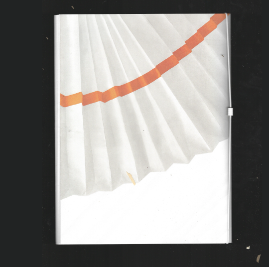
Tissus Coptes du Musée du Louvre
I found this one at my favorite bookshop in NYC, Mast, and was immediately curious about the ribbon that closed the XL book. It explores different patterns on tissue, and the layouts are incredibly intricate and fascinating. What I find most special is that nothing really works together except through color, the shapes themselves are so varied and don’t naturally mix. This tension creates unique and surprising compositions on each page.
I love the large brown margins, and what I find exceptional is that each page includes a vellum sheet creating a separation. Because the book is so old, the ink from the printed patterns interacts with the vellum in unexpected ways, producing almost entirely new patterns, new, playful compositions that feel like miniature works of art. These vellum sheets are placed alongside the text explaining each spread, the text is so chic, adding both a visual and tactile layer to the experience.
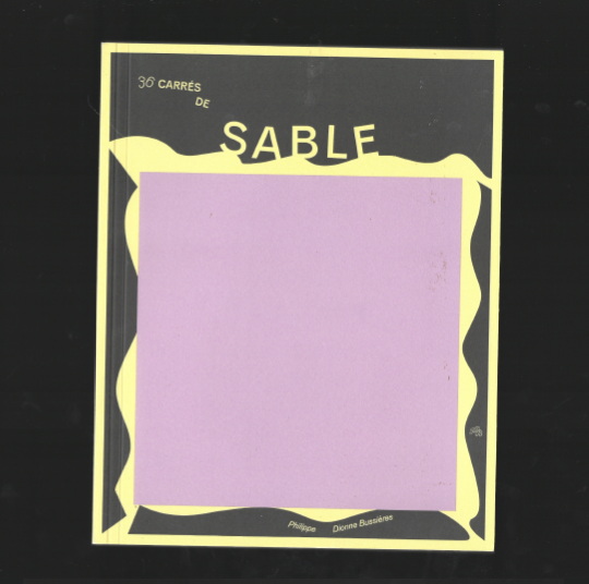
36 carrés de sable
This one is truly special because it’s a gift from one of the Guestlibris I invited, Philippe Dionne Bussière. Unsurprisingly, I’ve been a fan of Philippe’s work for a long time — following his social media, he always shares pieces of graphic art playing with type and color. I was completely obsessed with every post. It’s exactly the kind of graphic designer’s experimentation that results in stunning work.
Funny enough, I commented on one of his posts: “Waiting for the book.” And Philippe, a book lover himself, had already envisioned this book, which he called Carré de Sable, like a playground. Now you can discover an archive of his work in book format. Every spread is just so beautiful — I’m already waiting for the next print so I can put them everywhere in my house!
Title
36 carrés de sable
Designer
Philippe Dionne Bussière
Year
2021
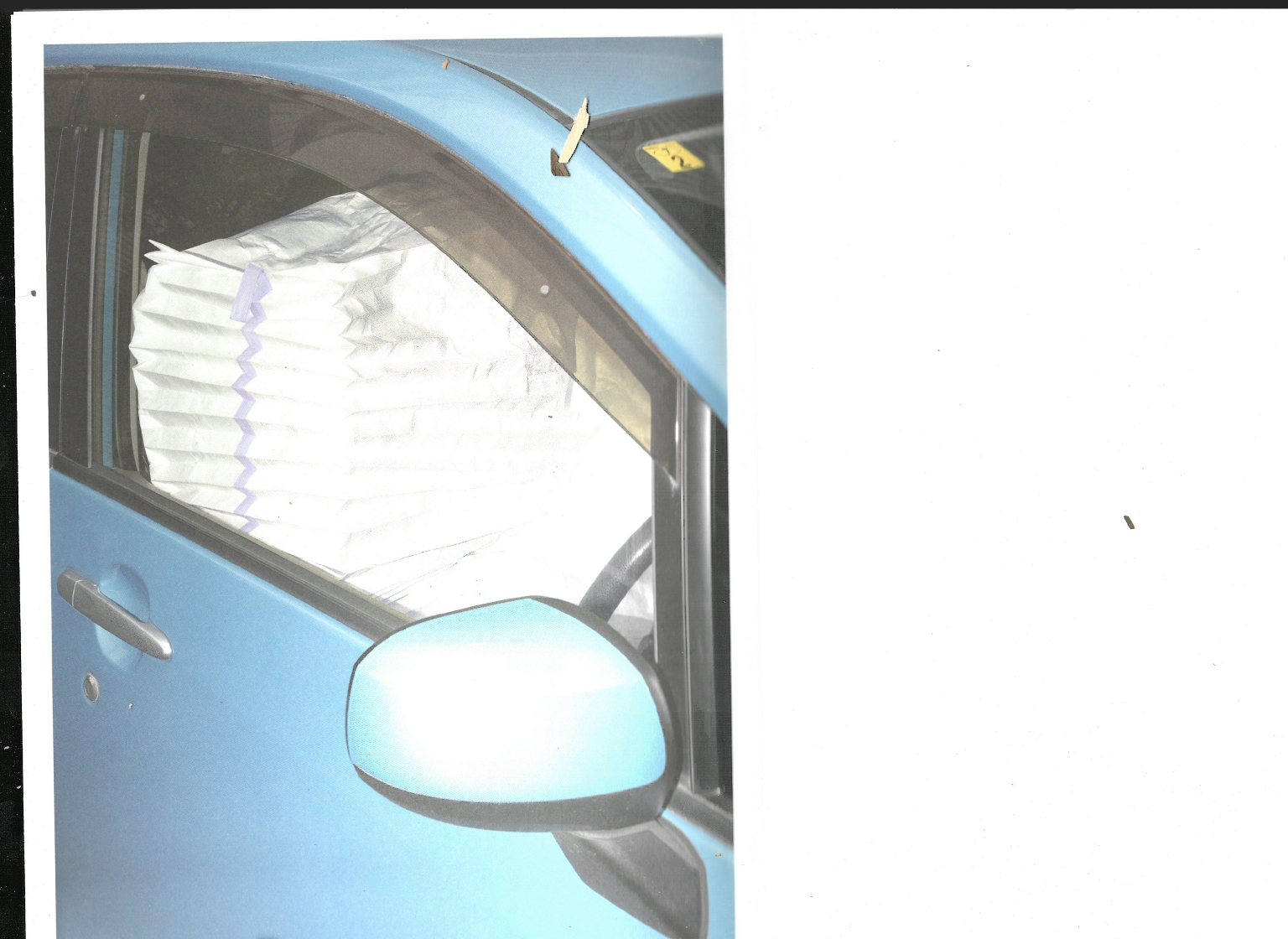
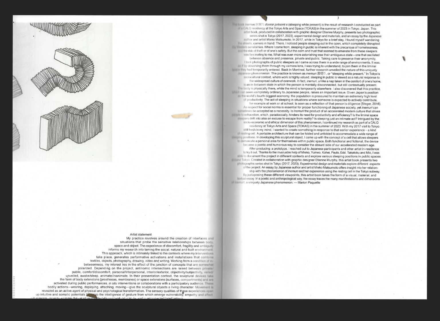
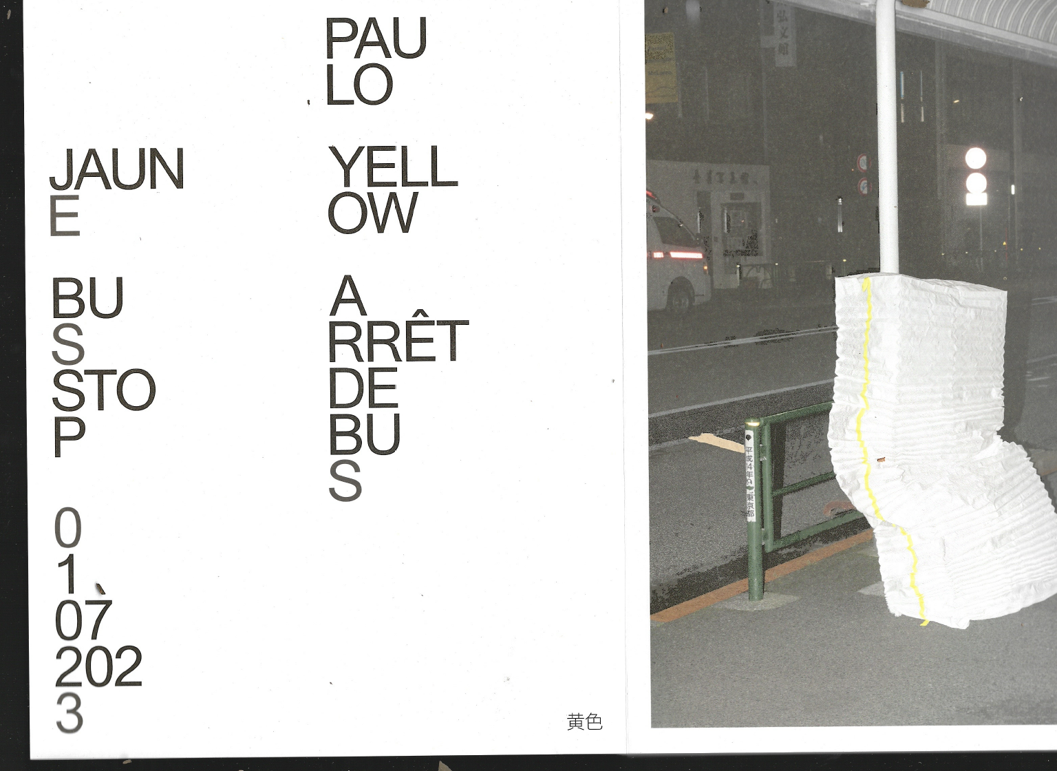
Inemuri 居眠り
dormir présent·e
Another graphic design genius, Étienne Murphy, collaborated with Marion Paquette to create this amazing book object. The materiality is incredibly well considered — from the paper and format to the typeface and even the cord that binds the spine of the book.
The book, Inemuri 居眠り Dormir Présent.e (Sleeping While Present), is the result of extensive research. The project explores the ethical, sociological, and economic dimensions of inemuri, the Japanese practice of sleeping in public places as a response to widespread overwork. Both functional and fictional, a portable resting cell is imagined to delimit a personal space for sleepers, right in public places.
You can feel the concept of Inemuri throughout the materiality of the book, every design choices reinforces the idea of the object.
Title
inemuri 居眠り dormir présent·e
Design
Etienne Murphy, Marion Paquette
Year
2024
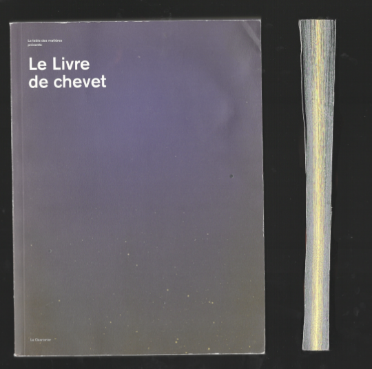
Le livre de chevet
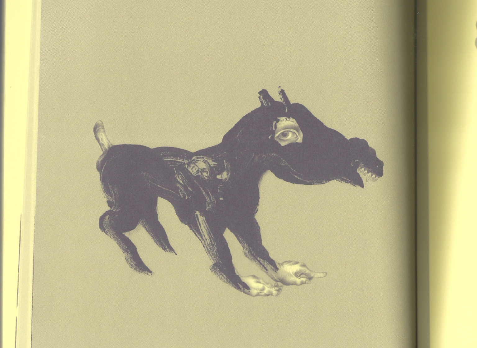
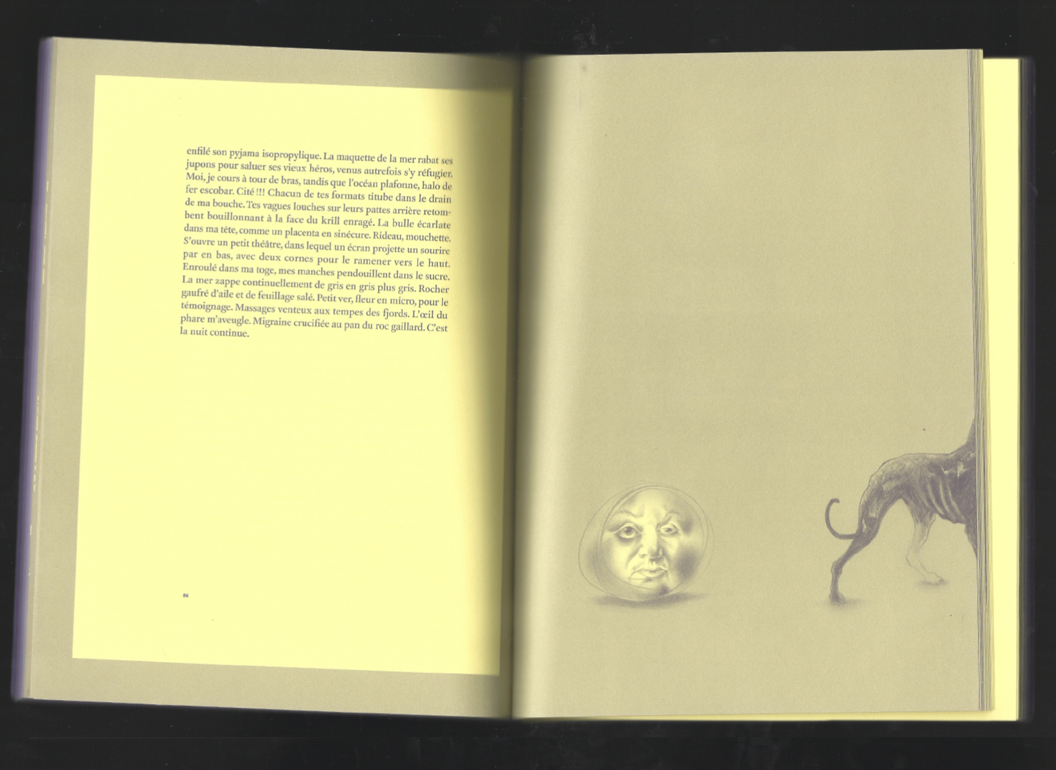
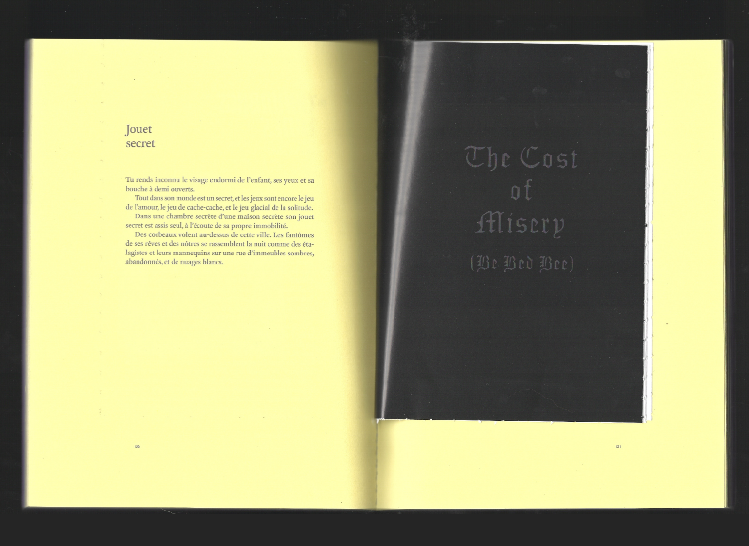
Another book by Daniel Canty and Studio Feed, simpler in format yet remarkably effective, is Le Livre de chevet — Night Table in English. Printed in a deep, soothing purple evocative of midnight, the book gradually shifts from purple to yellow as you flip through the pages, transforming reading into an immersive, nocturnal experience. The detail is both clever and thoughtful, and the structure follows a twenty-four-hour clock.
Inside, a hidden black booklet — a secret “twenty-fifth hour” — awaits discovery, like a forbidden book stumbled upon in the middle of the night. The illustrations are equally exceptional: Pol Turgeon conjures a strange, nocturnal universe inhabited by human-animal hybrids, talking creatures, and surreal characters, forming fantastical chimeras that intertwine with the stories unfolding through the night.
The book itself resembles an album, with twenty-six authors and two artists invited to “sleep together” and create texts designed to alter or populate the reader’s sleep. You encounter inventors of sleep, members of a secret society that exists only in dreams, various insomniacs, a sexual obsessive, a glacier, talking animals, and other elements of paradoxical slumbers.
Title
Le livre de chevet
Editor
LE QUARTANIER
Design
Studio Feed
Year
2009
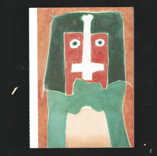
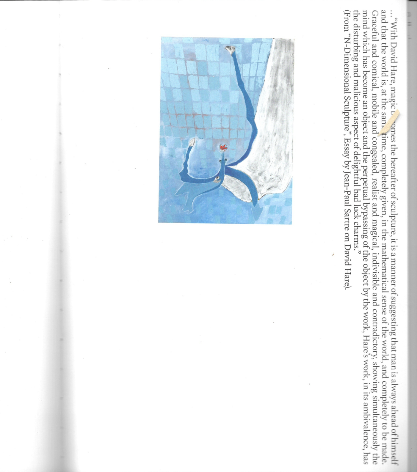
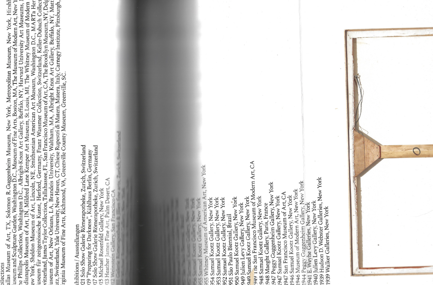
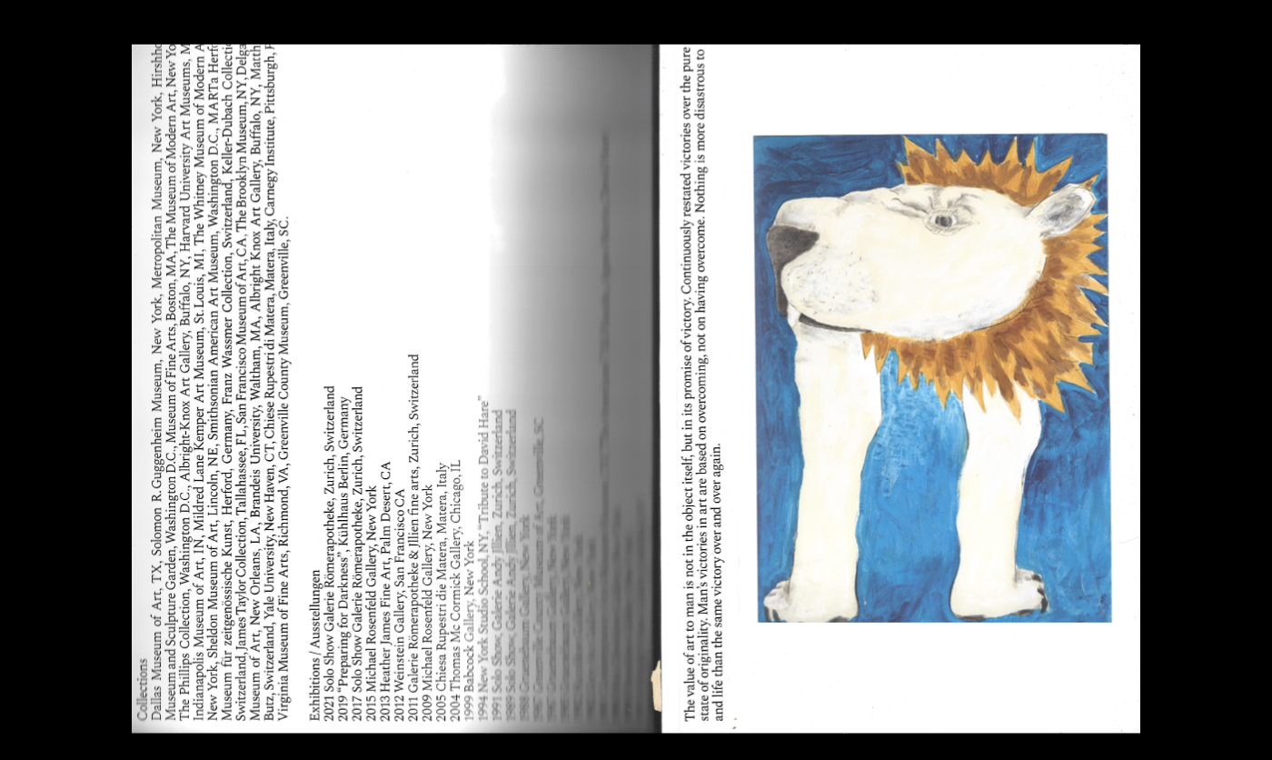
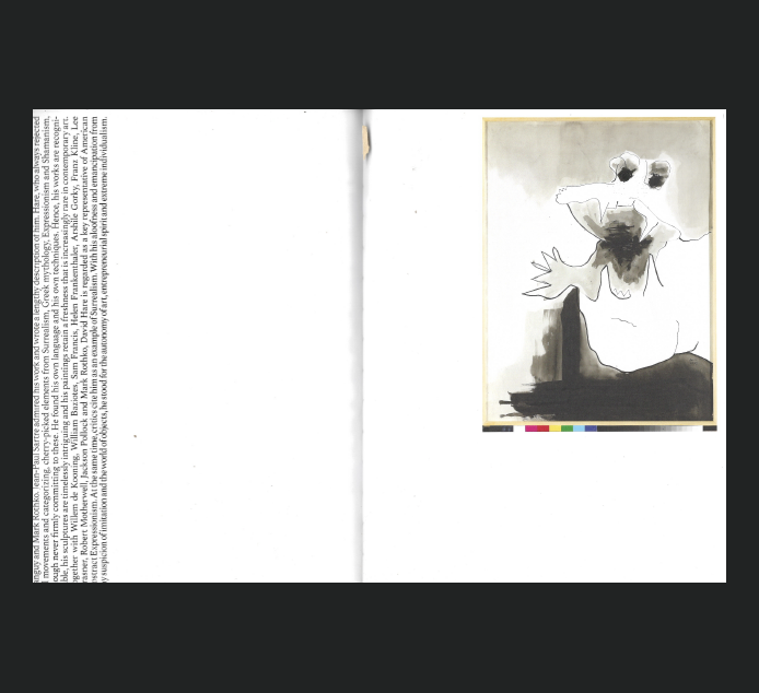
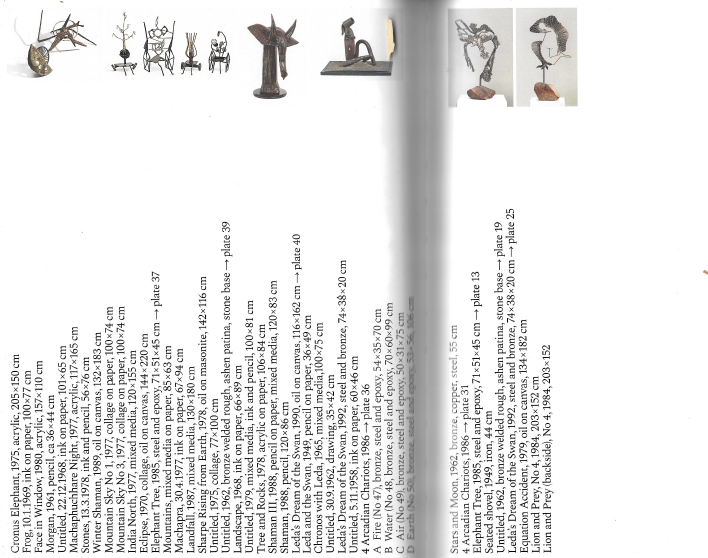
David Hare – The Shape of Things
This one is from Kodoji Press, my favorite publishing house, which I discovered this year at the FairArt book fair in NYC. Let me tell you — I wanted everything on their table.
This one is just so fun. The artist is truly special, and the layout is simple yet playful, designed entirely in a horizontal format that allows for two directions of reading. I love the tri-fold spreads, where typography flows horizontally without ever interrupting the artwork. It all feels so elegant on the white paper, and the design really lets the artist’s work shine. My favorite spread is the one where the text interacts with small pieces of art, each sentence combining with the artwork to create a new narrative.
Title
David Hare – The Shape of Things
Publisher/Designer
Kodoji Press
Year
2021
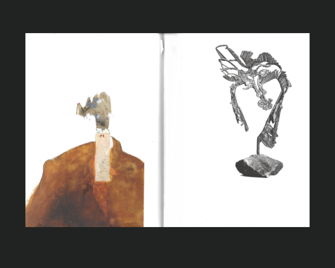
Almanach Guillaume
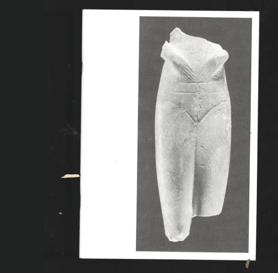
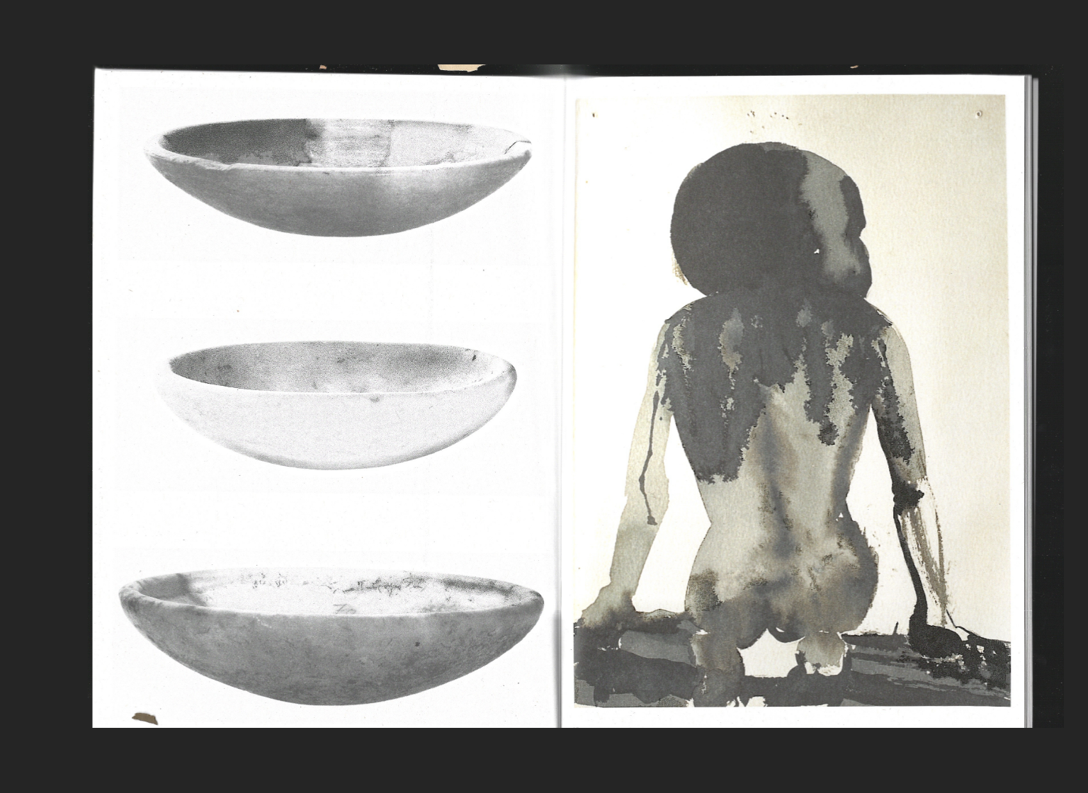
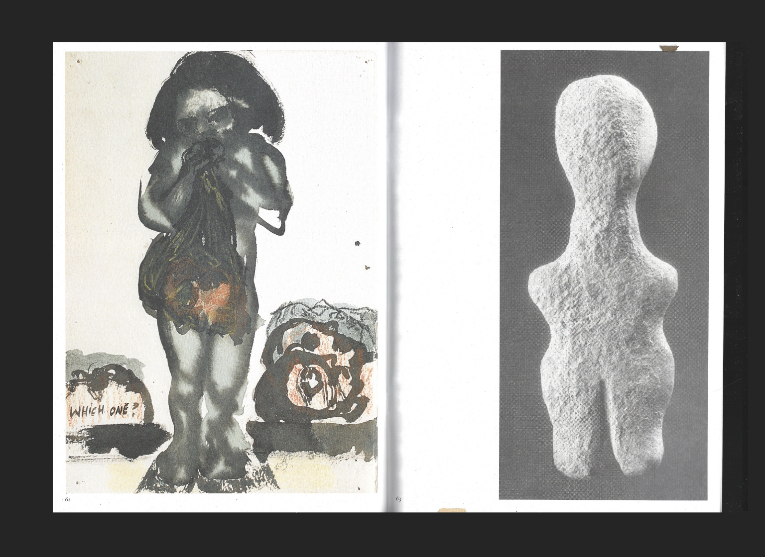
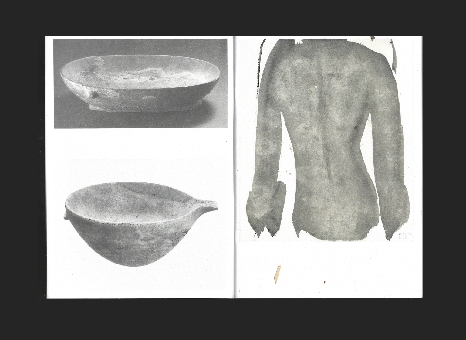
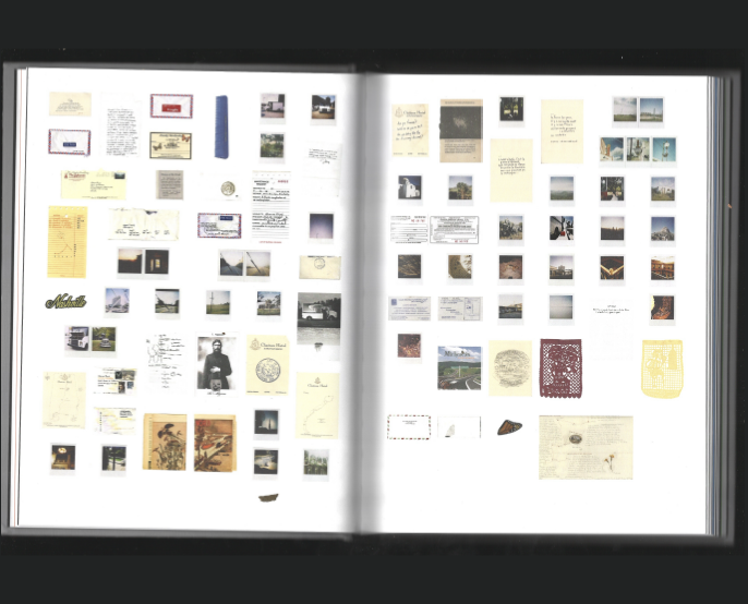
Eveline also featured this one in her Guestlibris Curation, but I couldn’t not include it in mine, it’s such a big inspiration in artist books for me at the moment. There isn’t much to say, really, except that everything works together perfectly. There’s not even any typeface, just beautiful combinations of the artworks on a stunning format, printed on high-quality paper. I love how each spread creates its own narrative, depending on how the artist chose to combine the pieces. And the cover… it’s just so beautiful; I had to have it in my library.
Title
Marlene Dumas – Cycladic Blues at the Cycladic
Pubslier
Roma Publications
Year
2023