September: Back to School
Back to School
September has always felt like a little reset to me, a return to school, new notebooks, new ideas, and the exciting feeling of starting something again. This curation is very much inspired by that energy, and by my own return to school after ten years to do a Master’s program.
A little mix of books I’ve started reading for my thesis and books that have been sitting on my TBR and some are here simply because I find them interesting. I obviously love sharing books for their visual content, but sometimes I want to share books simply because of what’s inside them. Of course, they are all beautiful as well!
So consider this your September reading list, your TBR, your little back-to-school assignment. From artists conversation to design classics, research, and everything in between, I hope you find something that makes you curious enough to pick it up.
If Need Be
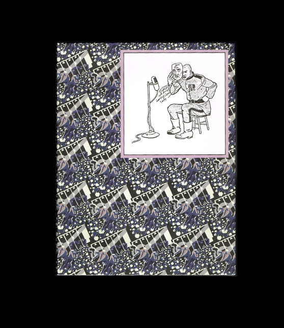
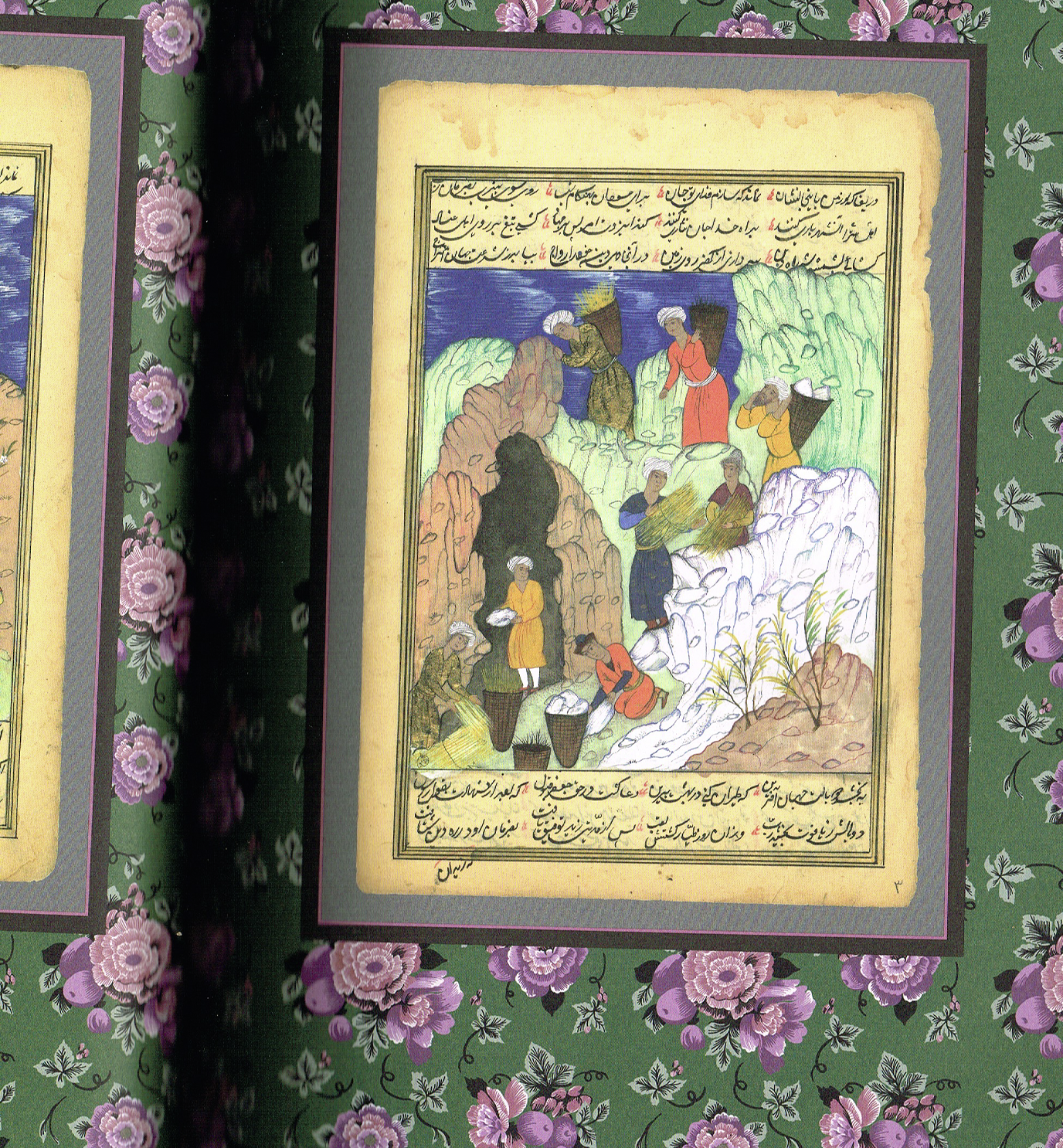
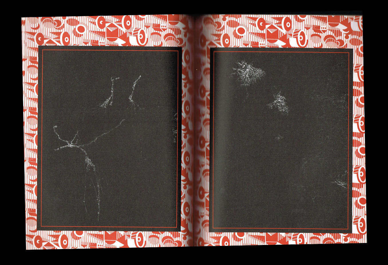
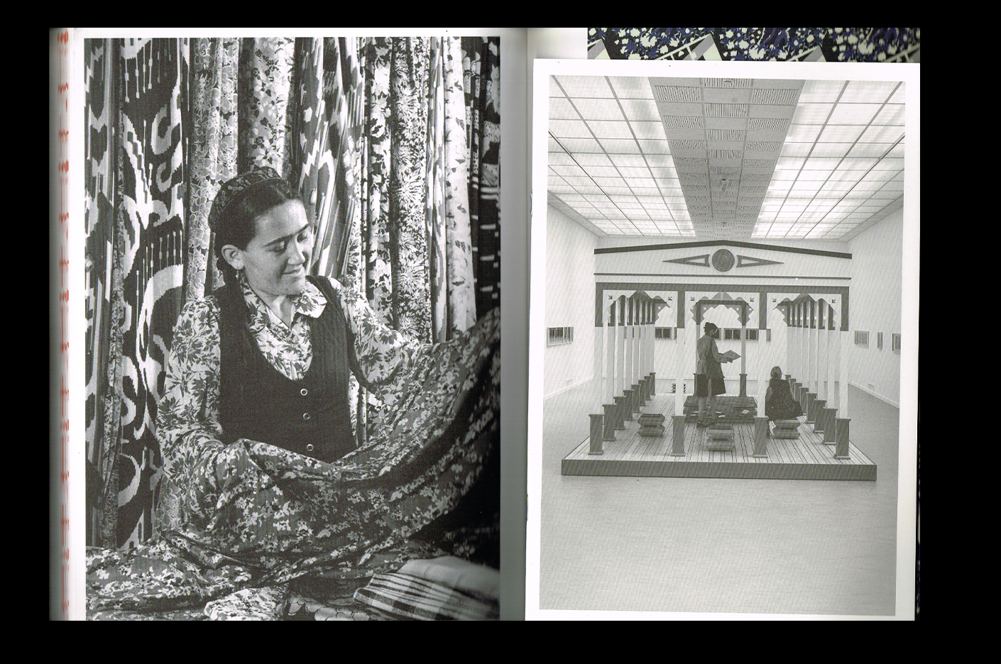
If Need Be explores water scarcity through a mix of history, mythology, fiction, and research, looking at how water—and its absence—has shaped landscapes, cultures, and stories across different parts of the world. But what immediately drew me to this book is how such a serious and complex subject has been turned into such a beautiful contemporary object.
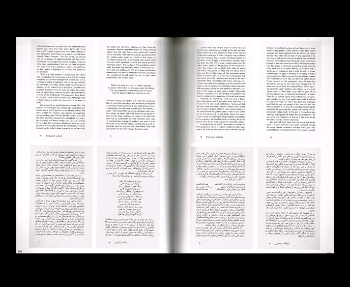
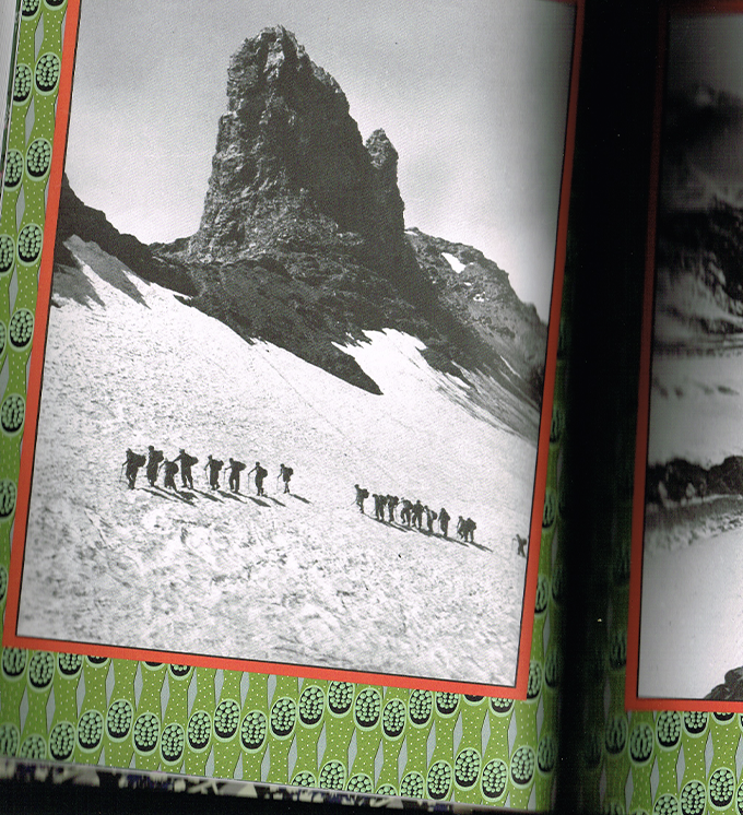
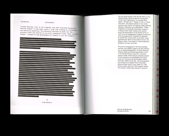
At 316 pages and in a fairly large format, the book feels almost like an art book. A large fold-out poster introduces and contextualizes the project, while patterns, striking photographs, archival material, and carefully composed texts create a visual rhythm throughout. I especially love the way the typography is treated: the text itself is kept quite simple, sometimes framed by these large graphic outlines, which makes the pages feel incredibly considered without ever feeling overly designed.
It’s a good reminder that a book dealing with subjects as serious as climate, water scarcity, history, and displacement doesn’t have to look serious in the conventional sense. It can be thoughtful, contemporary, and visually playful—and become an artwork in itself. This is definitely one of those books where I keep finding myself wanting to look at the object just as much as I want to read it.
As Celebration As Critique As Play
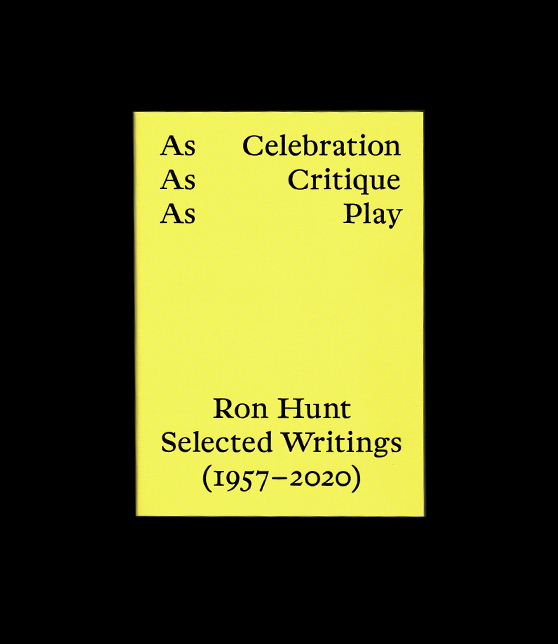
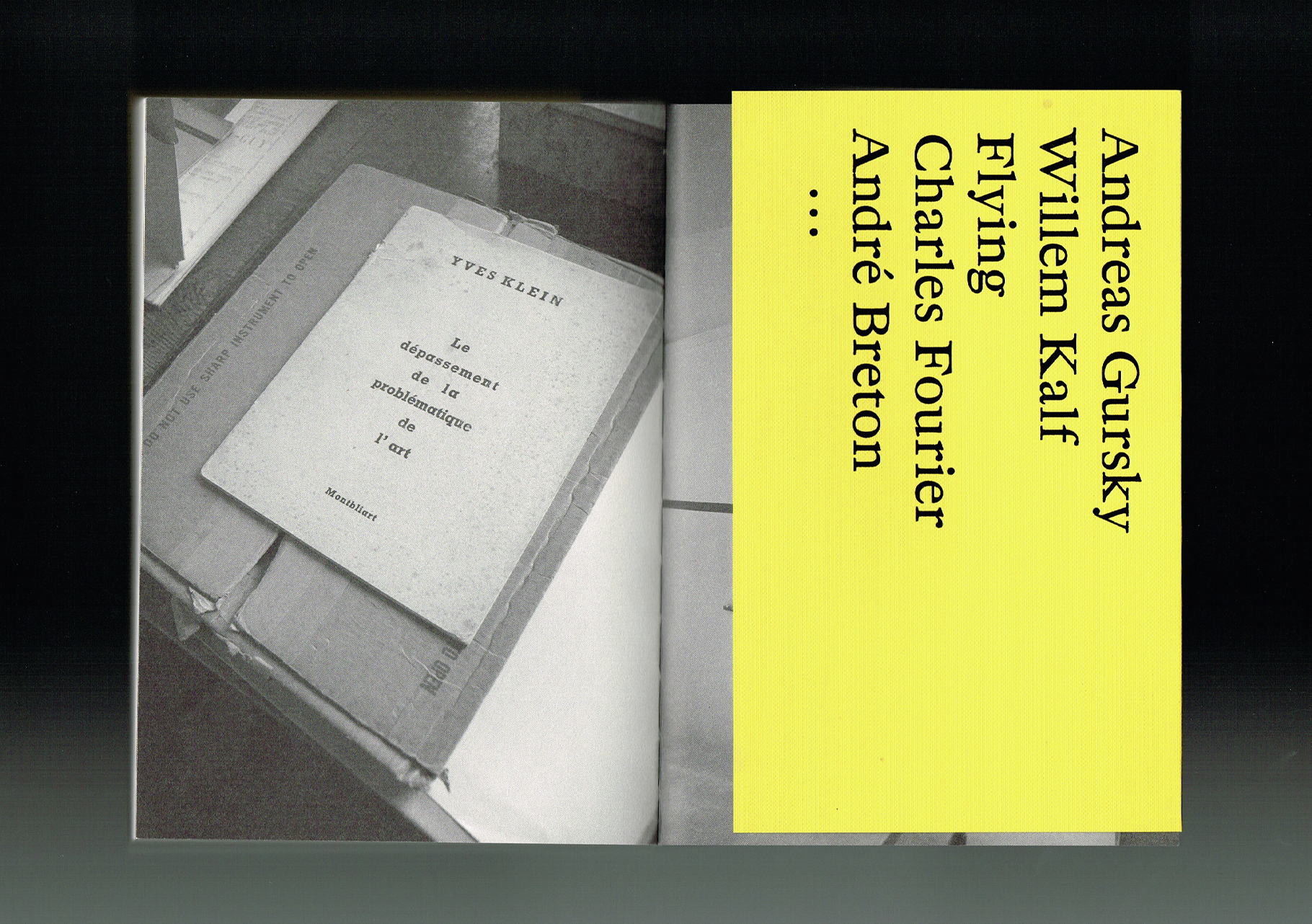
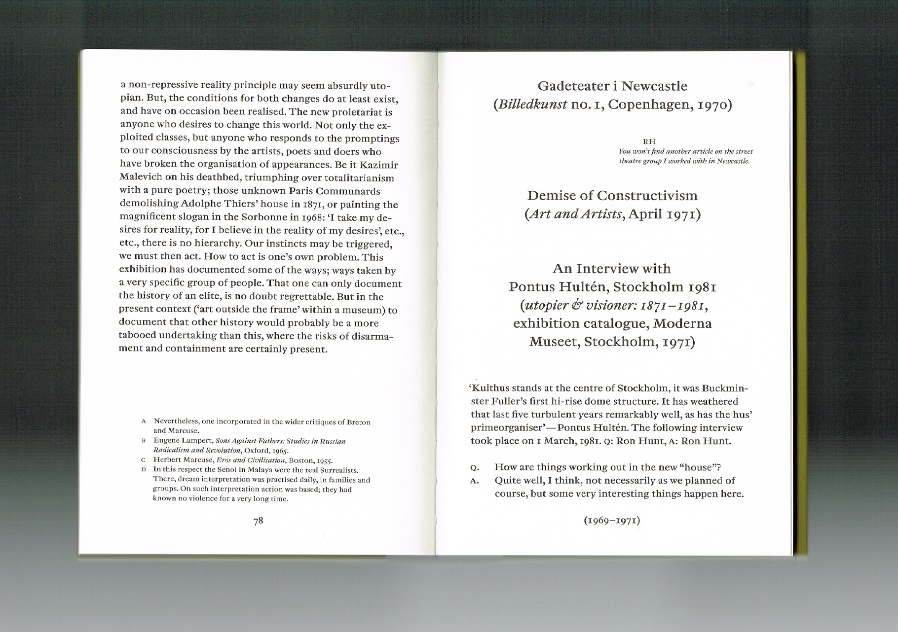
As Celebration, As Critique, As Play brings together selected writings by Ron Hunt across more than six decades of his work as a writer, librarian, curator, and art critic. What I find especially interesting is the way Hunt approaches art not simply as something to look at, but as something that can question, disrupt, and re-enter everyday life.
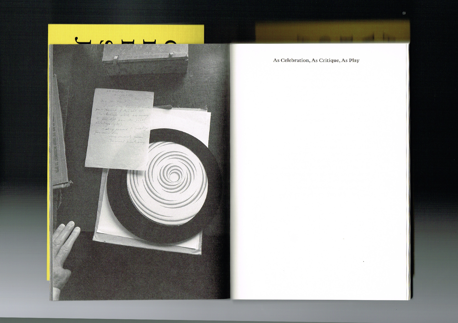
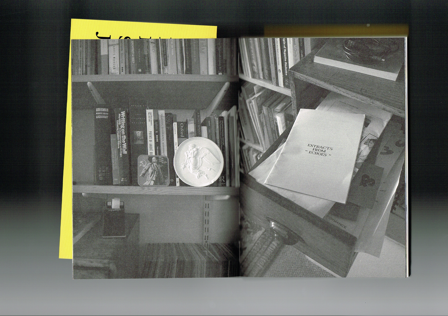
Visually, this little book is such a gem. The fluorescent yellow on the cover immediately caught my eye, with a really simple but incredibly strong layout. Inside, the photographs have this beautiful grainy quality that gives the book an almost tactile, archival feeling, while the typography becomes much more expressive. The compositions are bold and unexpected, but still feel incredibly intentional. I also love how the design makes a book filled with critical and theoretical writing feel playful and alive.
It’s a good example of what I’m interested in exploring through my own research: how design can influence the way we encounter ideas, and how visual form can make something intellectual, critical, or complex feel more intuitive, emotional, and engaging. For me, this book sits beautifully at that intersection between design as communication and design as an experience in itself.
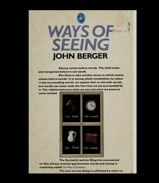
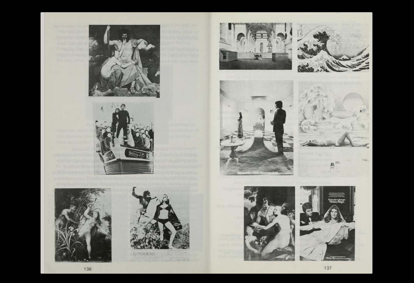
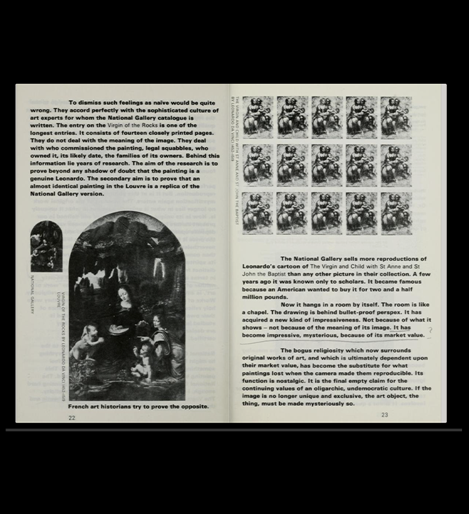
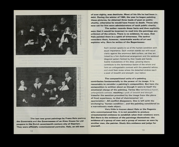
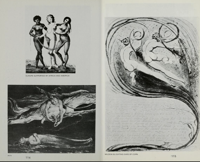
Originally published in 1972, Ways of Seeing has become such a classic that it almost feels impossible to make a curation about books and visual culture without including it. The book explores the way we look at images and how our understanding of art is shaped by culture, history, power, and context. It’s one of those books I genuinely recommend to everyone, especially anyone interested in art, design, or visual culture.
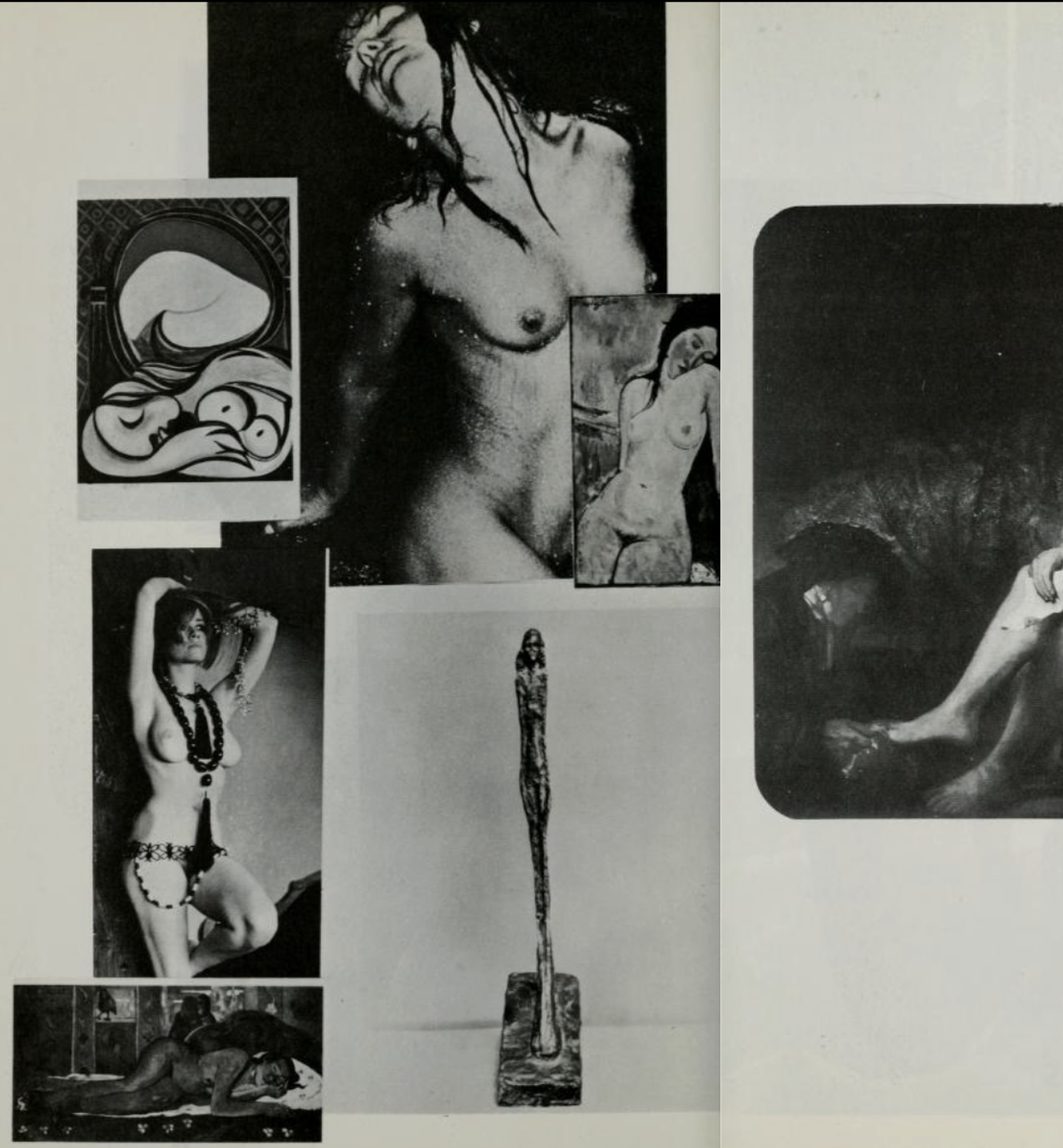
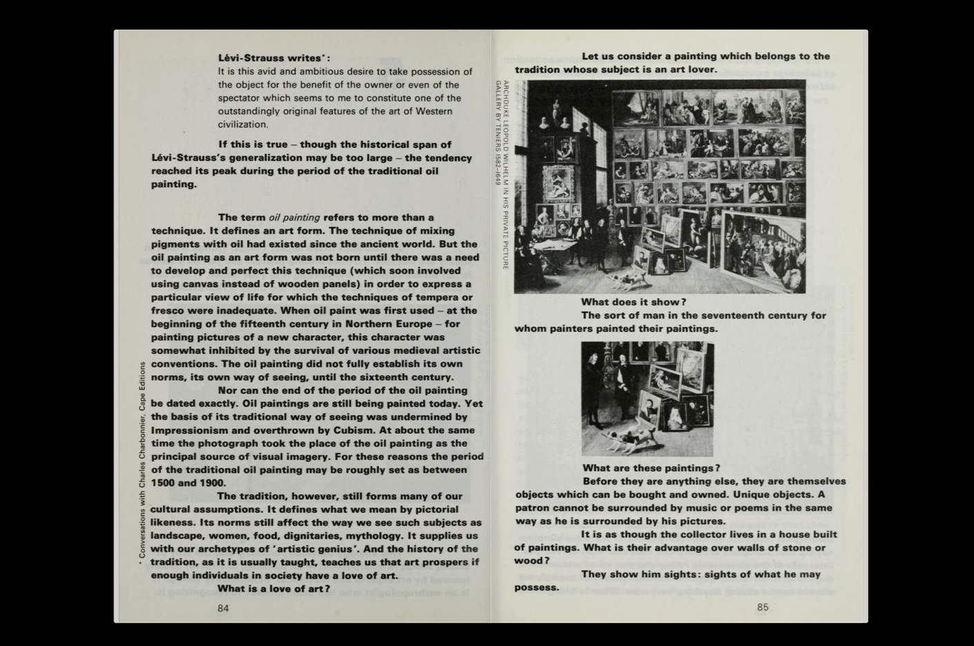
What I find particularly fascinating about this edition is how contemporary some of its typographic decisions still feel. There are no hyphenations throughout the long blocks of text, creating these beautiful, sometimes almost strange shapes across the pages. It may not be the most efficient way of setting long copy for comfortable reading, but it completely changes the role of the text on the page. The words become shapes, and the typography becomes part of the visual experience rather than simply a vehicle for the content. The black-and-white images also feel incredibly considered, creating this beautiful dialogue between text and image throughout the book.
I first discovered Ways of Seeing during Typography Summer School two years ago, where Fraser talked about this particular approach to setting long-form copy without hyphenation. It stuck with me because it’s such a simple decision, yet it completely changes the rhythm and personality of the pages. It’s also a beautiful example of something I keep coming back to in my research: how a design decision doesn’t have to be the most obvious or efficient one to create meaning. Sometimes, the way something is made changes the way we experience what it has to say.
Ways of Seeing
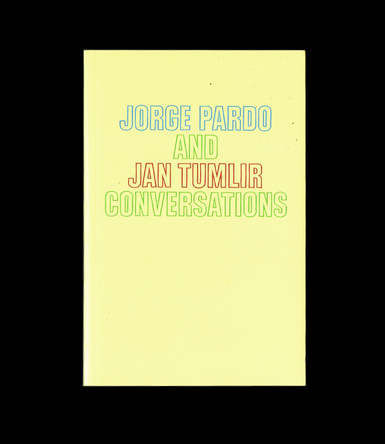
Jorge Pardo and Jan Tumlir Conversations
I discovered this little book while I was in Los Angeles with one of my best friends. We were visiting the Museum of Contemporary Art when the cover caught my eye. It was wrapped in cellophane, and the glossy paper made the colours almost glow. There was something about this small, shiny, almost precious object sitting there that immediately drew me in. The cover itself is incredibly simple, but the combination of colour, gloss, and light gives it such a strong presence. Of course, I picked it up—and when I opened it, I realized it was a series of conversations between artist Jorge Pardo and writer and critic Jan Tumlir.
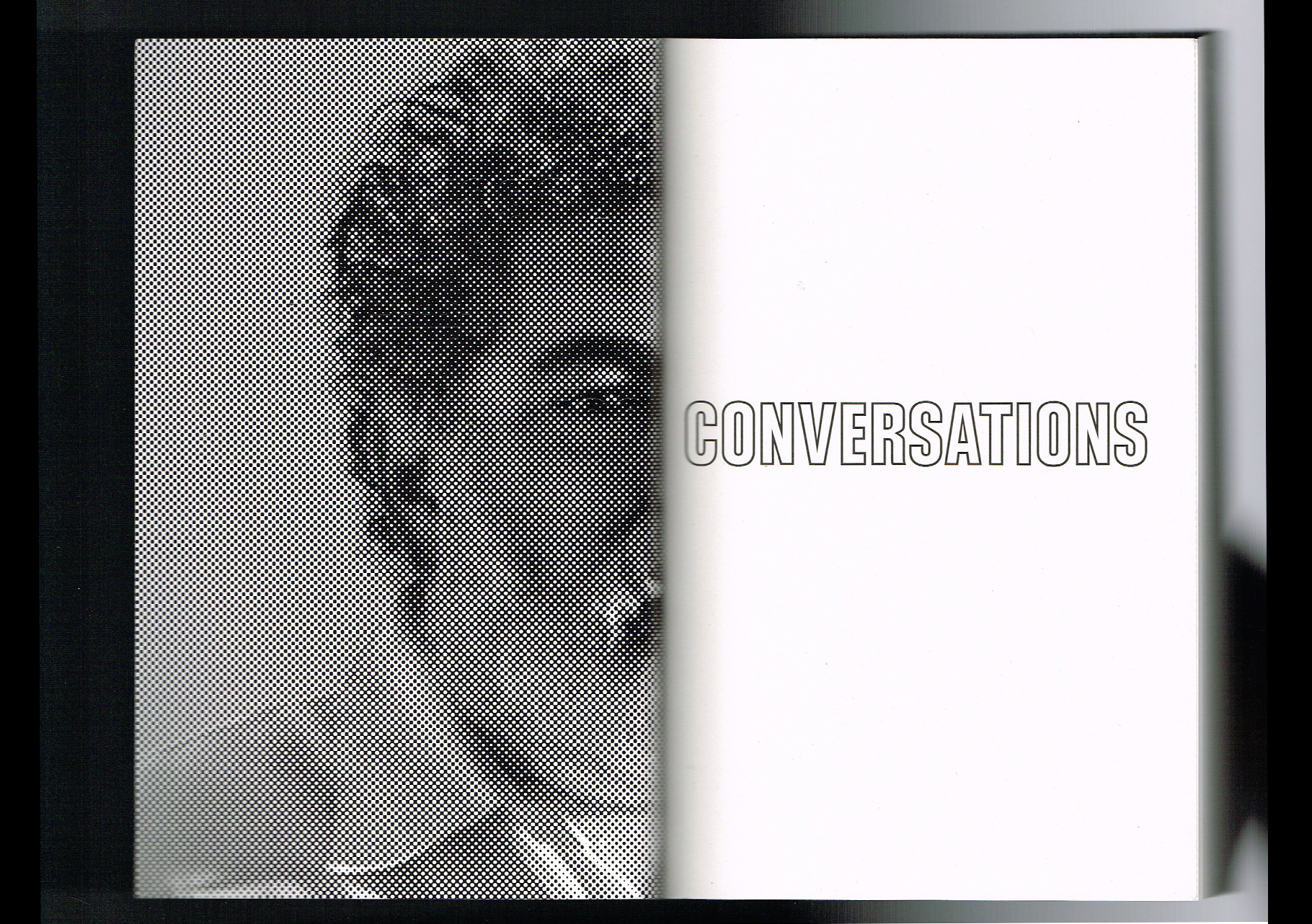
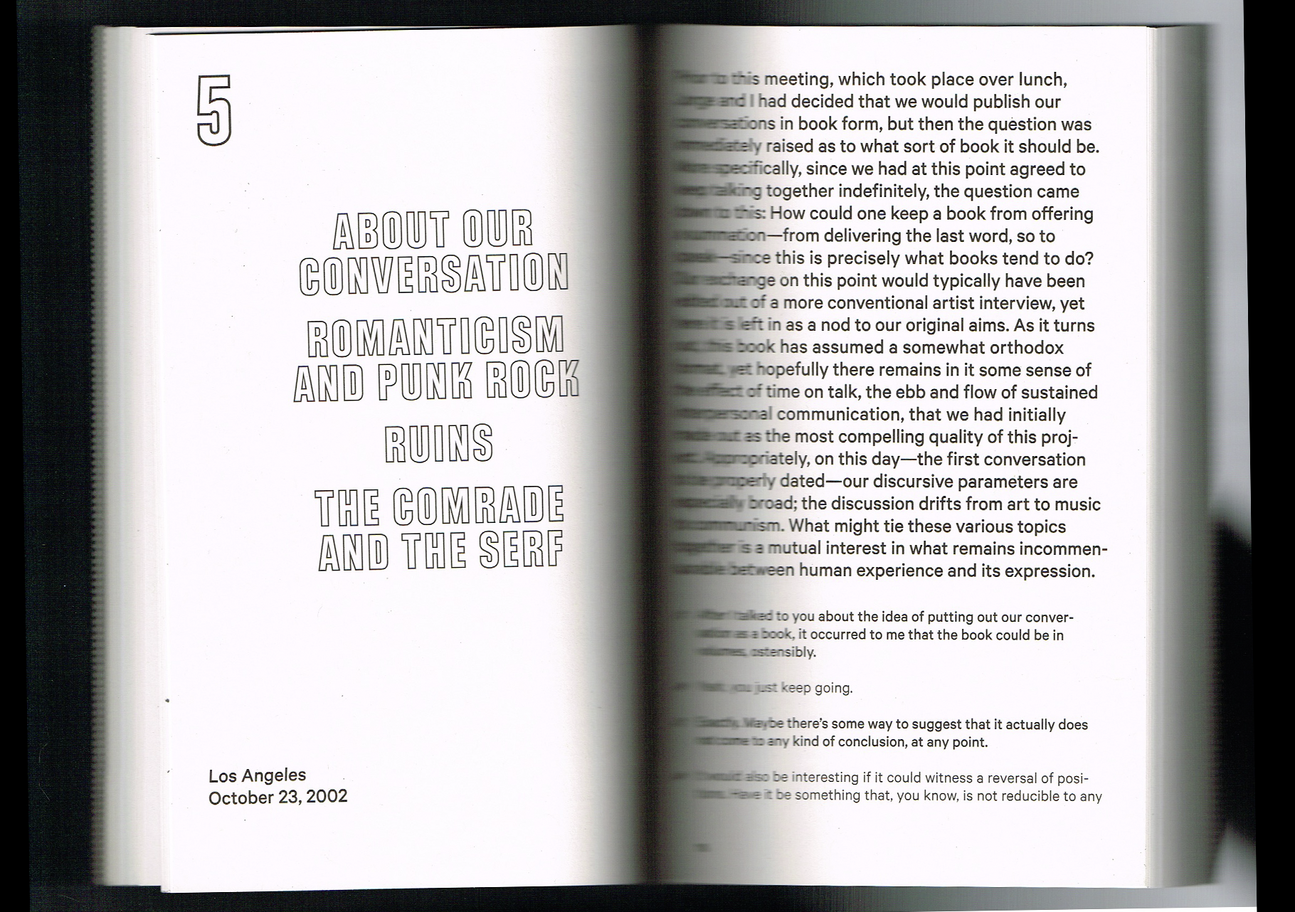
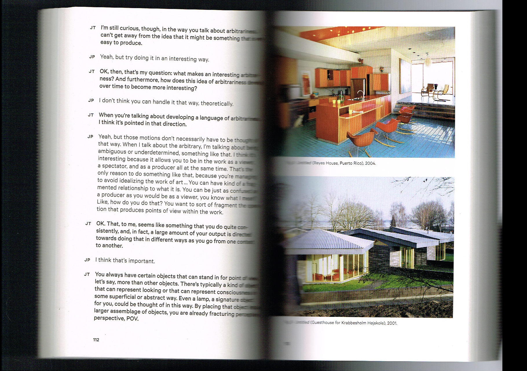
The book brings together conversations that explore Pardo’s work and his ideas around art, design, architecture, and the spaces between them. What I found especially interesting was the way design becomes part of the conversation itself. Rather than presenting a definitive theory or argument, the book lets ideas unfold through dialogue, questions, and different perspectives.
Visually, it’s quite simple, but I really love how the text is treated and how much space the conversation is given. There’s something very appealing to me about a book that doesn’t need to be visually loud to be engaging. It reminded me that research can also happen through conversation, curiosity, and simply allowing ideas to develop between people. This is something that really resonates with what I’m interested in exploring through my own thesis—how we can think about design beyond its traditional boundaries and create space for other disciplines, ideas, and ways of seeing to enter the conversation.
Commons in Design Publication
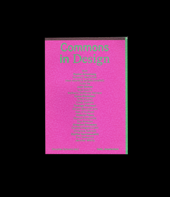
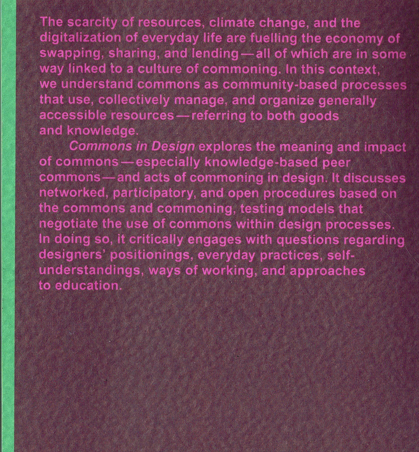
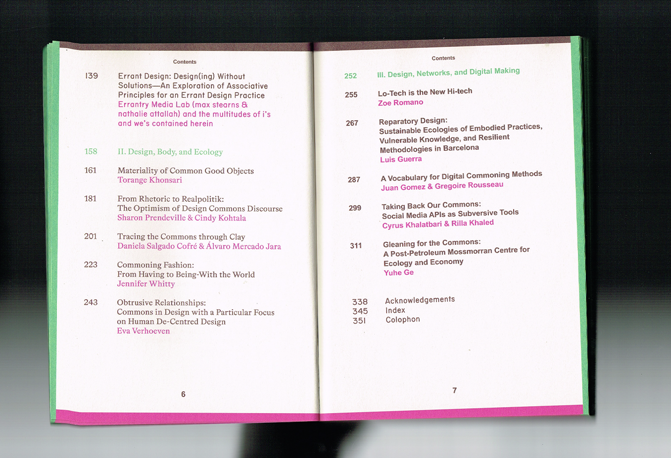
Commoning in Design looks at what happens when knowledge, ideas, and design processes become something we share and build together. It explores more collective and participatory ways of designing, questioning the traditional idea of the designer as an individual author and instead looking at what can emerge through collaboration, openness, and shared knowledge.
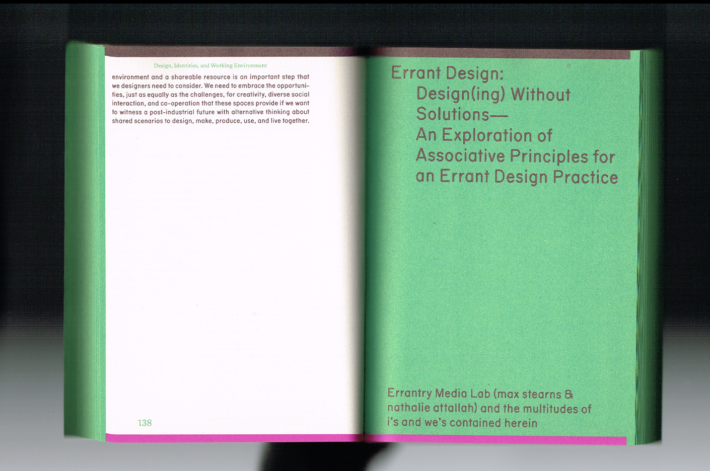
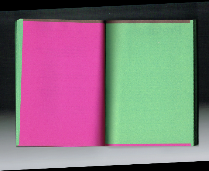
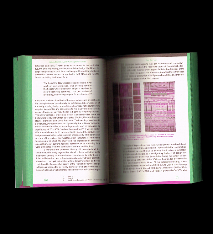
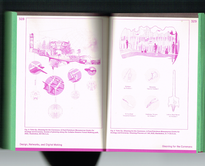
Of course, what first drew me to this book was the design itself. The bright pink, combined with this unexpected mix of green, brown, and white, feels so good against a very unassuming, almost ugly paper. And then there’s the typography: the way the two typefaces work together creates this absolutely beautiful grid. It’s a great example of how colour, type, and structure can transform even the most ordinary materials into something visually compelling.
But beyond the aesthetics, I find the subject particularly relevant to the questions I’m exploring in my own research. I’m really interested in how we can redefine what design is and what a designer’s role can be. The idea of sharing knowledge, collaborating, and creating through collective processes makes me wonder how design might become more meaningful when it’s not just about the designer’s individual vision, but about the knowledge and perspectives we create together.
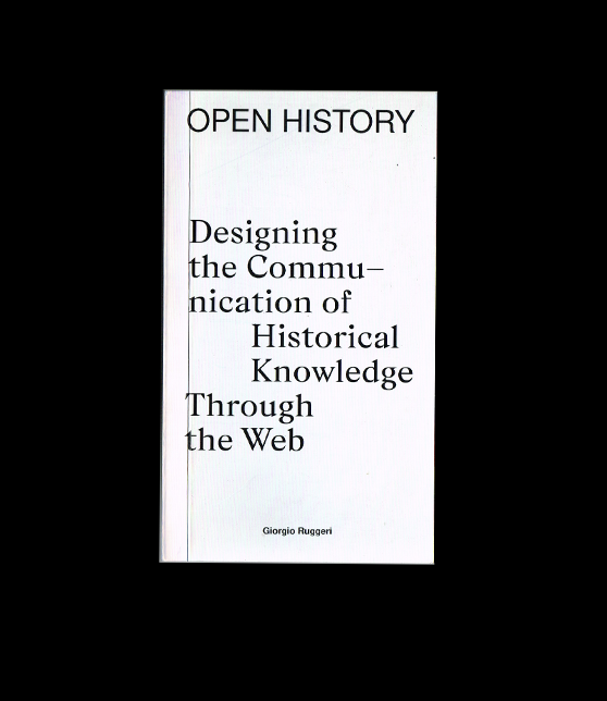
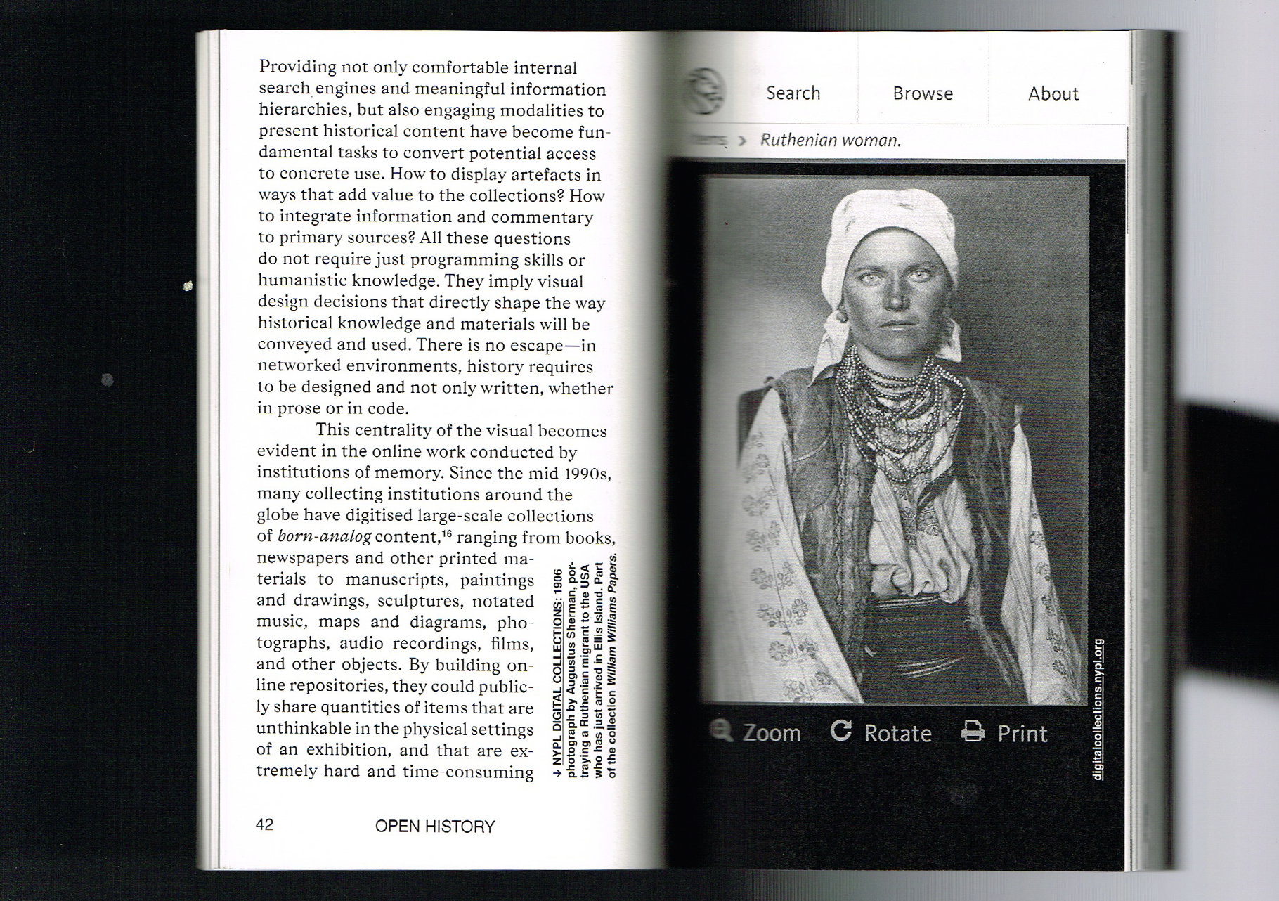
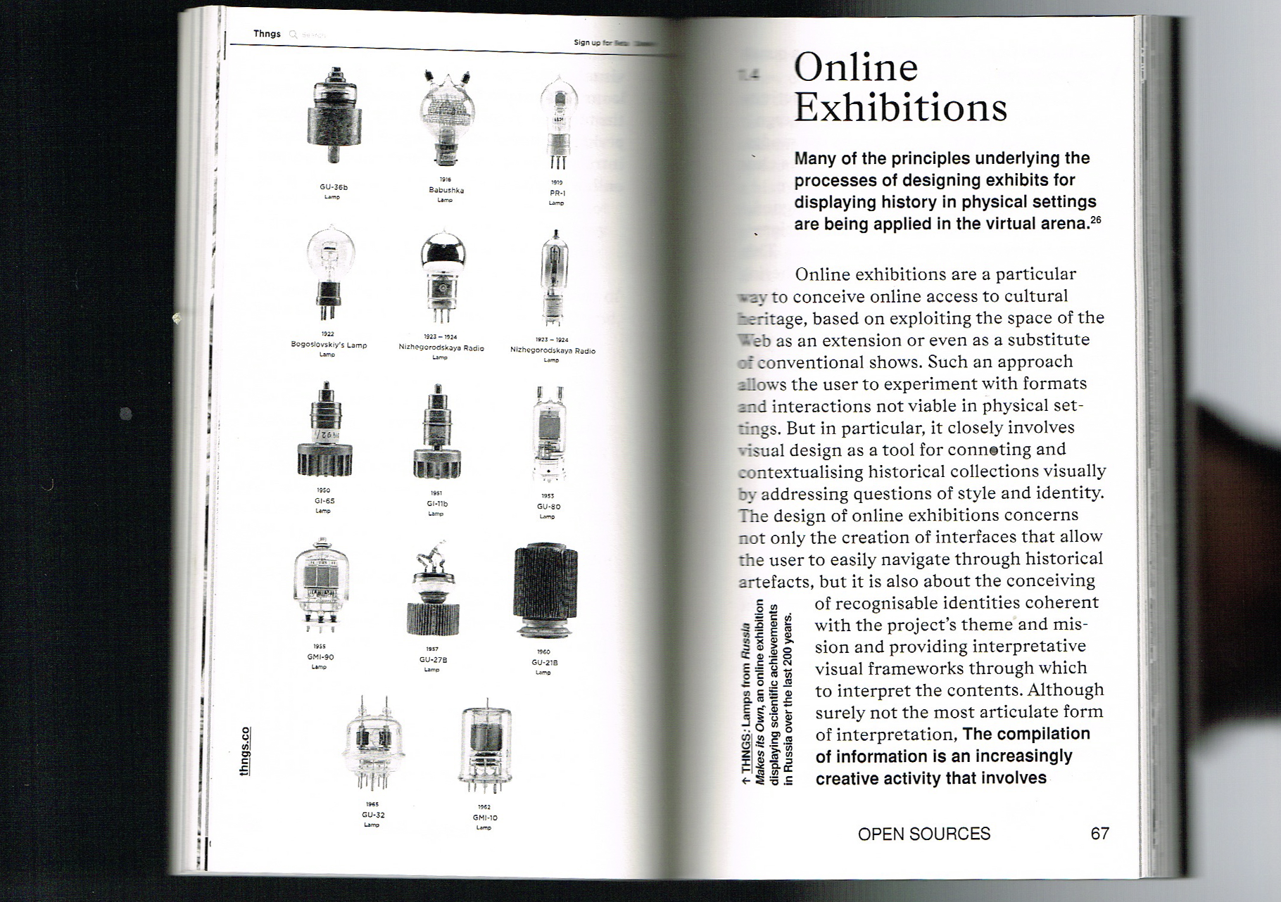
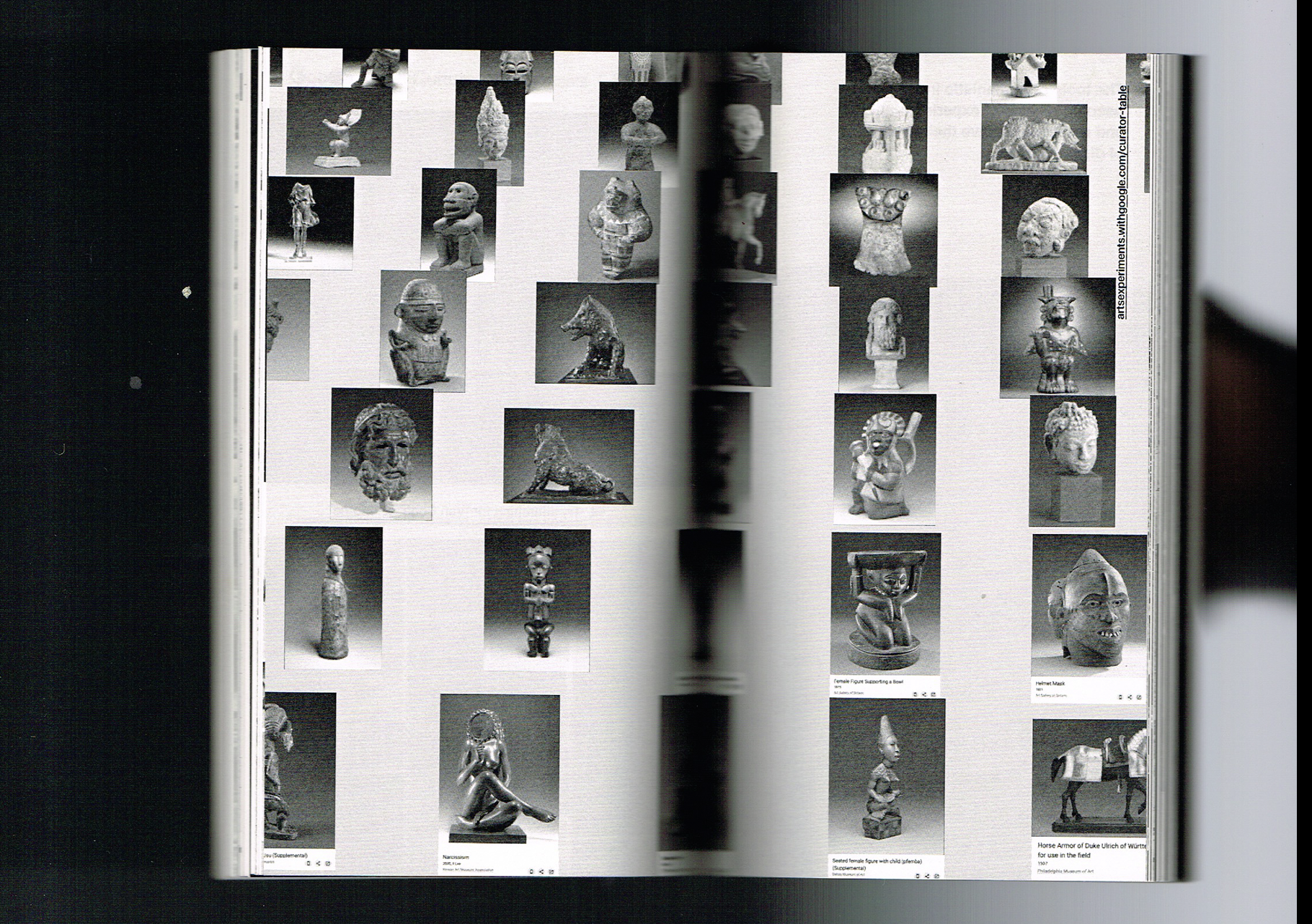
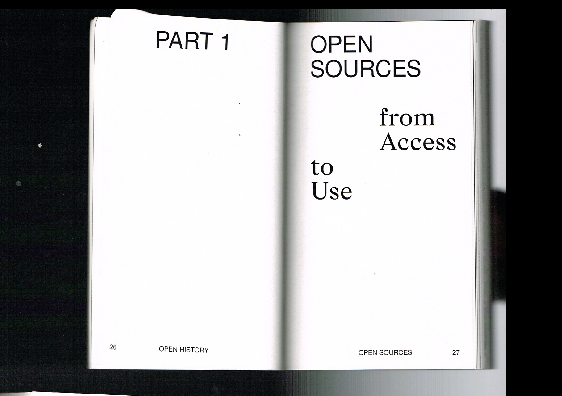
The word knowledge immediately caught my attention with this book. At a time when AI is changing so much about how we access, share, and produce information, I’ve been thinking a lot about what our relationship to knowledge might look like in the future—and how design can help us navigate that relationship. Open History looks at how historical knowledge can be communicated through the web, and I found the conversation around how we design the way information is shared particularly relevant right now.
I was also really drawn to how the book embodies its own subject through its materiality. It’s a small, narrow, almost pocket-sized book, which feels surprisingly appropriate for a publication about the web and the way information travels. The holographic quality of the paper almost feels like a physical reference to something digital, as if the book is borrowing a visual language from the screen while remaining very much a printed object.
Inside, the layout becomes even more interesting. The grid is incredibly dynamic, the images and compositions constantly shift, and there’s a really thoughtful use of white space that gives the small format room to breathe. I love when a book manages to be conceptually connected to its subject not only through its content, but through the actual choices made in designing the object. It makes me think about how design can shape the way knowledge is accessed, understood, and shared—and how that might become even more important as our relationship with technology continues to evolve.
Open History: Designing the Communication of Historical Knowledge Through the Web
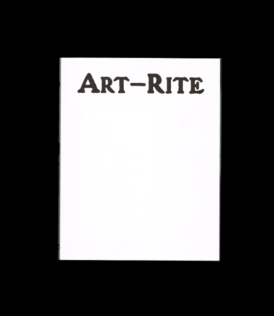
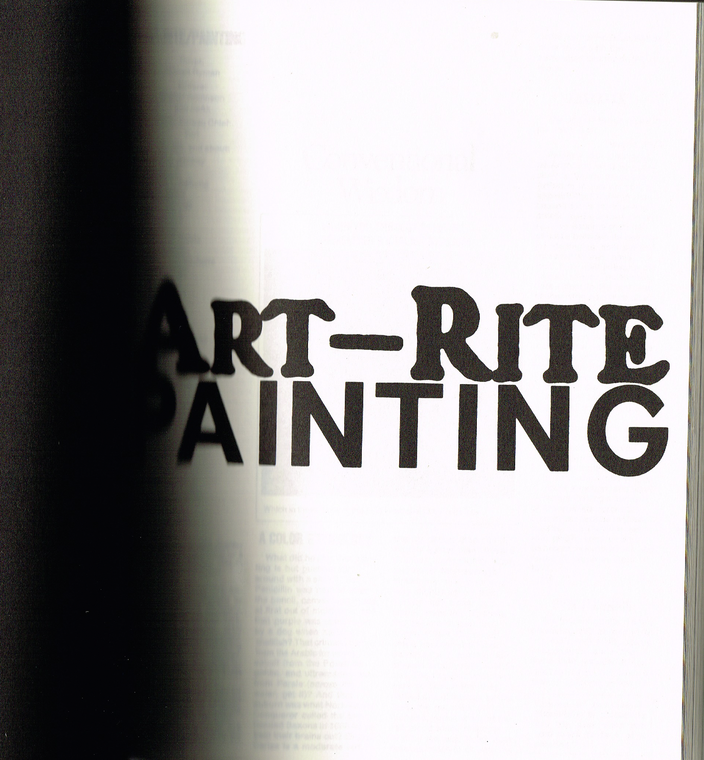
Art-Rite
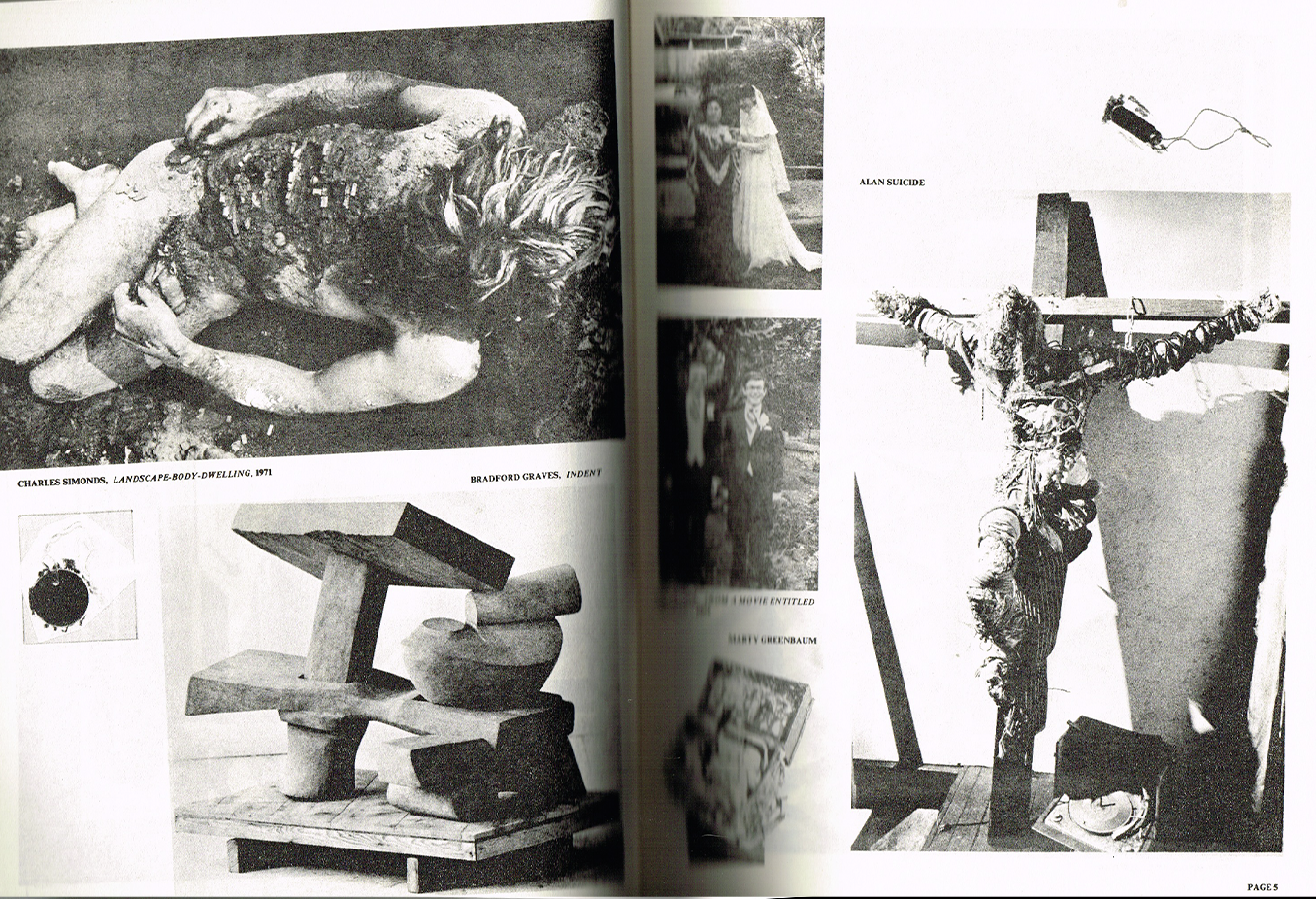
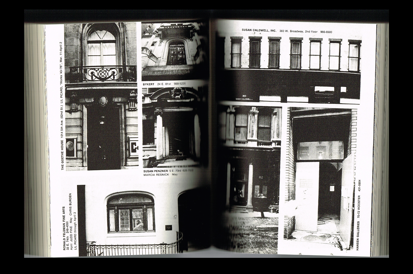
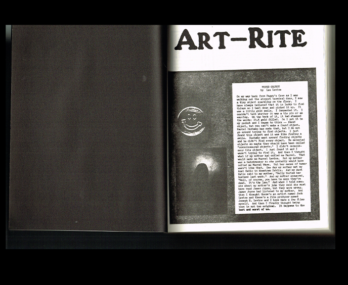
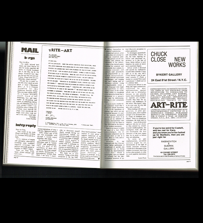
This giant brick of a book is a facsimile collecting the publications of Art-Rite, a New York art magazine published between 1973 and 1978 that focused largely on the underground art scene. Printed entirely in black and white on incredibly thin newsprint, the book feels almost like a time capsule. It’s a massive object, but the paper is so light and delicate that it still feels very much like a magazine.
What I find especially inspiring about it is the way the medium itself references what it’s documenting. The thin newsprint, the black-and-white printing, the sheer volume of pages—it all brings you back to the feeling of an independent publication rather than turning it into a polished contemporary art book. The material choices make the archive feel alive.
I also love coming back to publications like this when thinking about how we might redefine design today. There’s something to learn from the DIY and alternative practices of the past, especially at a time when we’re questioning established ways of working and thinking about what design can be. Sometimes looking backward is a really good way of finding new answers. Revisiting Art-Rite reminds me that many of the questions we’re asking today have already been explored in different ways—and that there’s still so much to learn from the people who were experimenting with them decades ago.
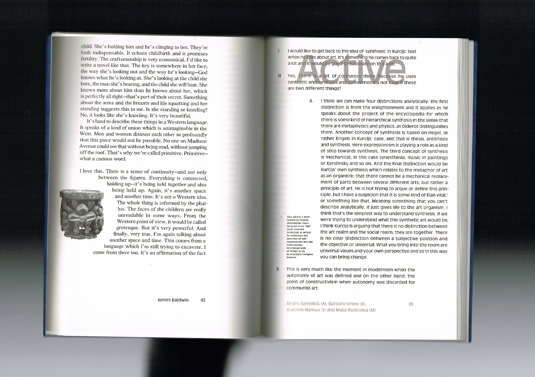
Active Art
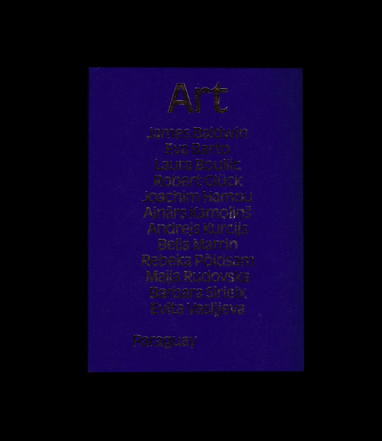
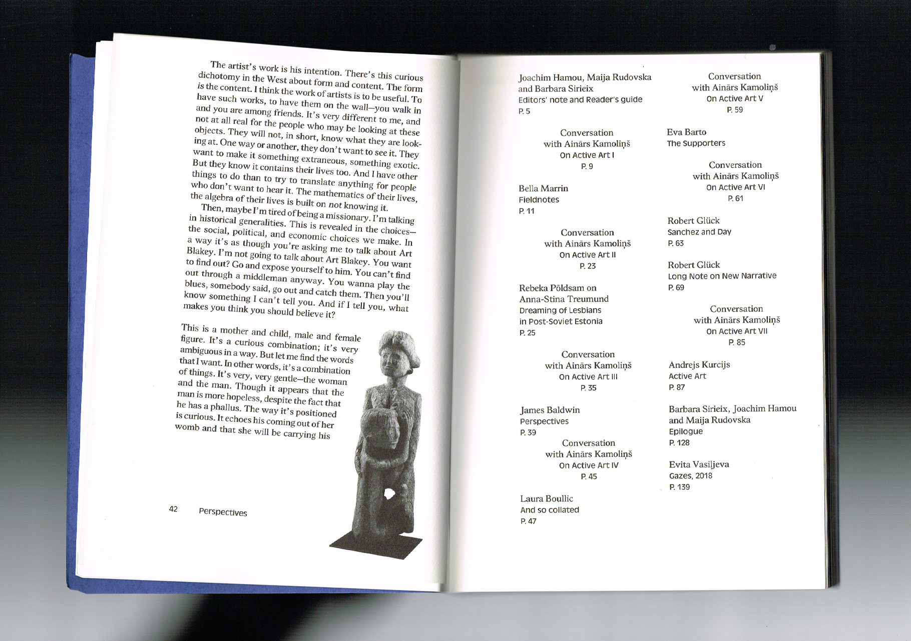
I found this book in a small bookstore in Amsterdam a few years ago, and I was immediately obsessed with the idea behind it. Active Art revisits a manifesto written by Latvian philosopher Andrejs Kurcijs in 1923 and brings together different voices to think about what an active art could mean today. Writers, artists, and other thinkers are invited to question what art can do, how it can participate in the world, and how we might redefine its role. Even though I still haven’t made my way through the entire book, the idea behind it has stayed with me ever since I found it—and it feels especially relevant to the questions I’m exploring in my own research.
The object itself is also one I absolutely cherish. The soft, almost leather-like cover is finished with hot foil, giving it the appearance of a very serious technical or academic manual—something you wouldn’t necessarily expect from a publication about experimental and active art. But then the cover is soft rather than hard, and when you open it, you see the exposed binding and ribbon, creating this beautiful contrast between something that feels formal and something much more tactile and human.
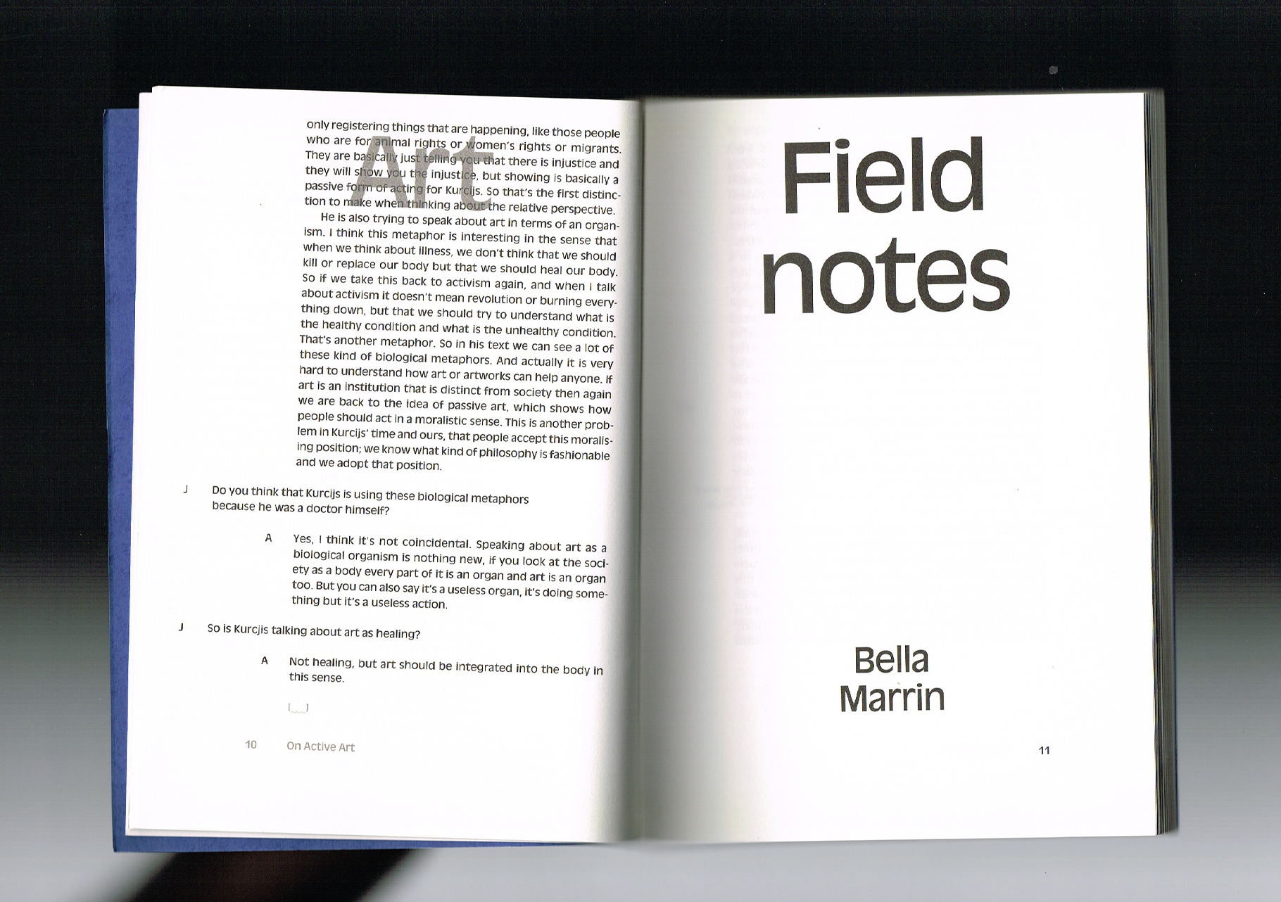
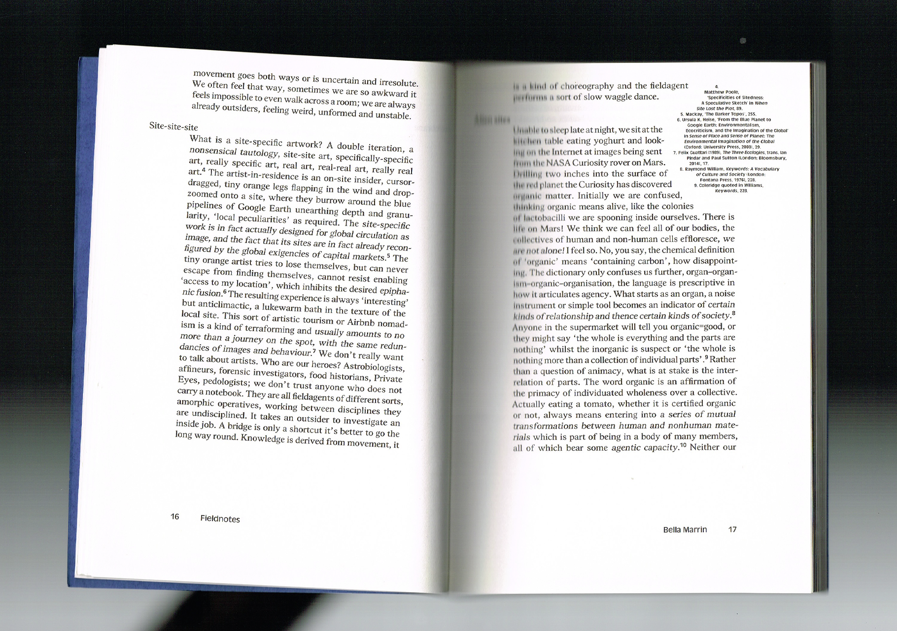
Inside, the typography is incredible. The entire book is kept very restrained, with pale grey throughout and almost no colour beyond the navy blue and gold of the cover. Somehow, that restraint makes every detail feel even more intentional. I love how the design gives the ideas room to exist while still making the book feel like a very carefully constructed object. It’s the kind of publication that makes me want to keep it on my shelf, but also reminds me why I’m so interested in books as spaces where ideas, materials, and design can all become part of the same conversation.