November: Collected Inspiration
Collected Inspiration
This month's curation is a little bit of everything! I've been discovering so many different books lately, and instead of following a particular theme, I decided to simply bring together the ones I've been drawn to. Some are new, some are old, and all of them have caught my attention for different reasons.
So consider this month's selection a little collection of things that have inspired me lately. No particular theme, just a bunch of lovely discoveries I wanted to share with you.
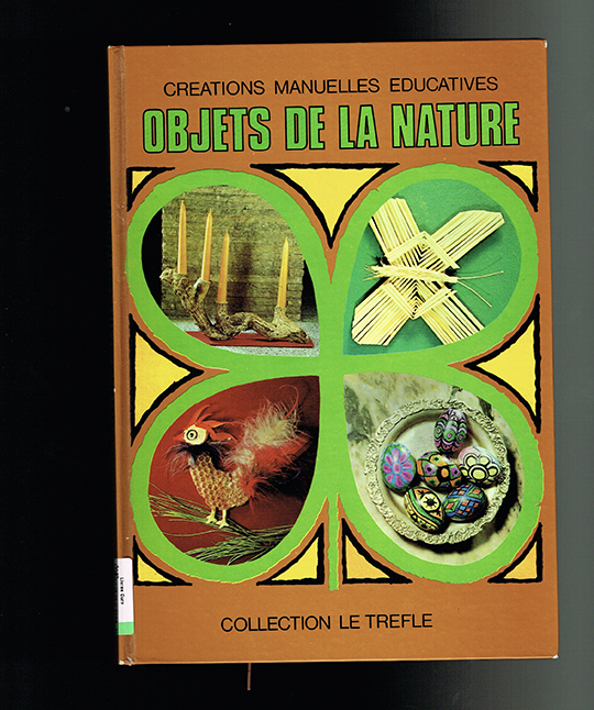
Objet de la nature
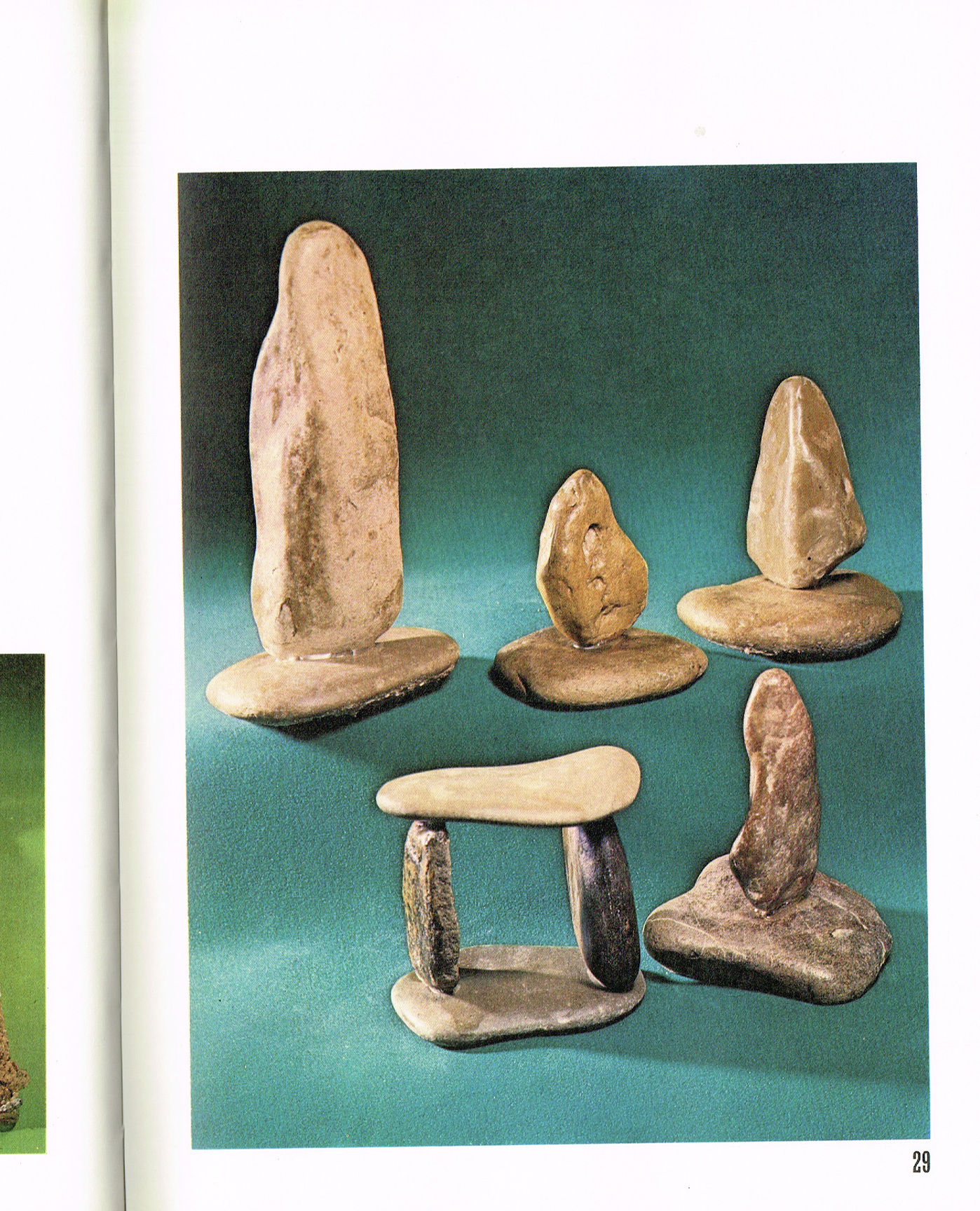
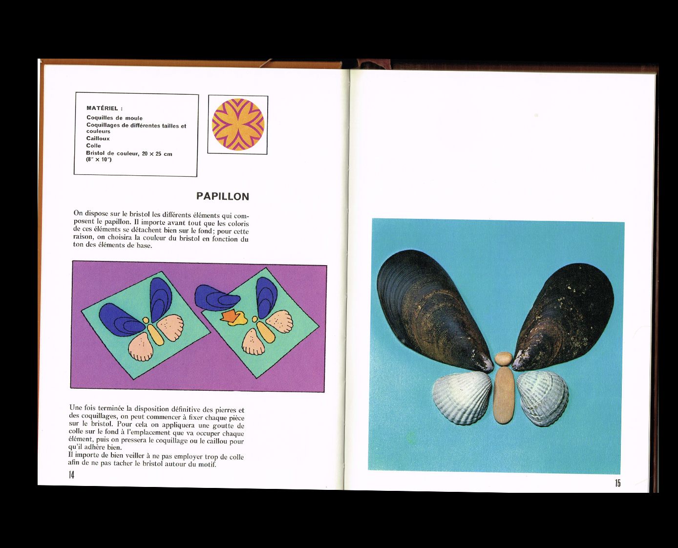
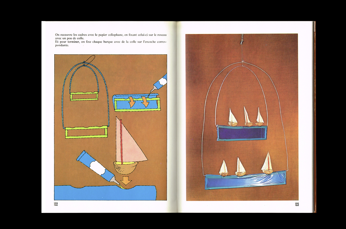
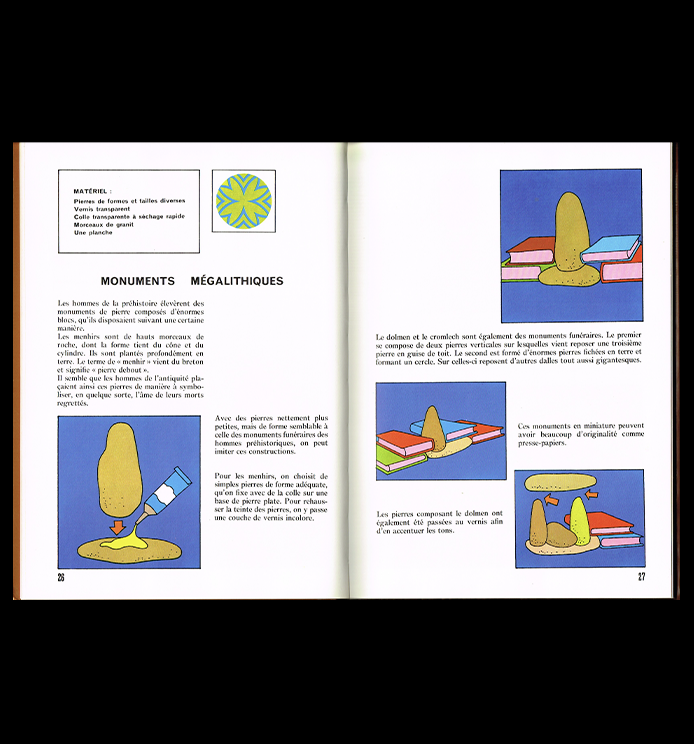
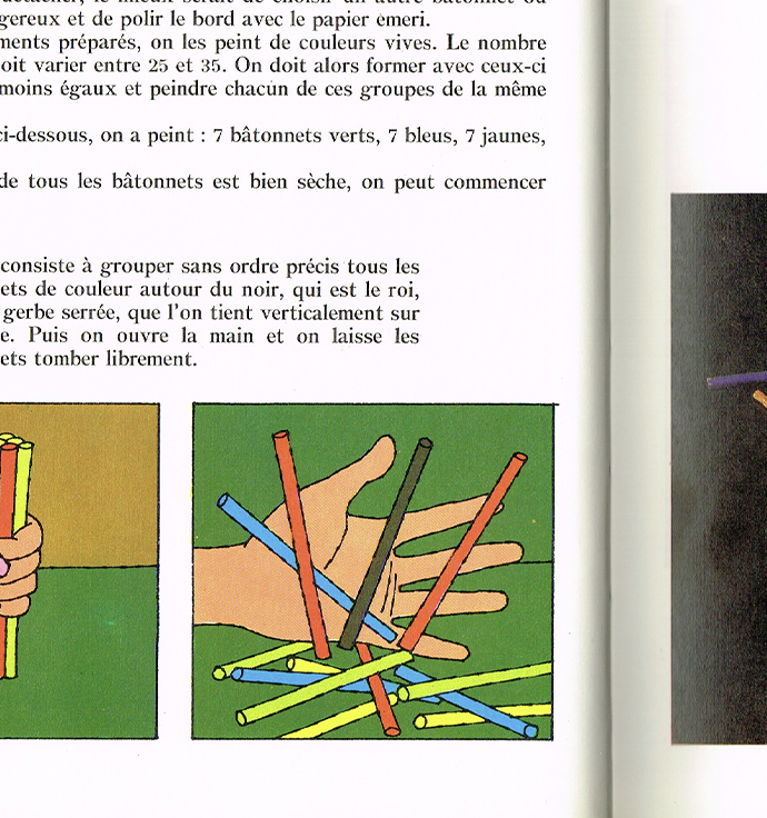
This book is so playful and inspiring! It's all about making little crafts using things found in nature, but what really caught my attention is how beautifully everything is presented. I'm completely in love with the illustrations showing each step of the process. The colour palette is just gorgeous, and the way everything is illustrated makes even the simplest little projects feel so special.
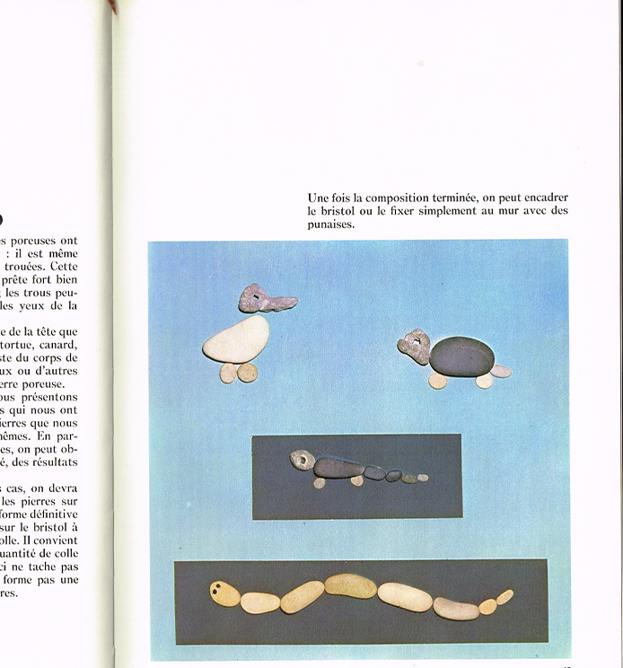
And the art direction of the photography is AMAZING! These are nature crafts, but somehow the photographs feel like a beauty editorial, with carefully chosen backgrounds and beautiful compositions showcasing each creation. I just love the contrast between the handmade projects and the polished photography.
The combination of illustrations and photographs makes this book such a lovely object. And now, of course, all I want to do is go outside, collect little things from nature, and start crafting!
We Came In Peace
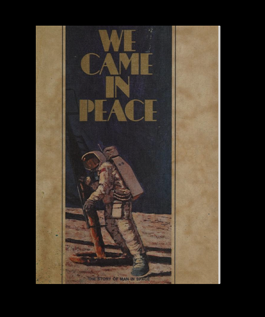
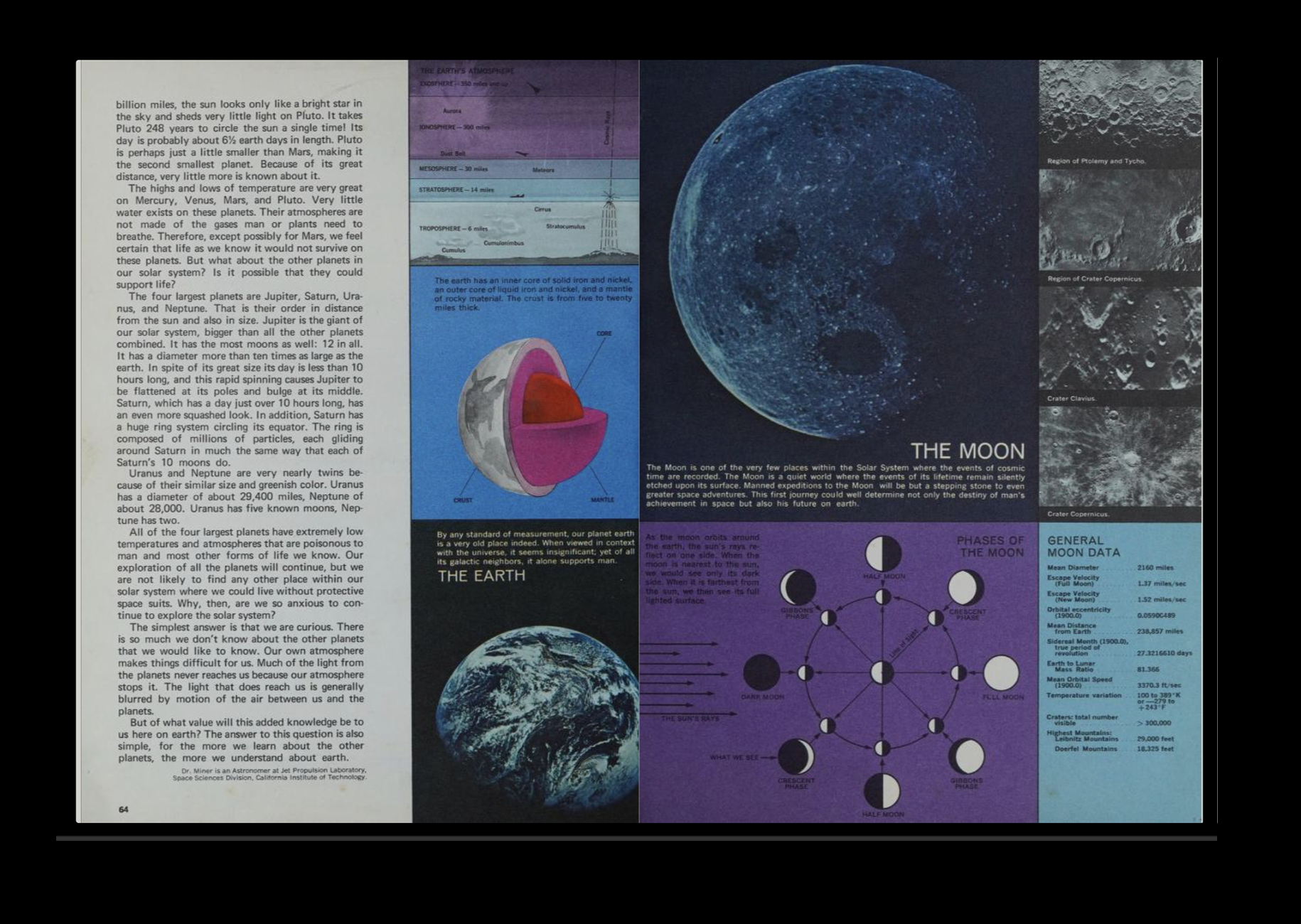
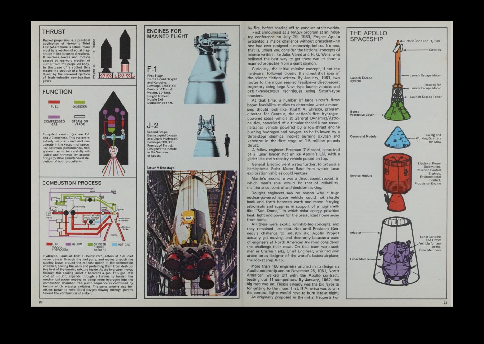
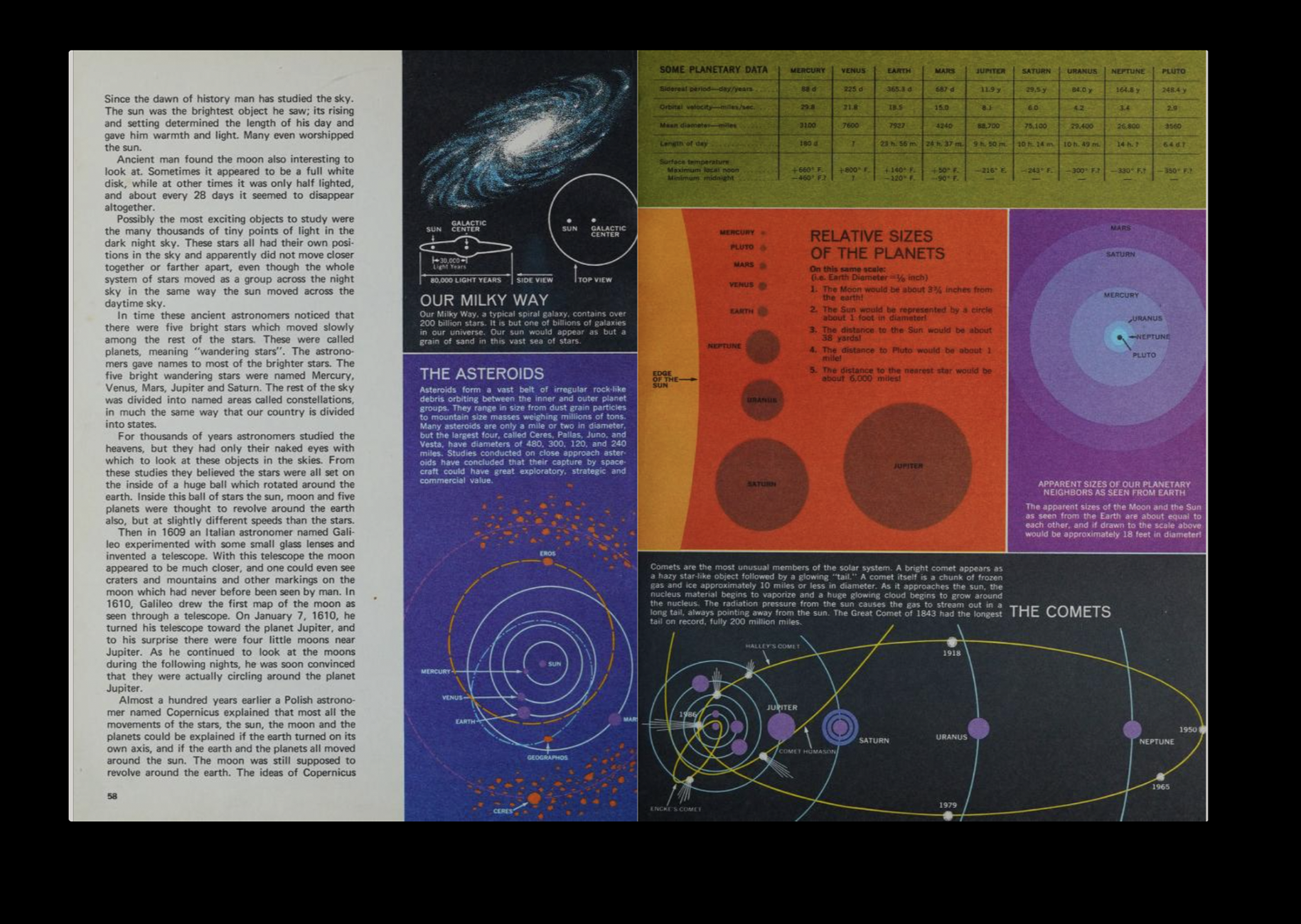
As a designer, I've always been drawn to infographics, diagrams, and all kinds of visual information. And that's exactly what caught my attention in this book about space! I love how it's filled with all these little diagrams explaining everything from rockets to different objects found in space. There's something so satisfying about seeing complex information translated into simple visuals that are both beautiful and fun to explore.
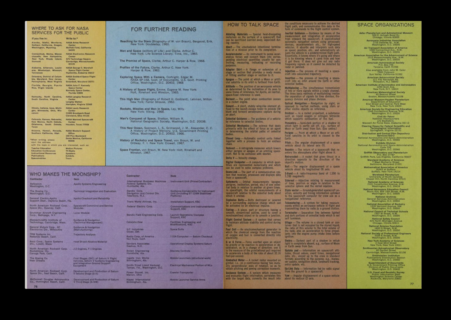
I also love the use of colour throughout the book. All these different coloured blocks create such dynamic compositions, making you want to stop and read every little piece of information. It's a really playful way of organizing content without making it feel too overwhelming.
And of course, the space imagery! I'm always a sucker for beautiful photographs of the sky and everything beyond our planet. There's something about space that feels so fascinating and universal, something I think we can all connect with in one way or anothe
Always On My Mind
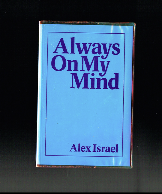
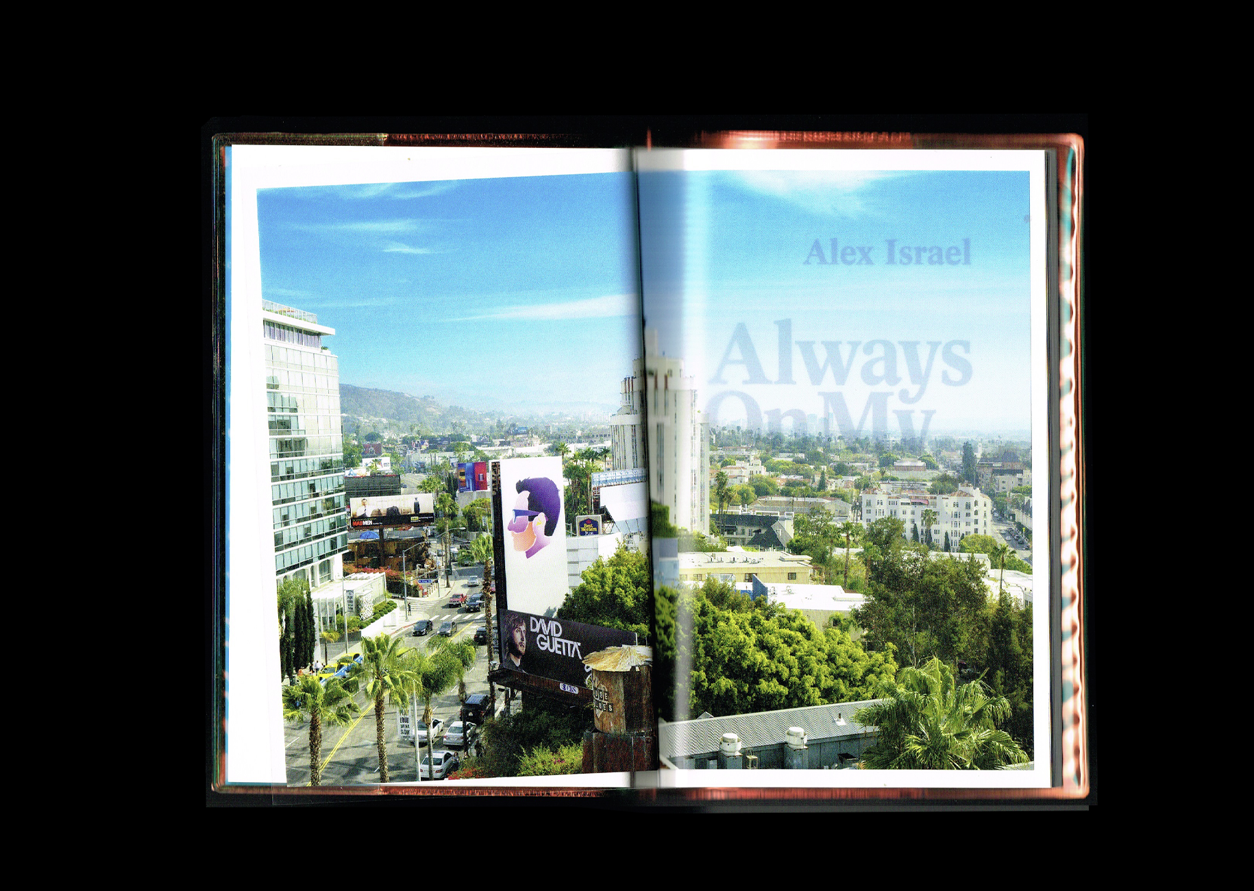
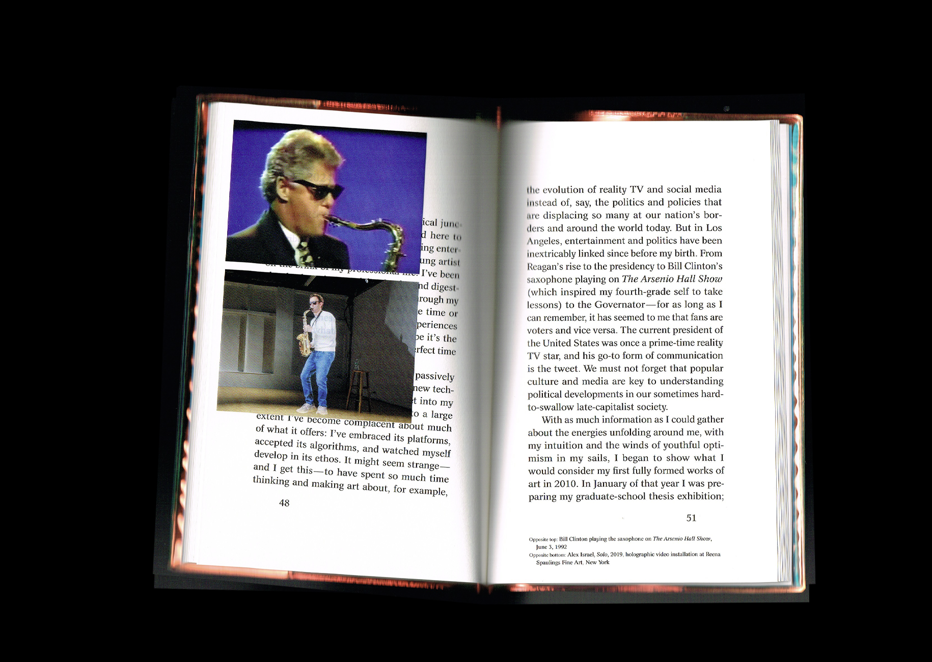
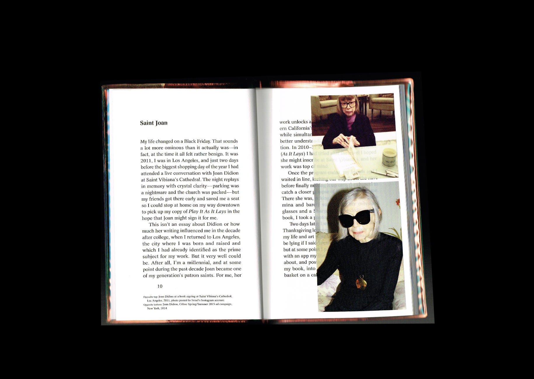
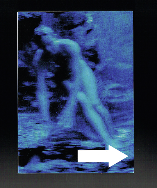
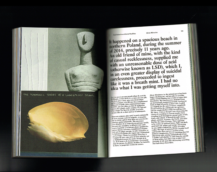
I found this little book at one of my favourite bookstores in NYC, Mast Books! I was immediately drawn to its holographic plastic cover and the title, Always on My Mind. From what I understood while flipping through it, the book feels almost like a personal blog, collecting thoughts and things that were going through the artist's mind during the pandemic.
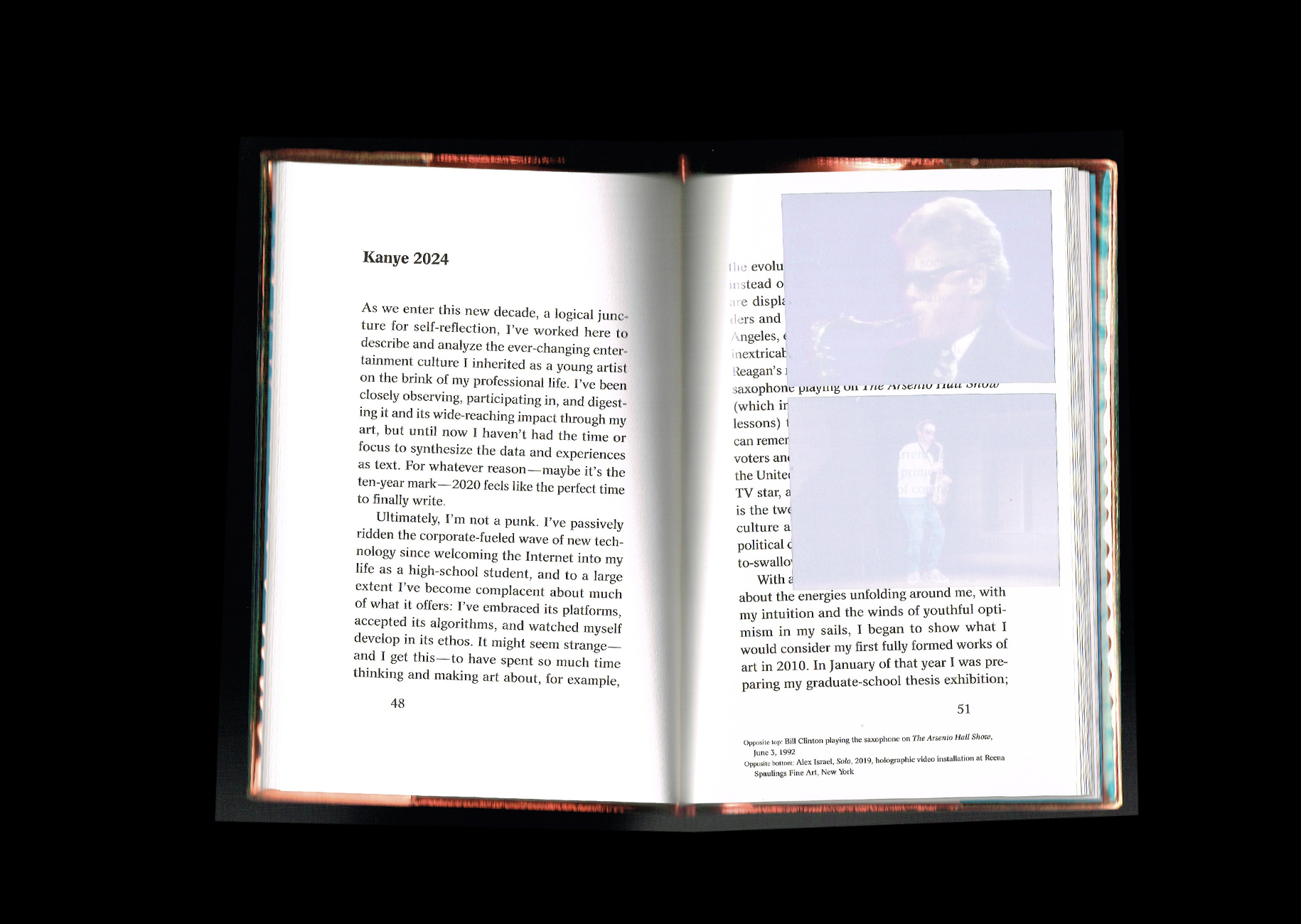
The texts are presented almost like a novel, but what makes this book so clever is the graphic treatment. All the images are printed on transparent acetate sheets, creating this beautiful effect where the images feel both present and disappearing at the same time. They leave these little ghost-like traces on the pages underneath, which I find such a smart and poetic way of playing with images and memory.
Acid Magazine!
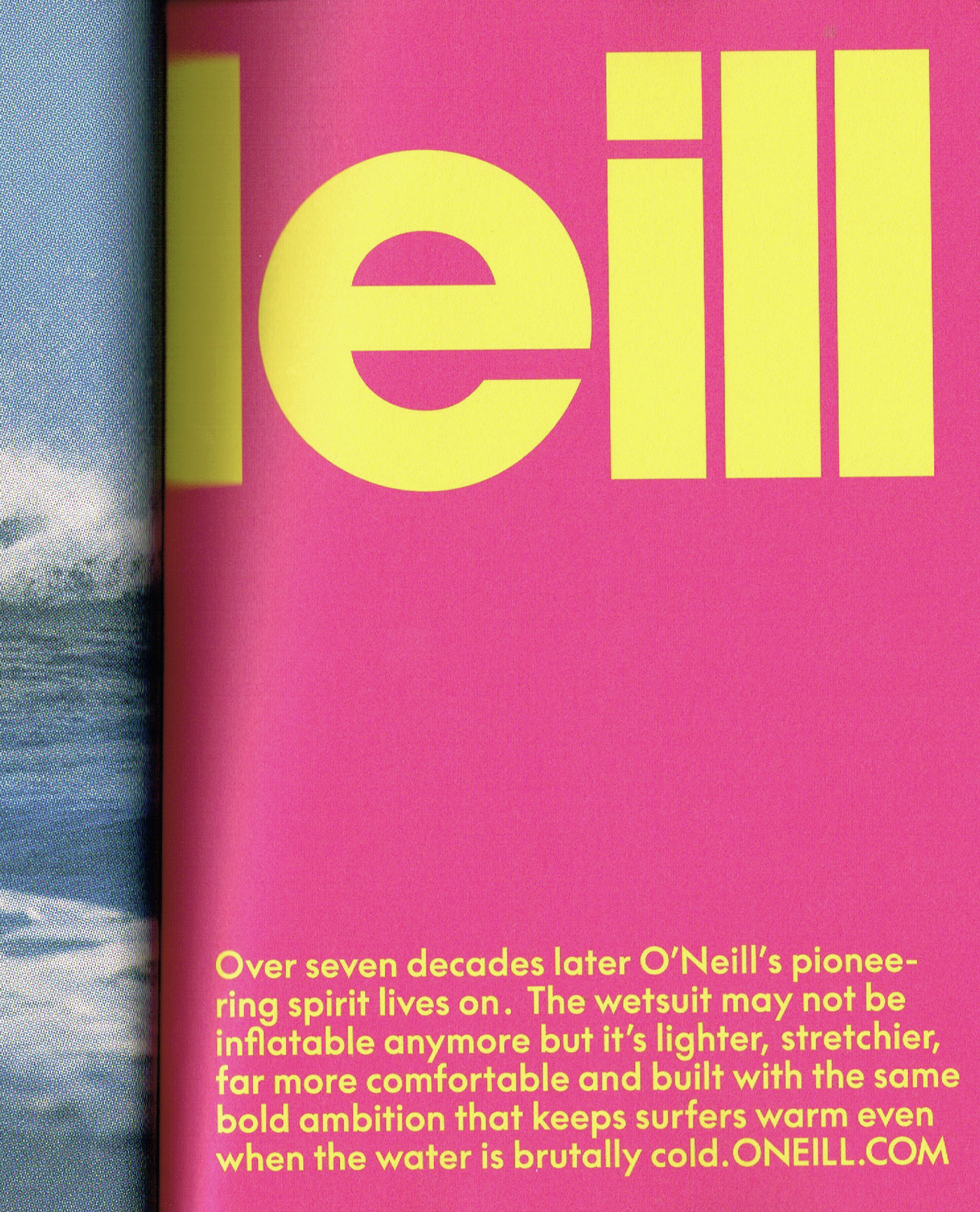
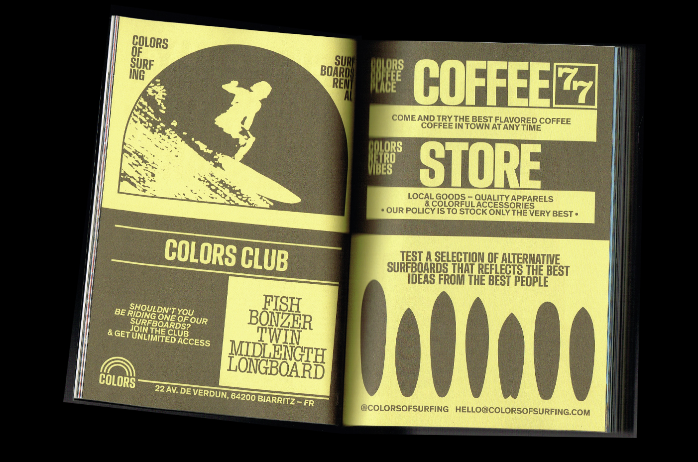
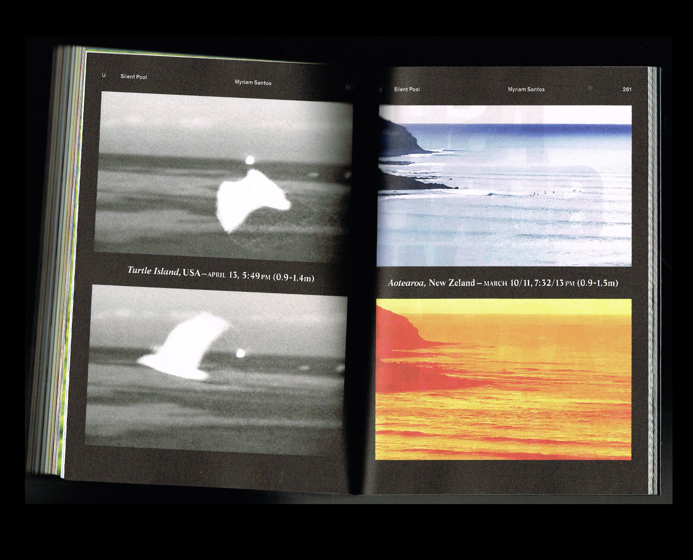
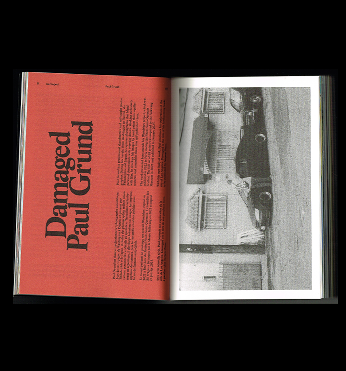
I'm definitely not a surfer, but I was immediately drawn to this magazine! What really caught my attention was the typography. Every single spread is so beautifully composed, with timeless typefaces and layouts that just work perfectly together. It's also a pretty substantial magazine, with around 250 pages, which is quite impressive! I honestly had such a hard time choosing which spreads to share because they're all so interesting.
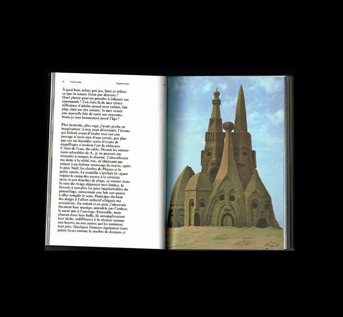
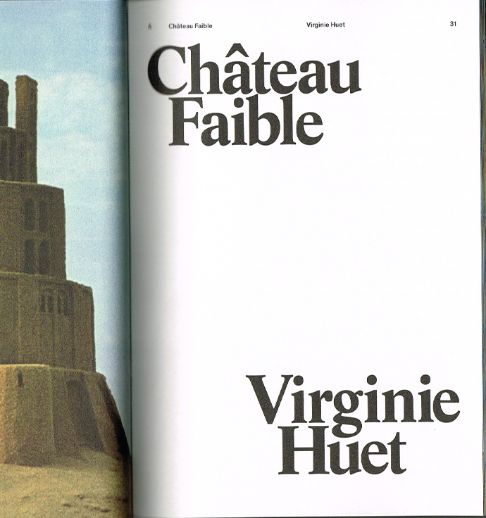
The photography is just as beautiful. One of my favourite features is actually about sandcastles! I love how the magazine explores not only surfing itself, but also all the little things connected to the culture and environment surrounding it.
The colours, the matte paper, the photography, and especially the typography all come together so beautifully. It's just such a well-designed magazine, from beginning to end.
Bronzes
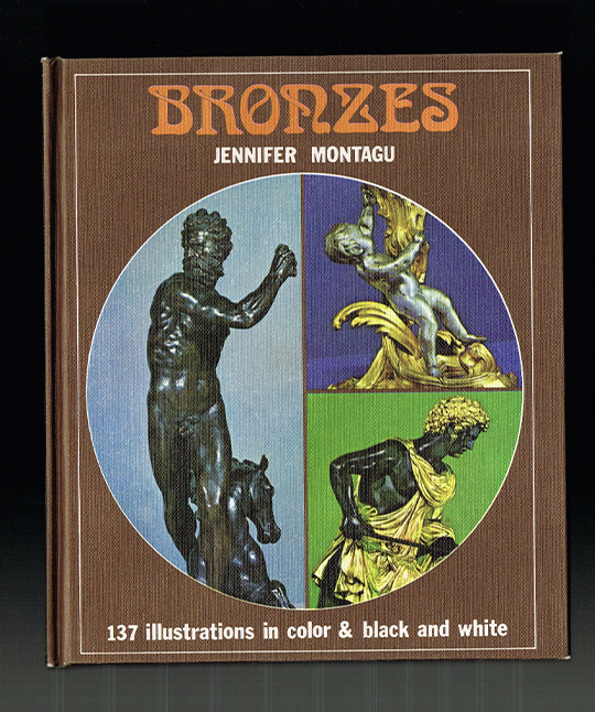
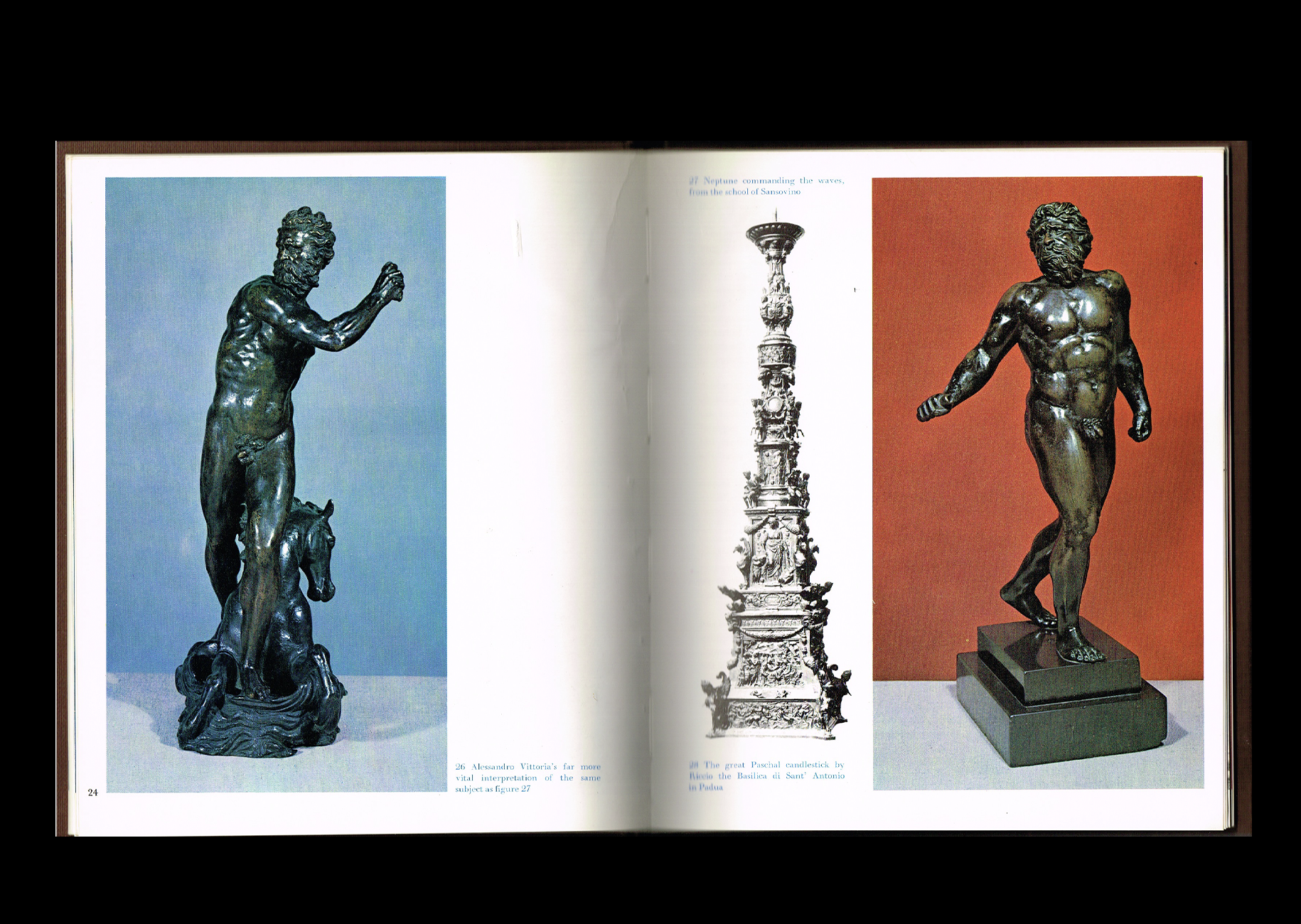
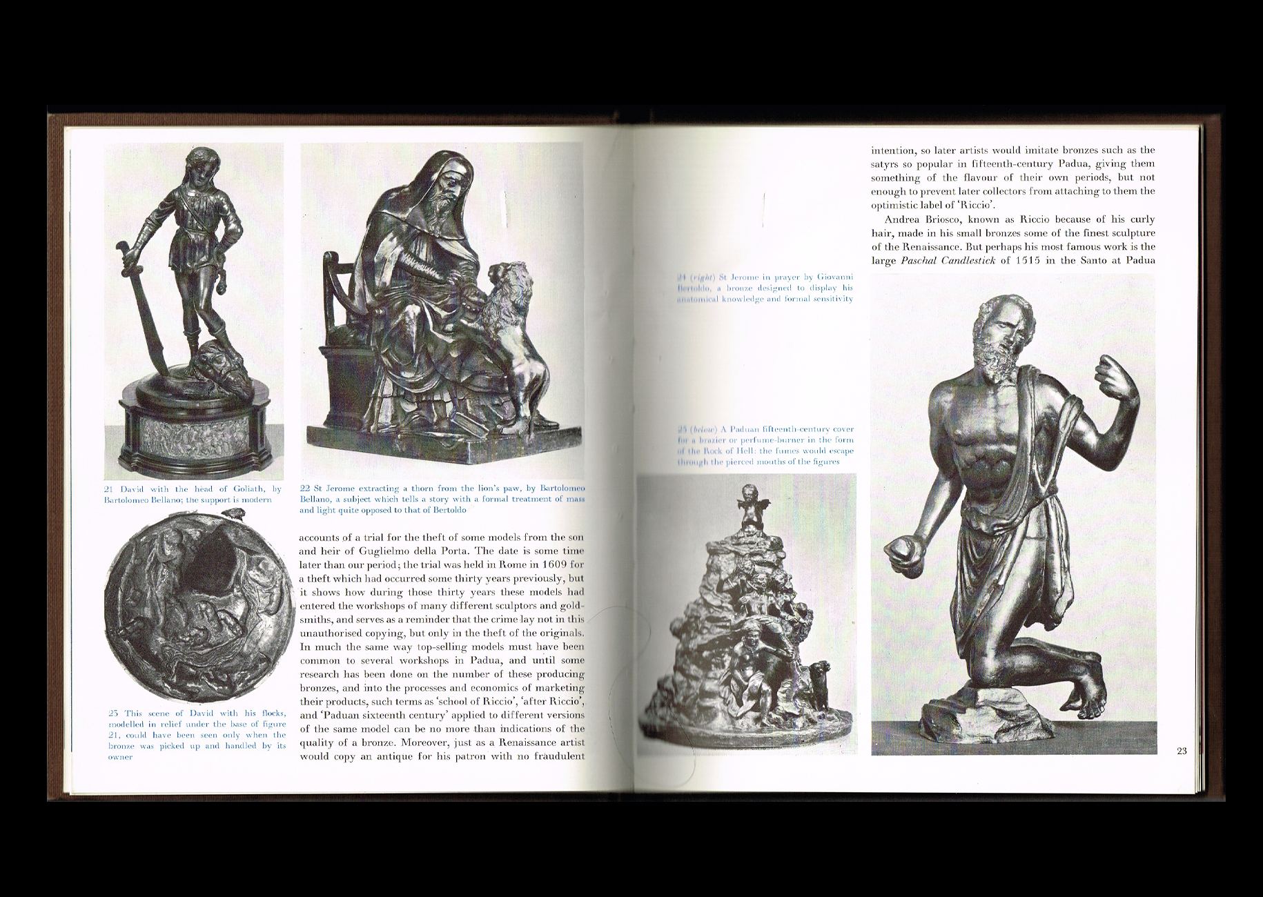
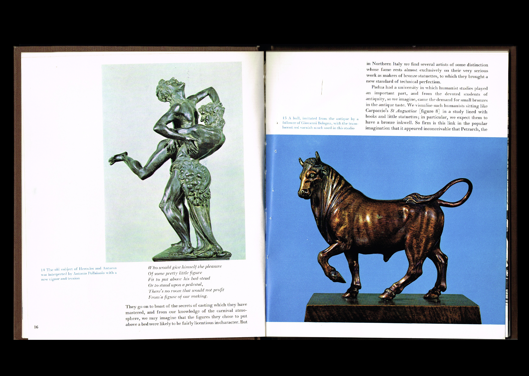
This one is a bit random, but I like it. It's a book about bronze sculptures, which, to be honest, aren't necessarily my favourite things to look at. But that's exactly what I find so interesting about this book! It's a perfect example of how good graphic design can make a subject you're not particularly interested in feel completely fascinating.
I'm obsessed with the layouts! Some of the sculptures are cut out and presented in black and white, while others are surrounded by these beautiful blocks of colour that almost feel like architectural pillars, echoing the shapes of the sculptures themselves. It's such a smart way of playing with composition, and I love how every spread feels different, with unexpected backgrounds and rich colour combinations.
But I think what really makes this book special is the printing. There's something almost magical about the colours in older printed books. I don't know exactly how they achieved these tones back then, but there's a certain depth and richness to the ink that I feel is harder to find in contemporary printing. The colours have this beautiful quality that makes every page feel like a little piece of art.
=
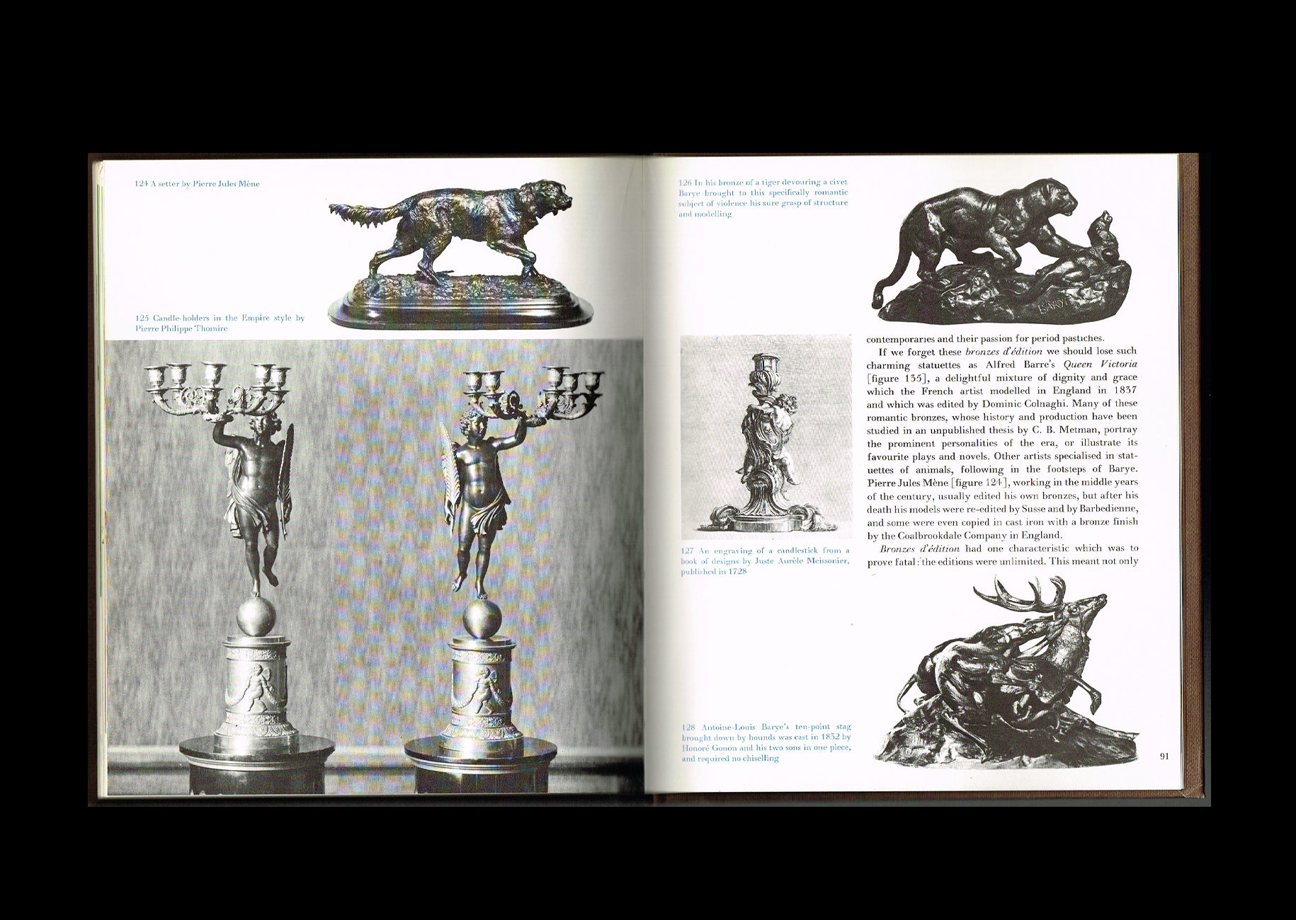
I’m Serious, I’m Friendly, I’m Funny.
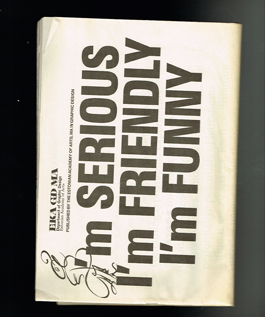
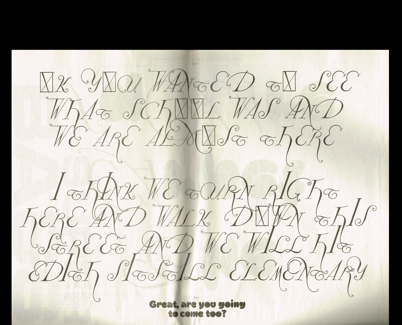
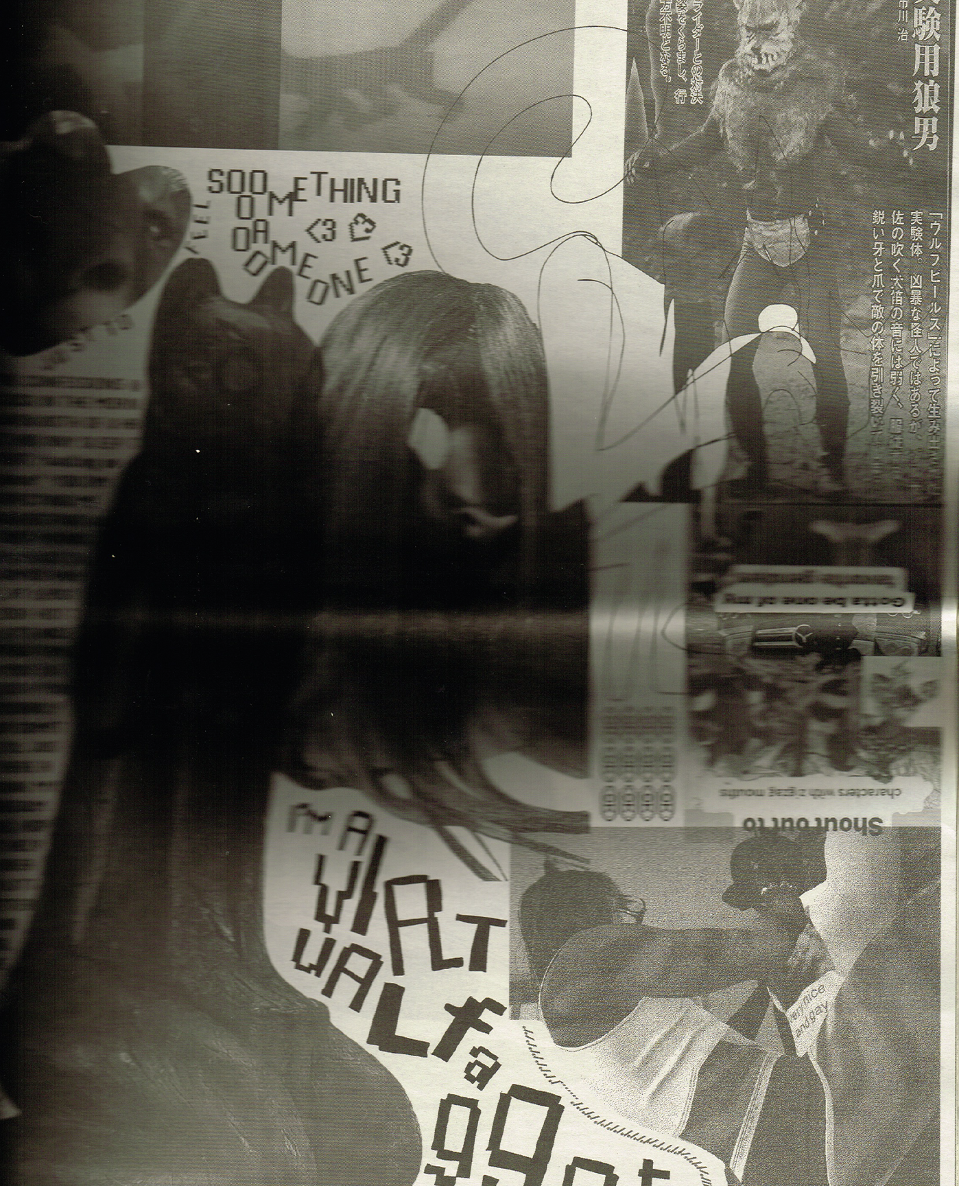
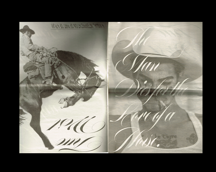
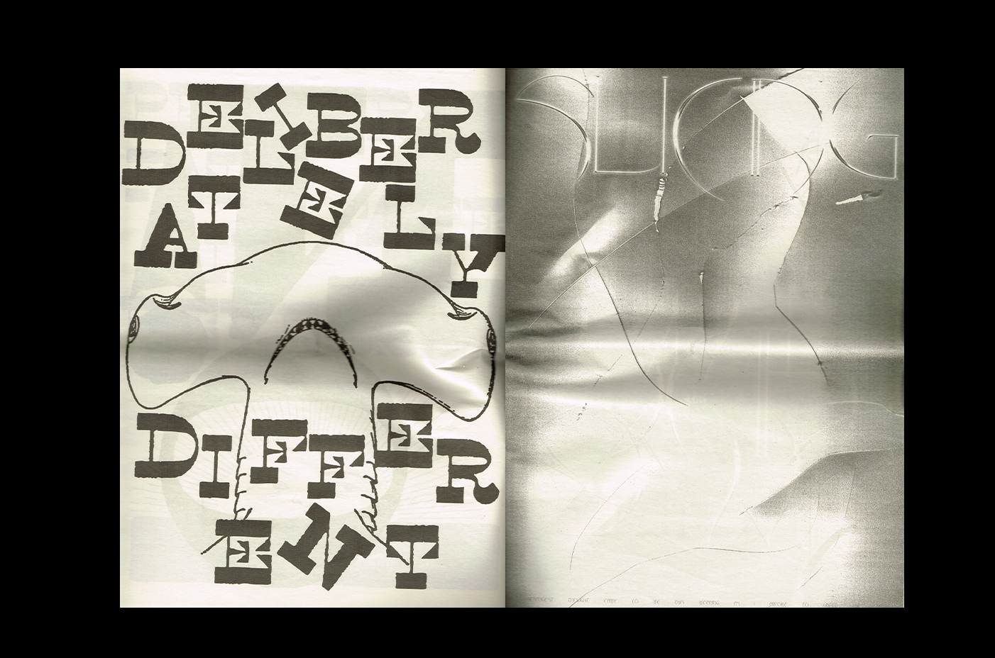
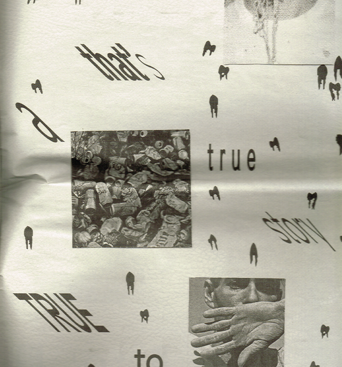
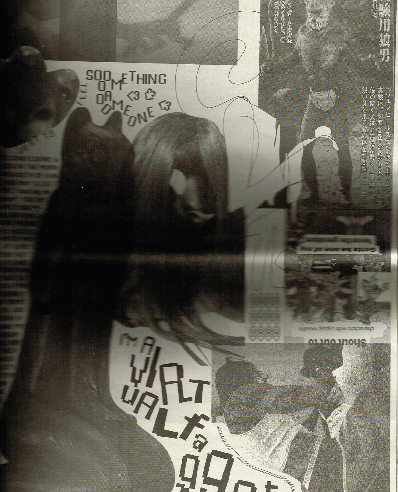
I love this oversized newspaper, almost 18 × 24 inches when opened, which makes every spread feel like a poster. From what I understand, it's a typography project created by students, with each page exploring a different typeface through visuals that complement its personality.
Everything is in black and white, but it's pretty amazing to see how differently each typeface can be expressed. I love how something as simple as typography can become so visually interesting, especially at this scale. It almost feels like a collection of posters rather than a newspaper with fun collage.
And can we talk about the cover? It has absolutely nothing to do with what's inside, haha, but I kind of love it anyway!
LIFE! Magazine
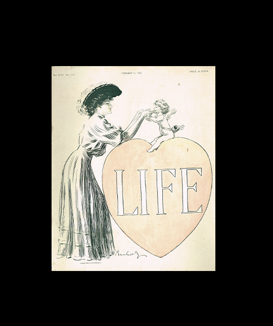
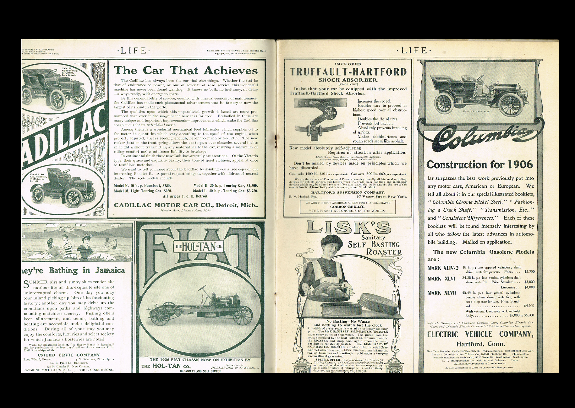
This tiny little magazine is such a lovely find! It's an old issue of LIFE, I believe from the 1900s, that I discovered in the cutest little secondhand bookshop, which is actually someone's house turned into a bookstore! I was immediately drawn to the cover, which I find absolutely adorable.
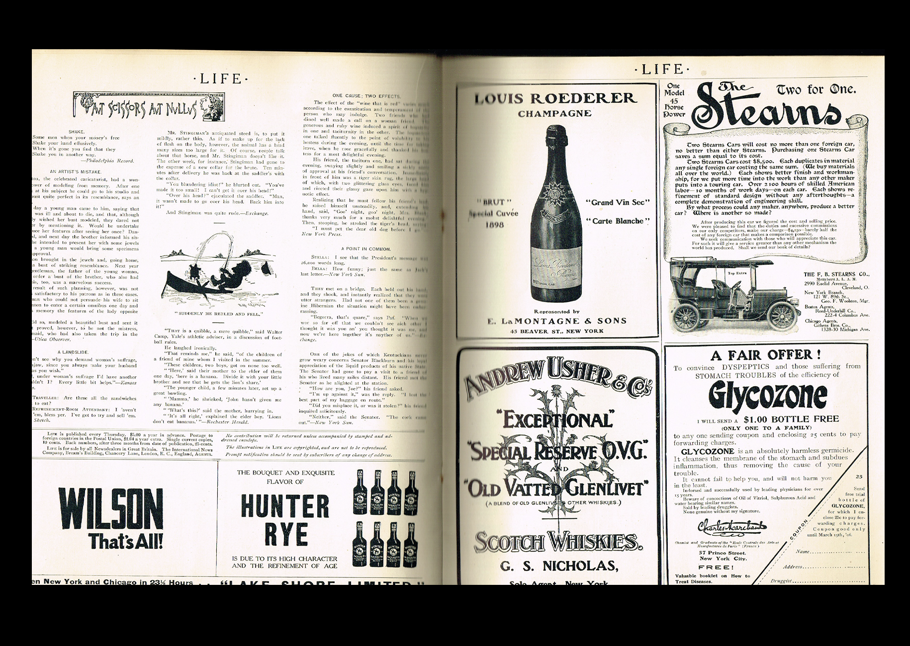
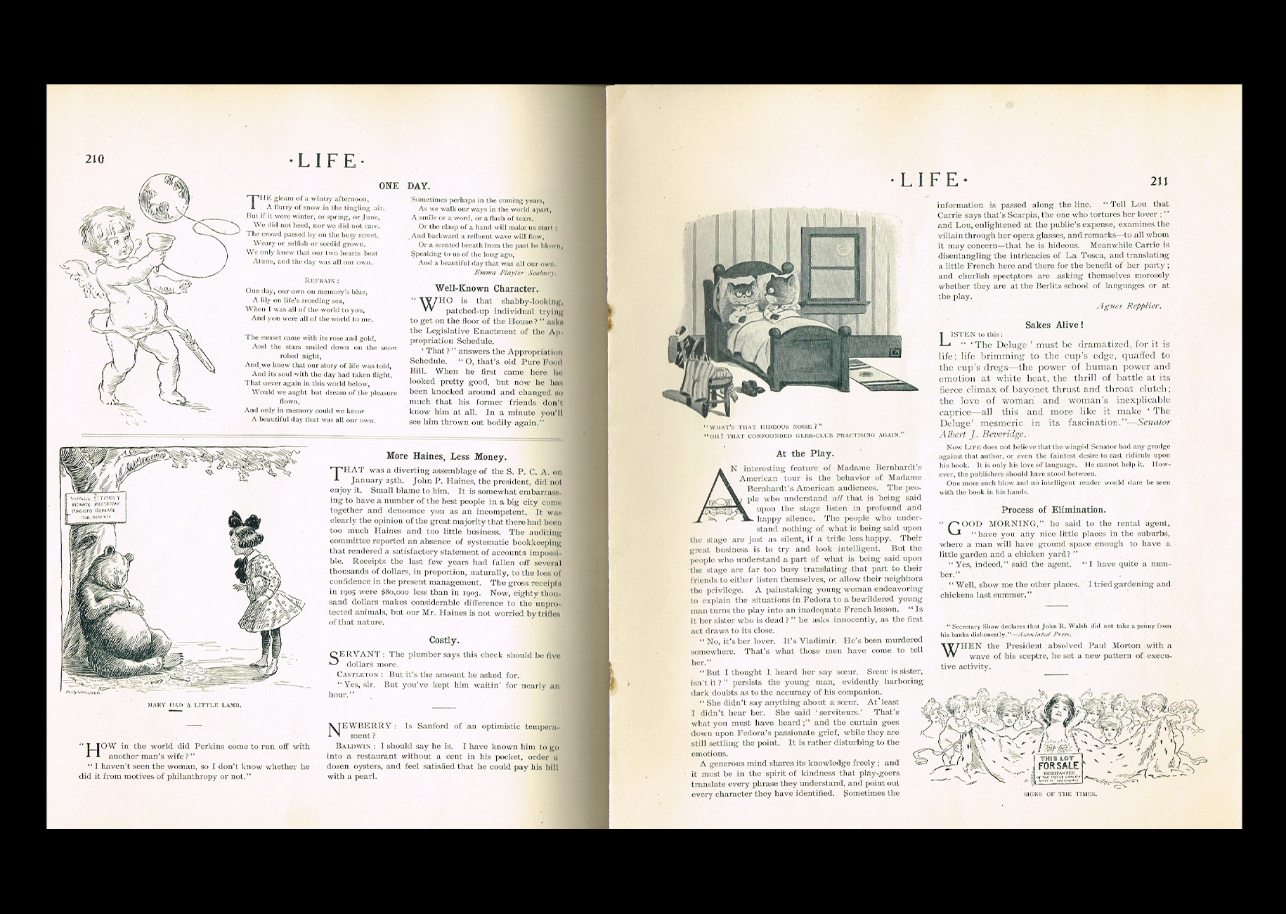
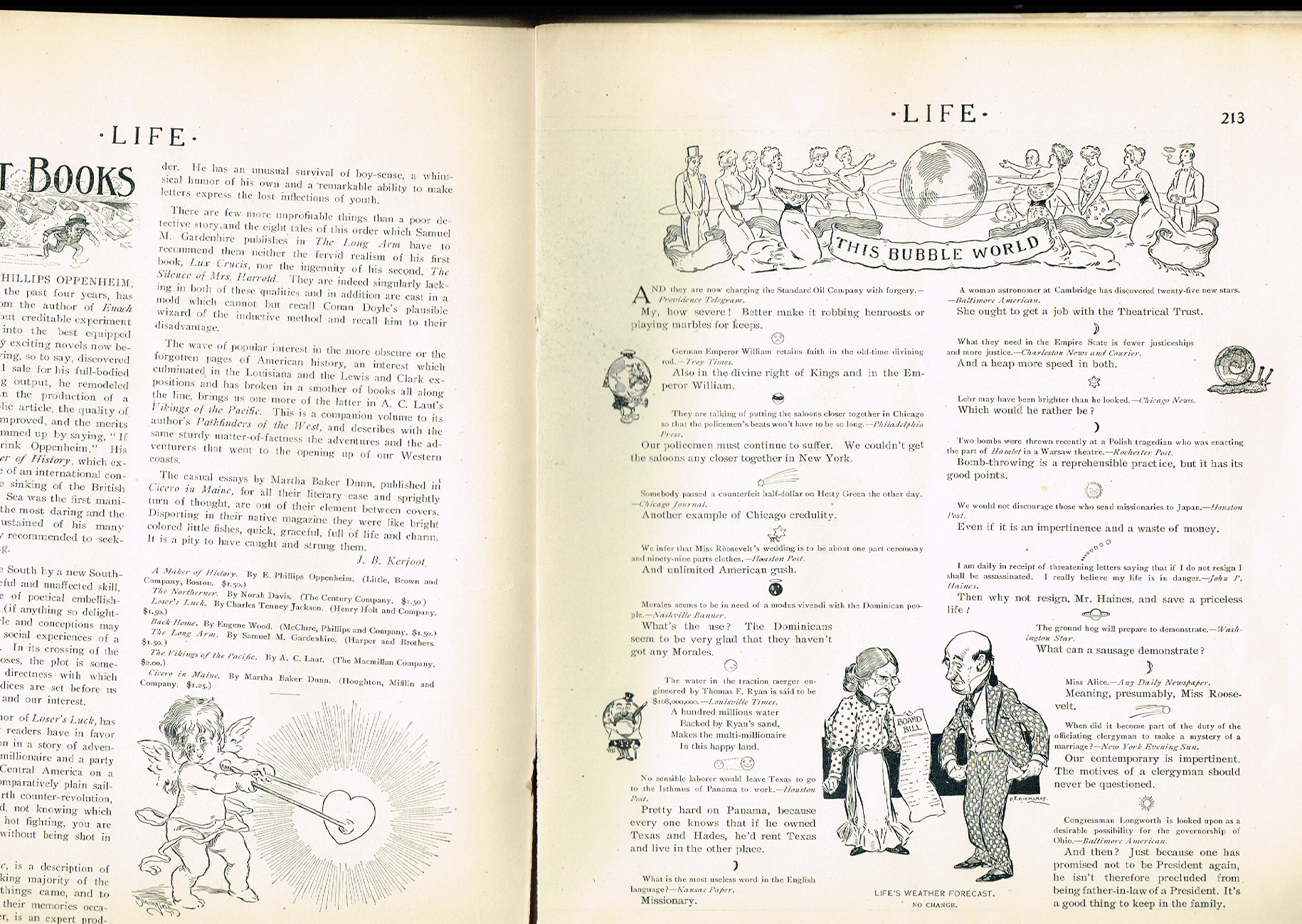
Inside, there are so many charming little illustrations and engravings that are just a pleasure to look at. But one of my favourite things about old magazines is always the advertisements! I love looking at vintage ads, especially all the beautiful custom lettering and typography used for the different brands and products. Each one has its own little personality, and there's something so satisfying about seeing how much attention was given to these details.
I don't know what it is about old advertisements, but I always find them so fun and inspiring to look at.
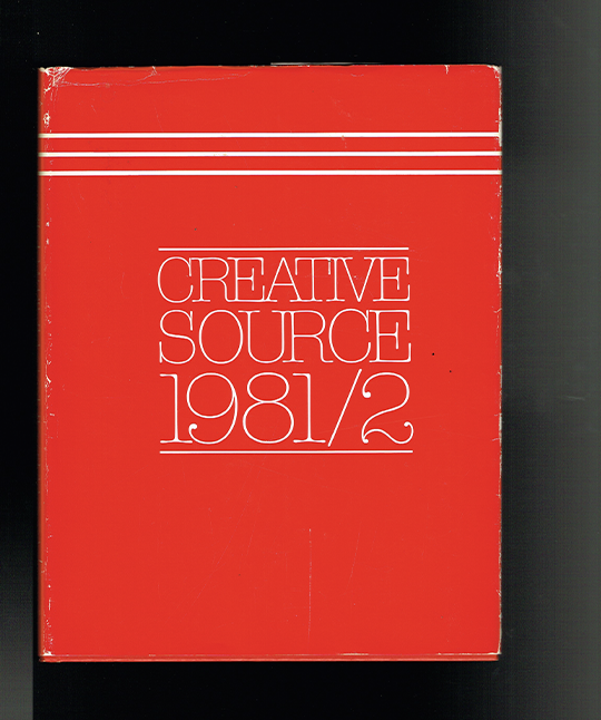
Creative Source 1981/2
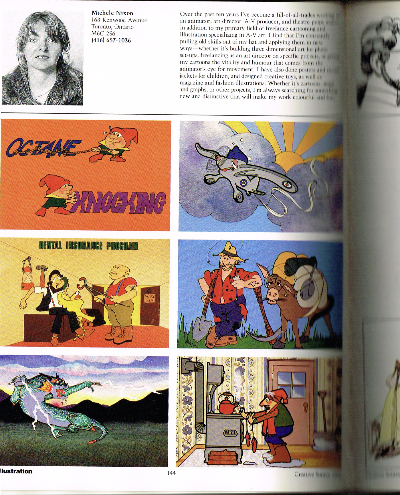
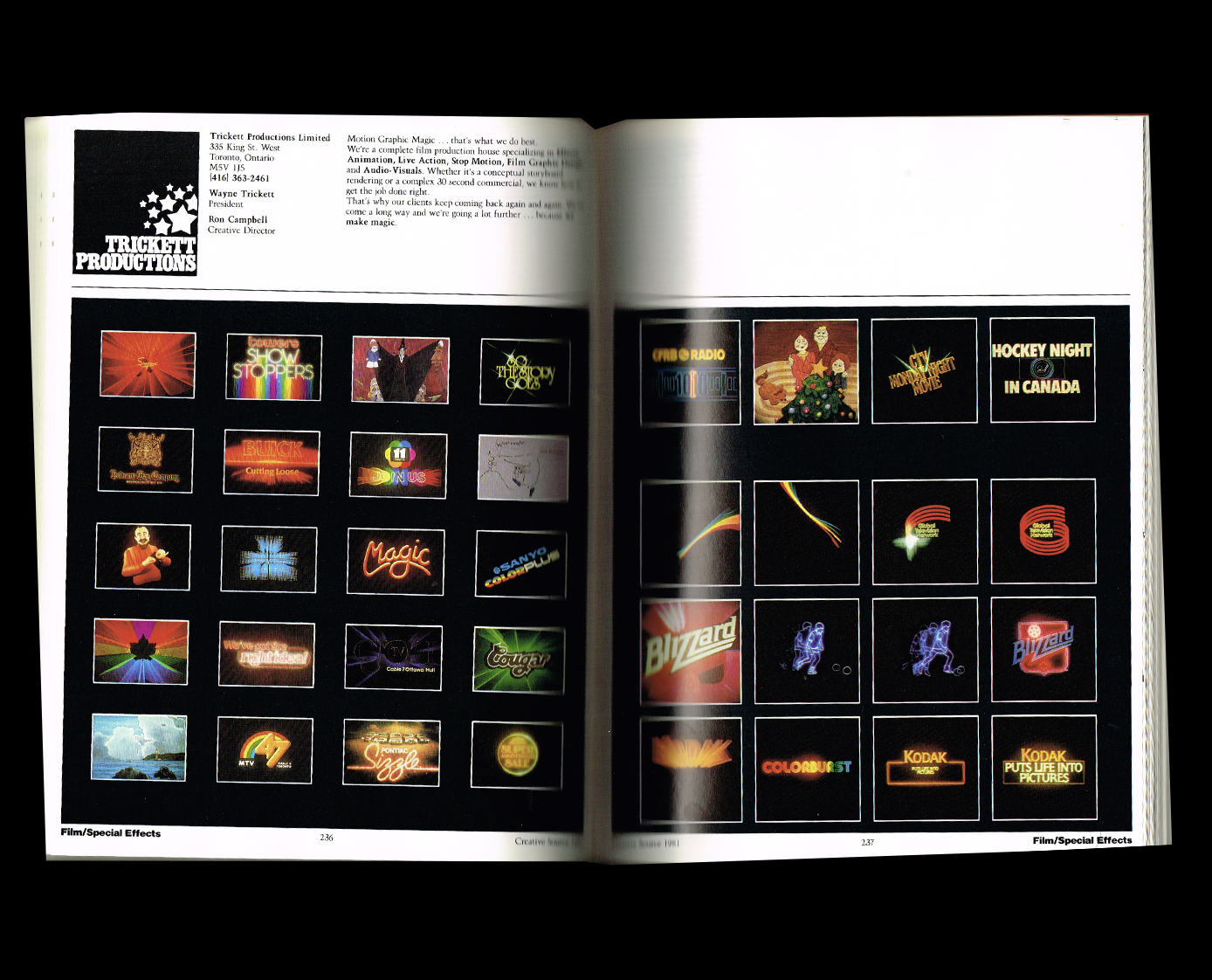
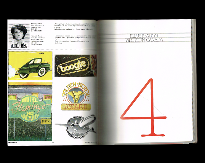
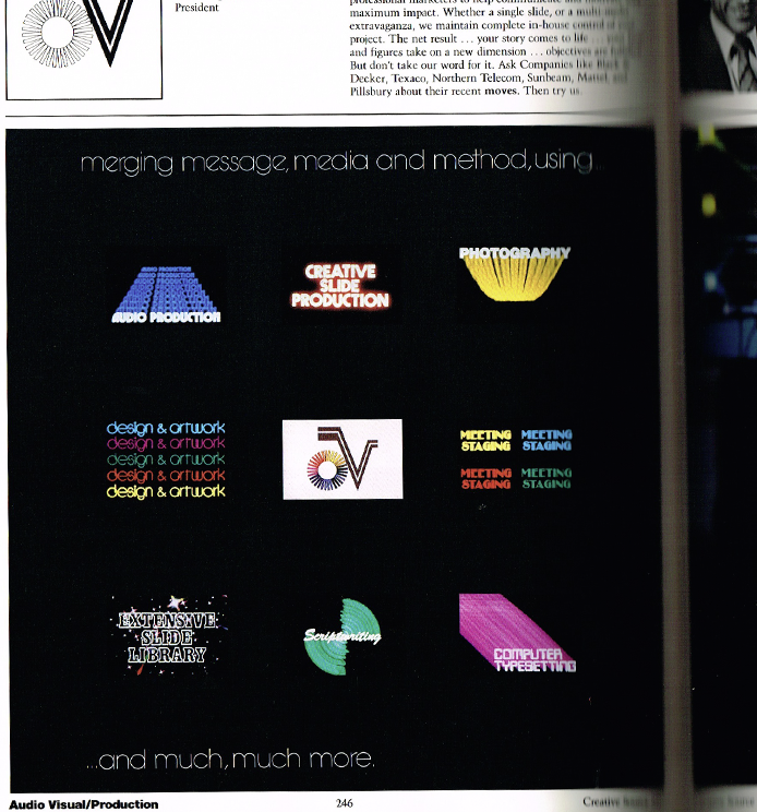
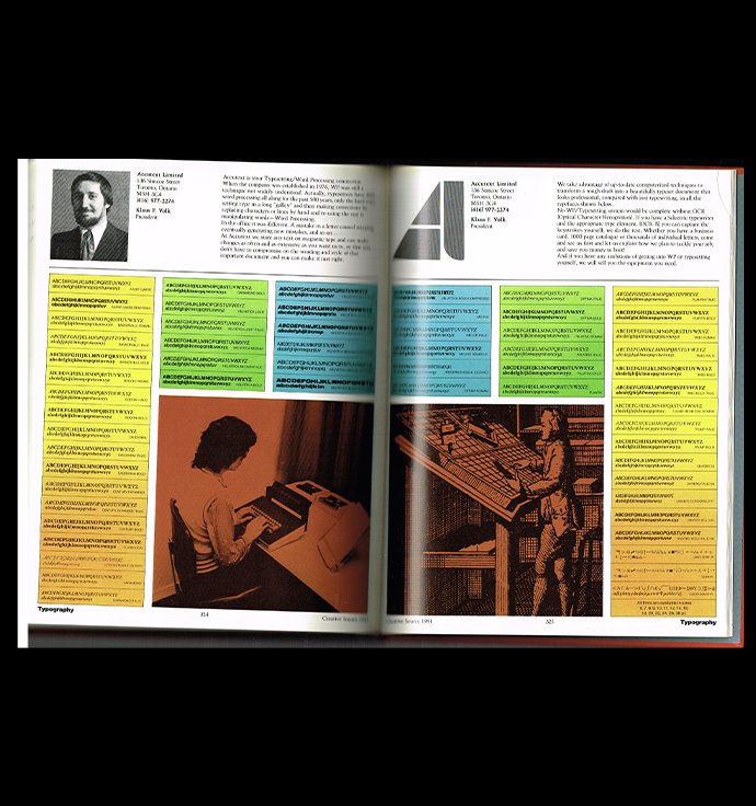
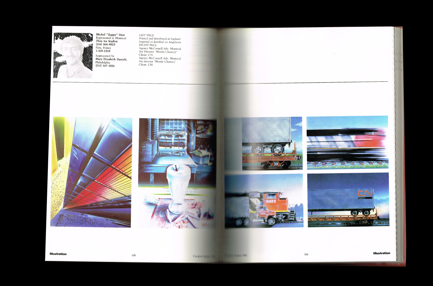
I love diving into old design books, and this big red book from the 1980s is such a good one! There's something so fascinating about going back in time and seeing what was happening in the design world back then. It's also crazy to realize how cyclical design really is. So many of the styles and visual references from that era are making their way back into contemporary design!
What I love most about this book is that it's basically 500 pages of vintage inspiration. So much to look at and discover! I'm especially drawn to the illustrations, which feel so refreshing to see today. There's something really inspiring about revisiting these older visual styles and realizing how relevant they still feel.