April: Collecting

Collecting

For April’s Bobbilibris curation, I felt drawn to something a little meta, exploring the idea of collecting, which felt especially meaningful for the anniversary.

I’ve always been a collector at heart. Books, of course, but also ceramics, curious objects, mugs… There’s something deeply beautiful about slowly building a personal universe through the things we choose to keep close.

This curation brings together different forms of collections, including books that are themselves born from acts of collecting. You’ll find works from OKBOOKS and PHARMACY BOOKS (two of my longtime favorites), alongside other explorations, from glass archives to furniture, and even encyclopedic collections to get lost in.

So many worlds, gathered. Waiting to be discovered.


Glass CandleStick Depression Era

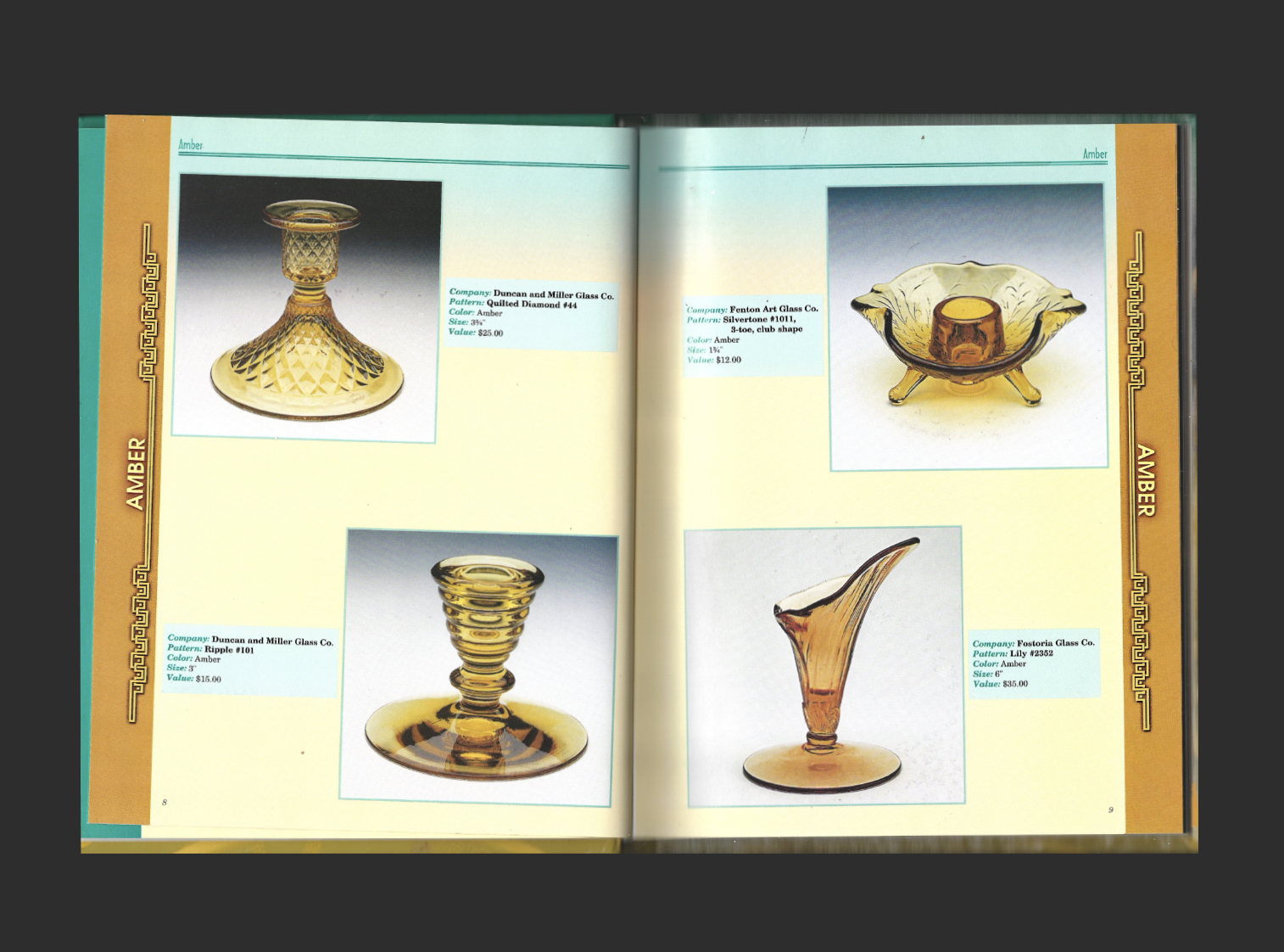
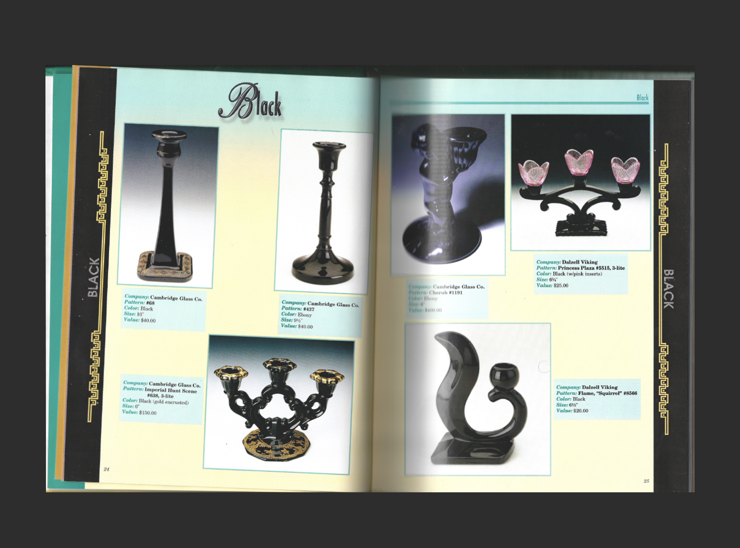
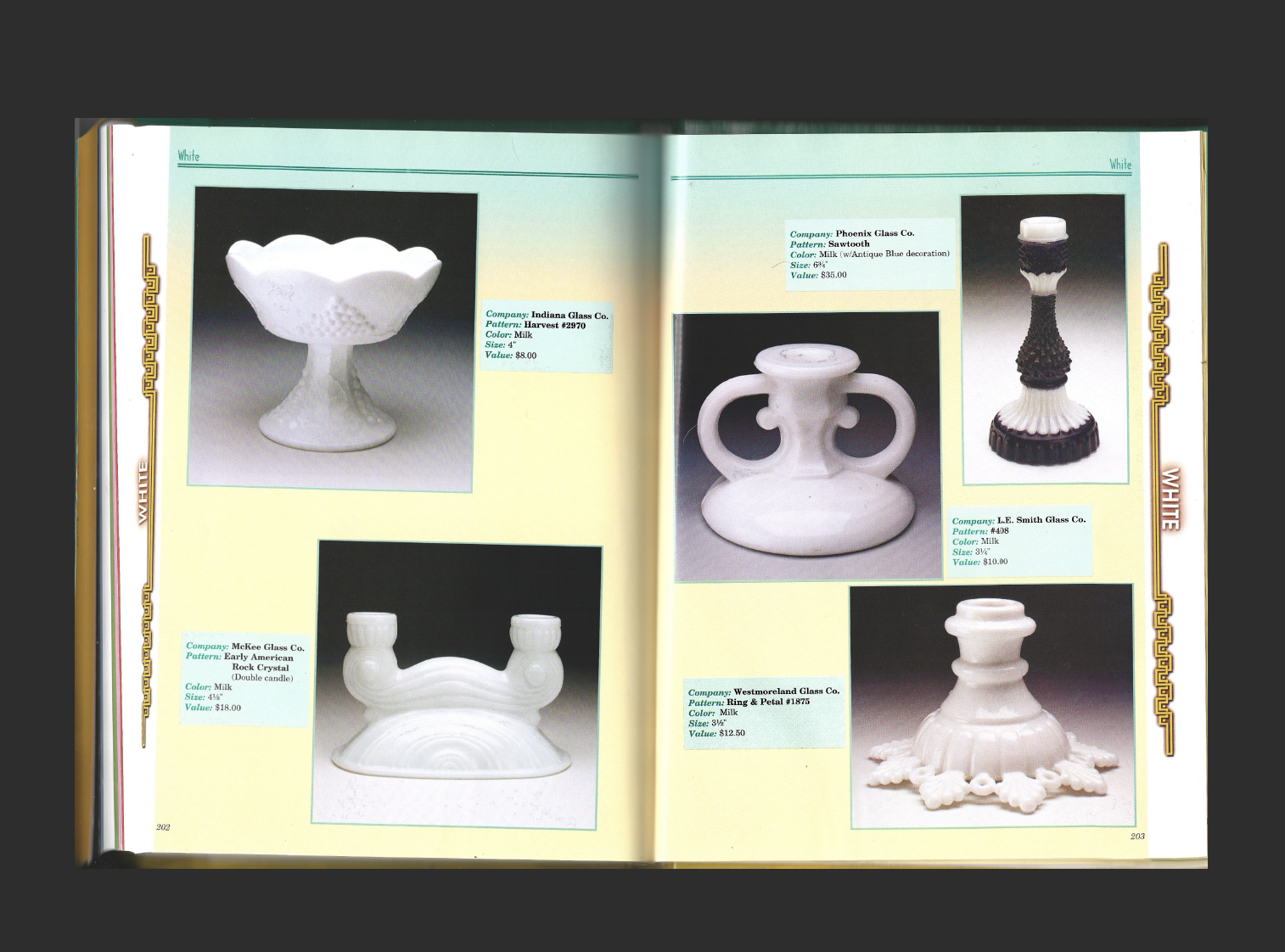
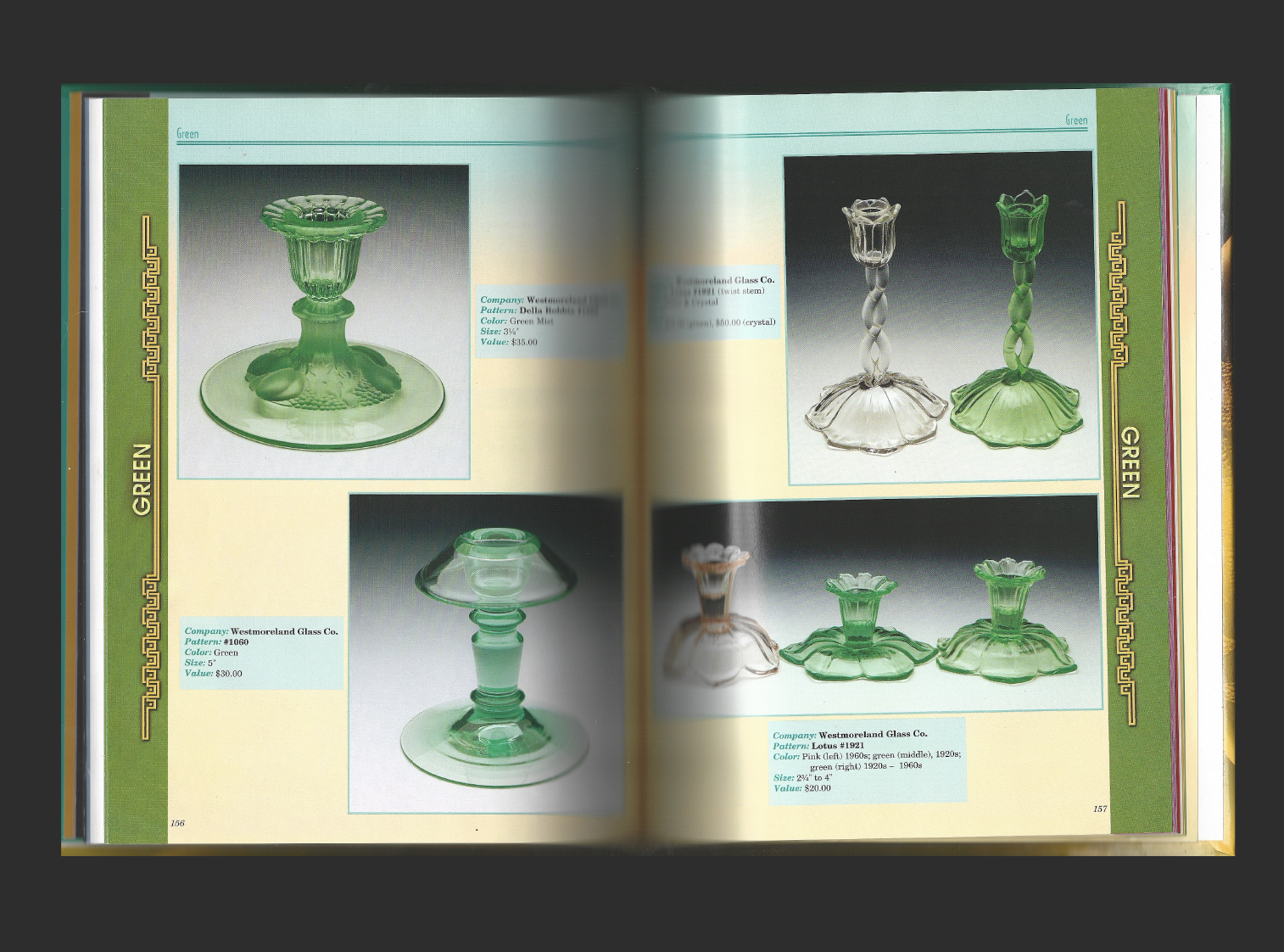
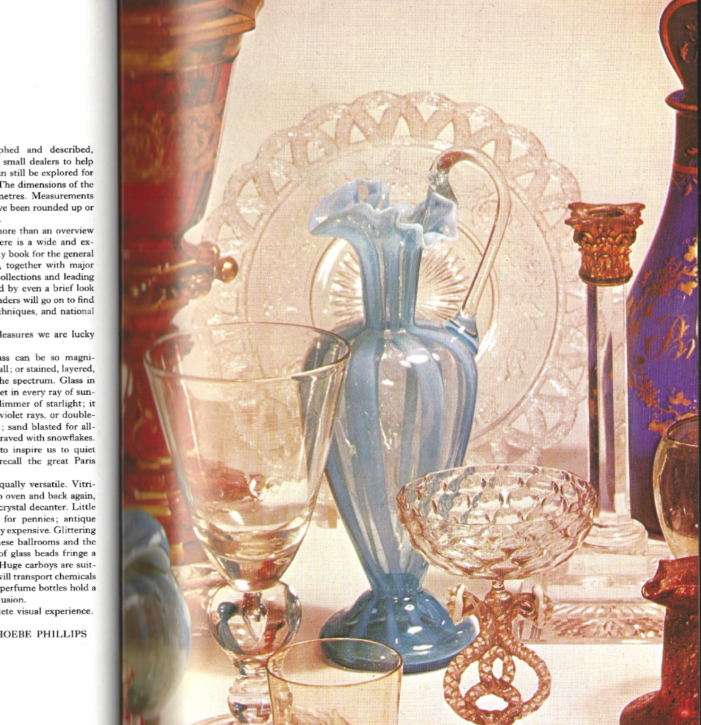
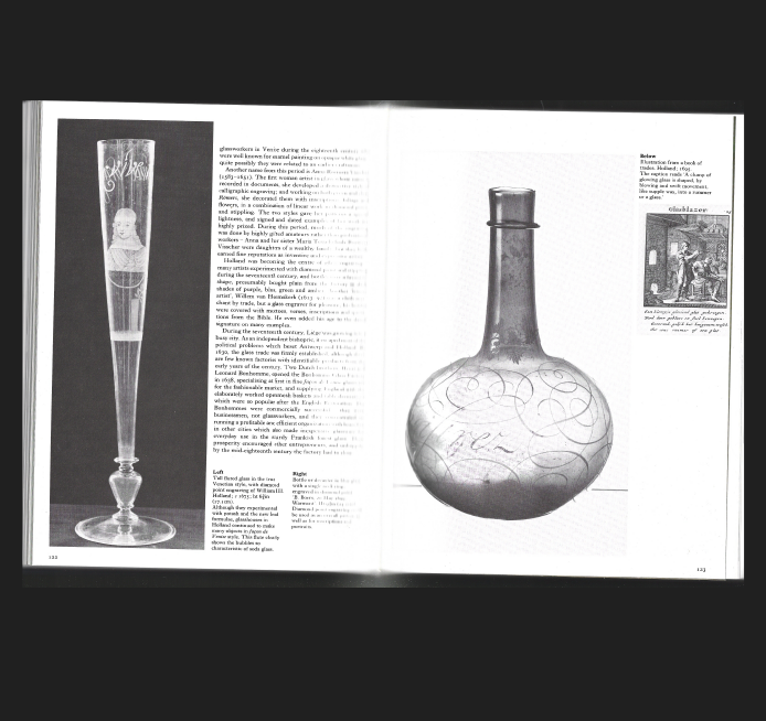
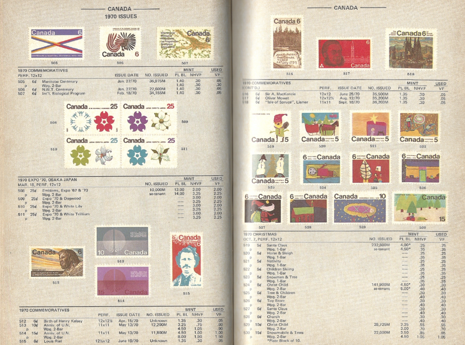
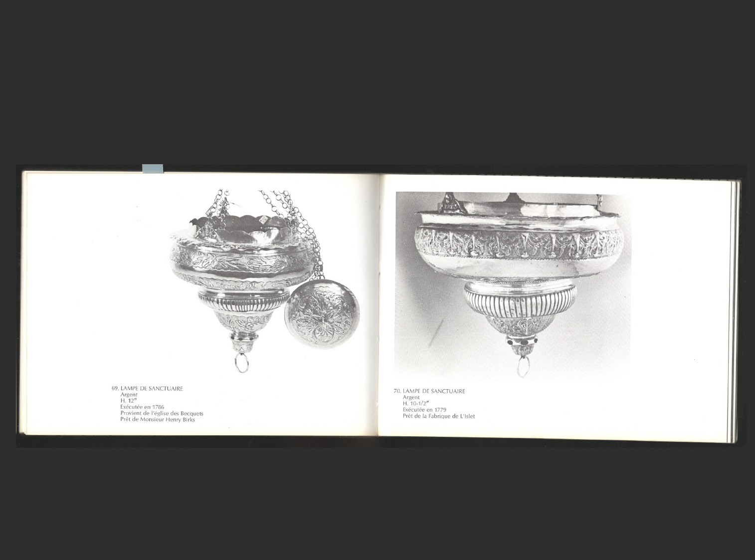
I’m still torn between finding this book beautiful or ugly, but what immediately drew me in was the imagery itself. The glasses are photographed with a striking elegance, placed against grayscale gradient backgrounds that give them a very chic presence. Each image seems to exist within its own grayscale atmosphere, as if the tonal shifts in the background are carefully tuned to each glass piece.

I also love the variety within each collection. Every object feels unique, almost sculptural, with its own personality. The way everything is organized through a simple color-coding system adds a quiet logic that makes the whole thing feel effortless to navigate.

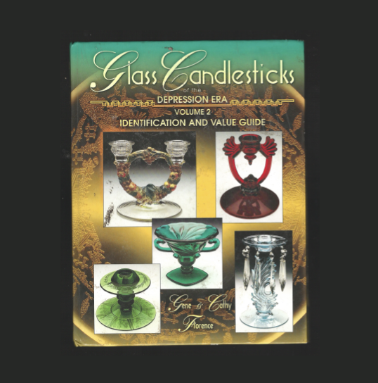
Even the cover stands out. Unexpected, slightly unusual, but undeniably charming.

What makes me hesitate, however, are the blue and yellow background pages for each collection. They feel less intentional to me, almost visually disruptive, and not as resolved as the rest of the visual language, but I choose to include them anyway because there are still many elements within them worth taking inspiration from.


Encyclopdia
of Glass

This book is another collection of glassware, but I didn’t hesitate with this one because every page feels sooo stunning. I really love the art direction and the combinations of glassware they chose to present together, as well as the backgrounds that support them.

The lighting is especially beautiful, revealing the shape and shadows of each object with a lot of sensitivity. Even when the pages are not purely photographic, the book stays compelling. The layouts combining black and white drawings with black and white photographs to explain the pieces, along with text that feels integrated into the visual rhythm and so original. The layouts overall are very well designed and thoughtfully set.


Imported Car Spotter’s Guide

What’s most striking about this book is its sheer scale. At over 400 pages, each one feels like a poster. This old car guide is pure graphic design gold.

The custom numbering, the way each car is positioned on the page, the typography, and the annotations all feel incredibly unique. There’s a richness in the details that makes every spread worth lingering on.

I feel like there’s so much to draw inspiration from on every page. The layouts constantly shift and evolve, yet everything remains cohesive through the use of black and white, which ties the whole book together beautifully.


Encyclopédie
des antiquités du Québec

In the world of collection books, encyclopedias feel like one of the best ways to gather something highly specific. The Encyclopedia of Furniture of Quebec is full of playful drawings and rich layout compositions.

I love how images and illustrations come together with the text to completely fill the pages. There’s something very satisfying about the density of it all. It almost feels like they’re trying to make each page as full as possible, and that intention becomes part of the charm.

I also love the logos pages, which feels like a great source of inspiration for typography. The imagery of each object is just as compelling, sometimes set against black backgrounds, other times shifting into a completely different art direction, which keeps the whole book visually engaging.


Canada British Postage Stamp

This book is quite simple, but it brings together a collection of stamps, and I find it so interesting to see the range of visuals that have been created over the years. Some feel like engravings, others like photographs, and at times they shift into more unique illustrative styles.

It’s genuinely fun to go through, page after page, and find inspiration in these small formats.

I also really love how the collection is presented. The stamps are displayed almost like an infographic, with details such as name, price, and date, which adds another layer of visual interest while grounding the collection in time.


Gas, Food, and Lodging

This book instantly gives you the urge to go on a road trip, chasing old postcards and motel aesthetics. It brings together a collection of vintage postcards and more filled with intricate illustrations and eclectic typography.

The colors are absolutely vibrant, adding to the nostalgic yet playful atmosphere. It’s also a very tactile experience. You can interact with the book through its inserts, discovering old restaurant menus and motel brochures along the way.

I love how the aesthetic extends beyond the book itself, as if the collection continues into the real world it’s referencing.


Tissus Coptes du Musée du Louvre

This collection is truly specific, as it is a religious collection from a private collector. What I really love is the format of the book and the way the objects are presented. Each page feels different from the next, with very minimal text that leaves all the space to the objects and their photography.

I love how it feels intentionally inconsistent. There’s a freedom in the sequencing that makes the experience feel more open and observational. Even when different objects are actually the same size in real life, they are sometimes presented at different scales on the page and placed within very varied compositions, which creates a playful tension throughout.

I also really love the pattern used on the inside cover, which feels very intentional and deeply connected to the religious nature of the collection. It makes perfect sense, with crosses repeated throughout, creating a strong and coherent visual language.


Xtra–Small

I finish with a book I recently got, a collection of graphics discovered through research on Archive.org. What I find particularly interesting about it is that a collection doesn’t need to be physical. It can start as a digital archive and later become something tangible through the act of publishing.

Xtra–Small by James Paris is comprised of 500 clipart images. These images were collected between 2022 and 2025 and saved into an Are.na channel. The full archive includes over 1,800 graphics.

Created by one of our guestlibris Lucy Dellar from Okbooks, in collaboration with Pharmacy Books, the project transforms an online accumulation of visuals into a physical object, shifting the idea of collection from screen to page. I love how simple the choice of materiality is, allowing the focus to remain entirely on the illustrations, which are at the heart of this book.