October: Keep Dreamin
Keep Dreamin
This month’s curation is all about illustration, with a little mix of zines and books filled with drawings, playful ideas, and visual worlds to get lost in. Some are here because I love their style, others because they remind me of the simple joy of making something with your hands.
I’ve always loved books that make me want to create something myself, whether it’s picking up a pencil, filling a page with little doodles, or simply looking at things differently. You don’t need to be an illustrator or have a plan. Sometimes, all you need is a little inspiration to get started.
So consider this your little invitation to keep dreaming, follow your curiosity, and make something just for the fun of it. 💚
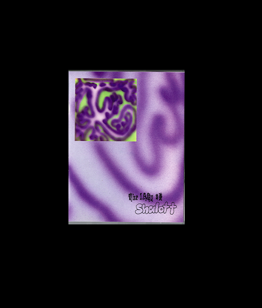
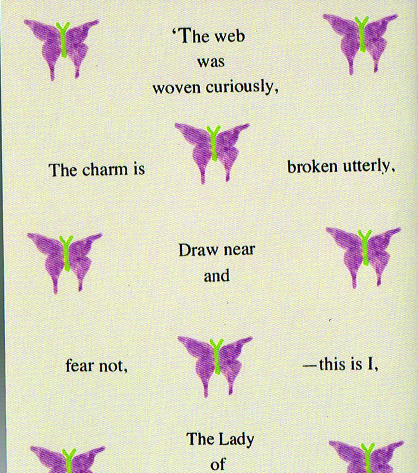
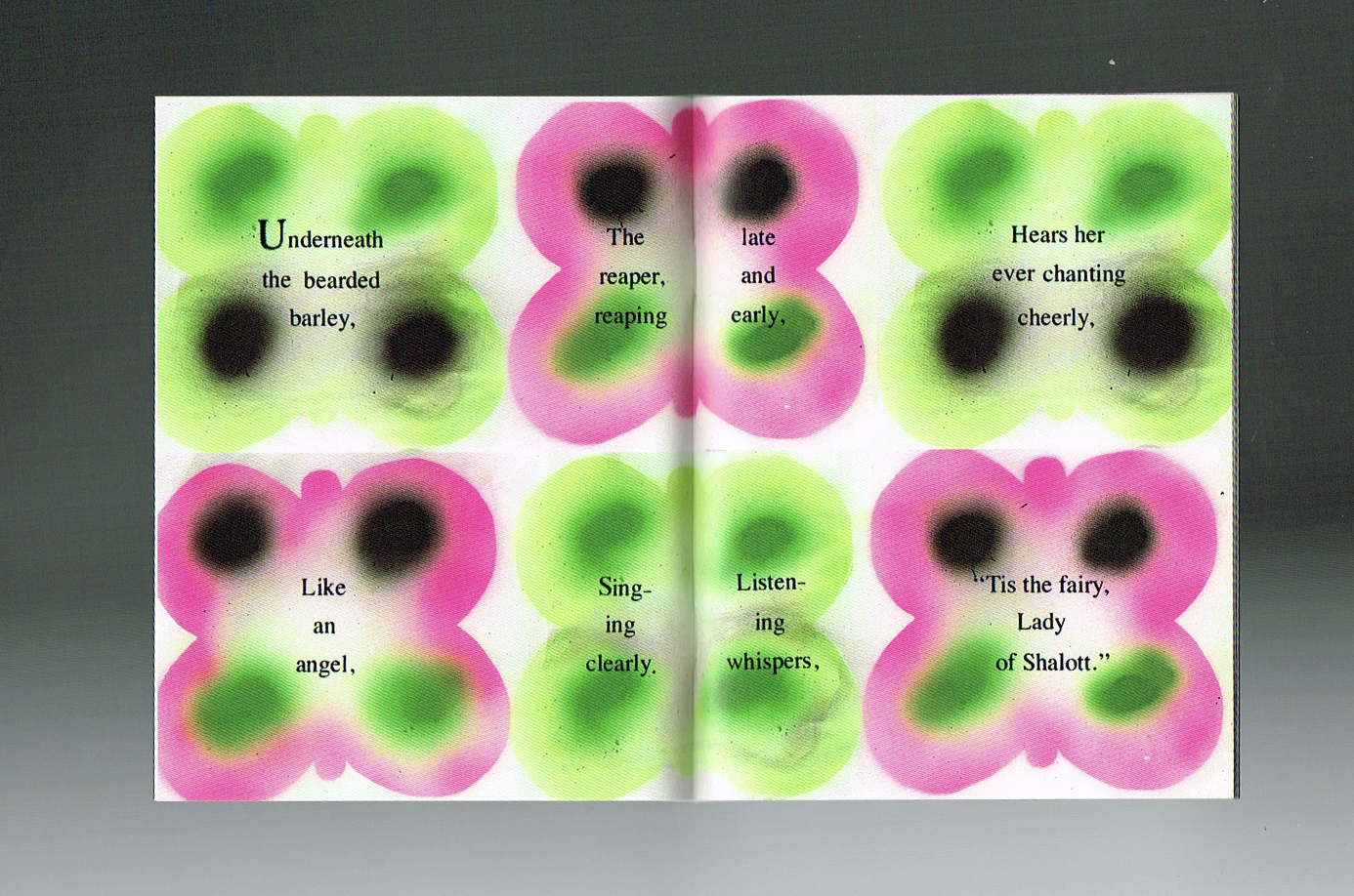
The Lady of Shalott
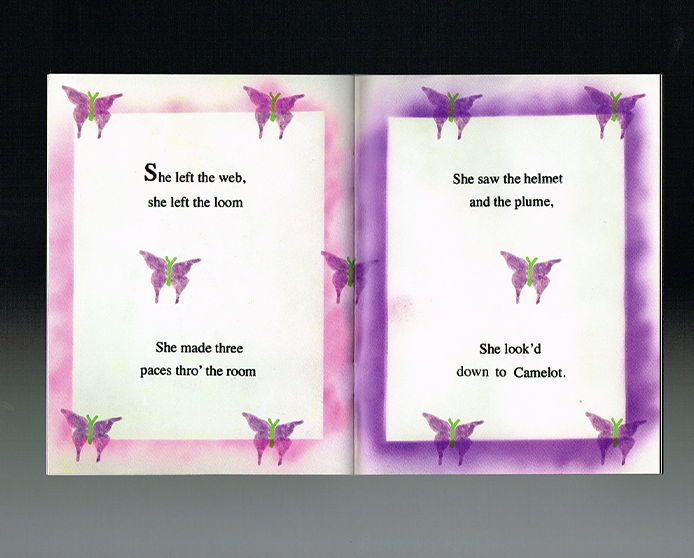
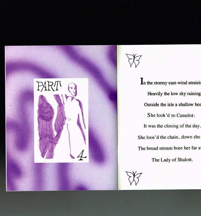
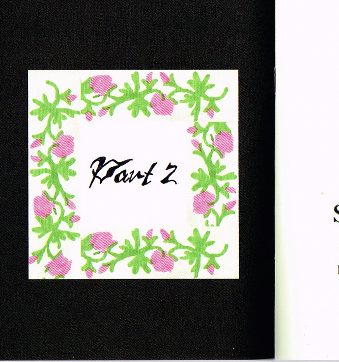
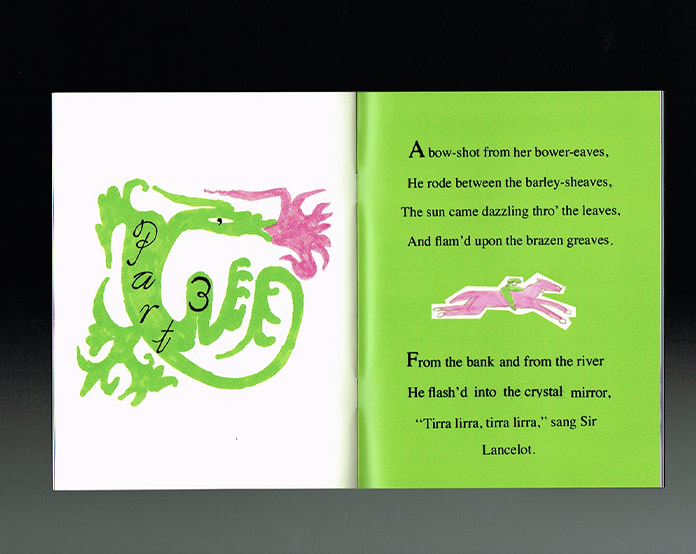
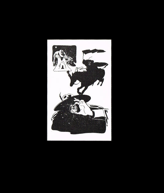
I love the mix of techniques in this little zine by Aless M.C, an incredibly talented illustrator, designer, and friend of mine. The airbrush illustrations, bold colour fields, and strong contrasts make it so visually striking. I’m especially drawn to the way she combines collage with pencil drawings, where you can still see the texture of the lines, and the hand-drawn typography that gives it so much character. Even the type choices, which remind me of old fairy tales and storybooks, feel so thoughtful. There’s something really special about seeing all these different elements come together. You can feel the time, care, and creativity that went into making it.
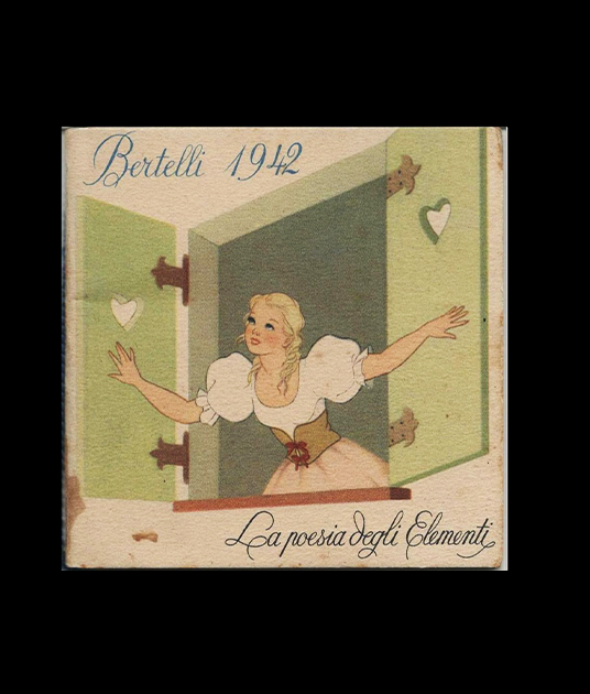
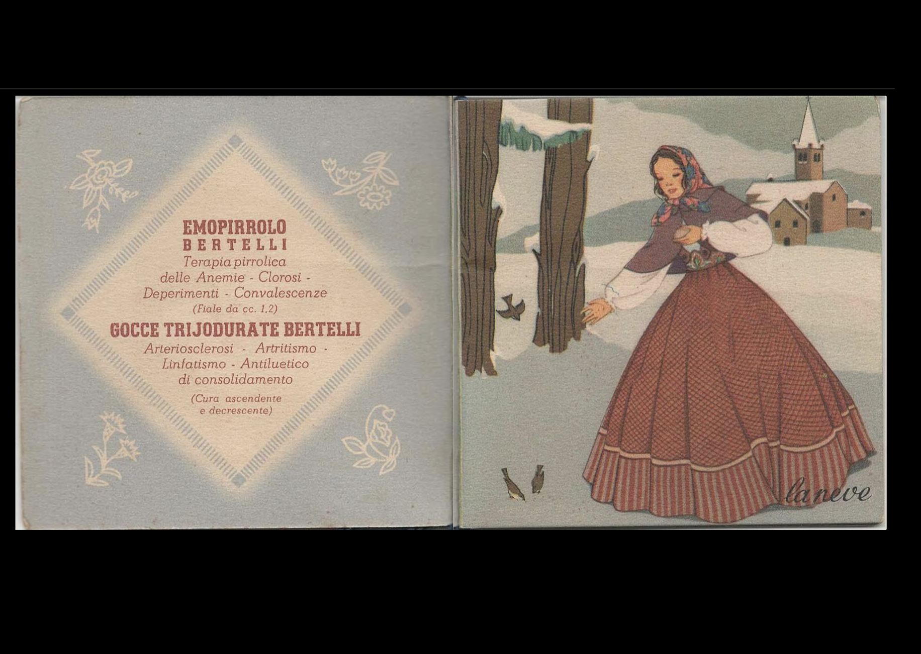
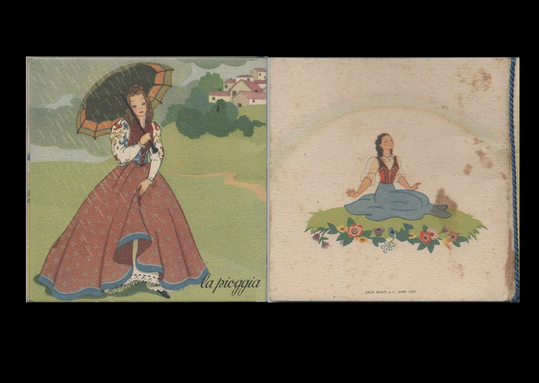
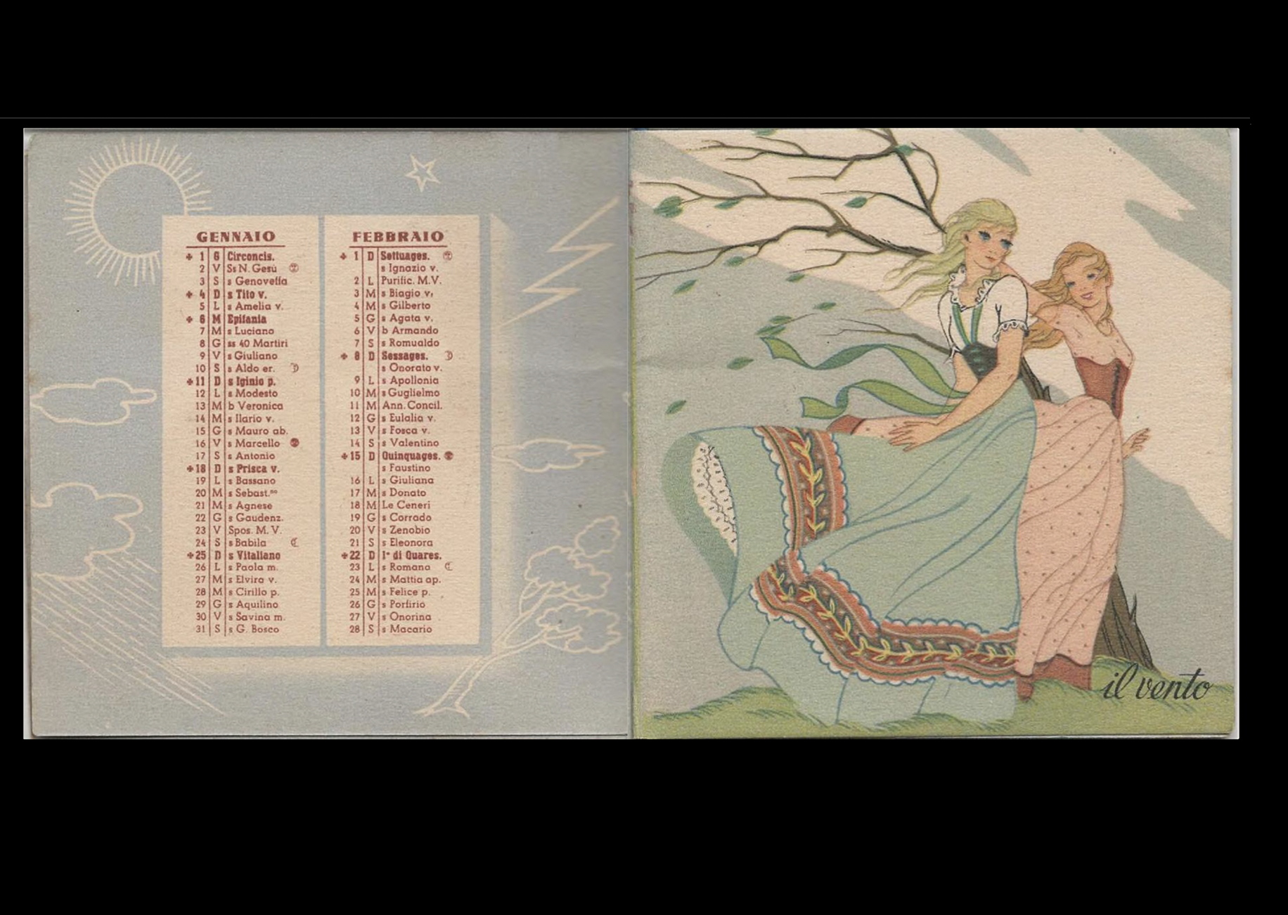
La poesia degli Elementi
Cha, my bff and friend of Bobbilibris, shared this little gem with me from the Internet Archive. I’m drawn to its vintage feel, the beautiful illustrations, and the way the paper adds texture and character to the pages. I also love the little blue string bookmark, such a simple detail that makes the object feel even more special. From what I understand, it’s an Italian almanac featuring full moon dates, which makes it all the more charming. The typography is beautiful, too, and feels perfectly at home alongside the illustrations. I love how something so simple can hold so much character through its paper, typography, and little details.
Disneyland
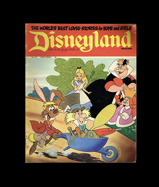
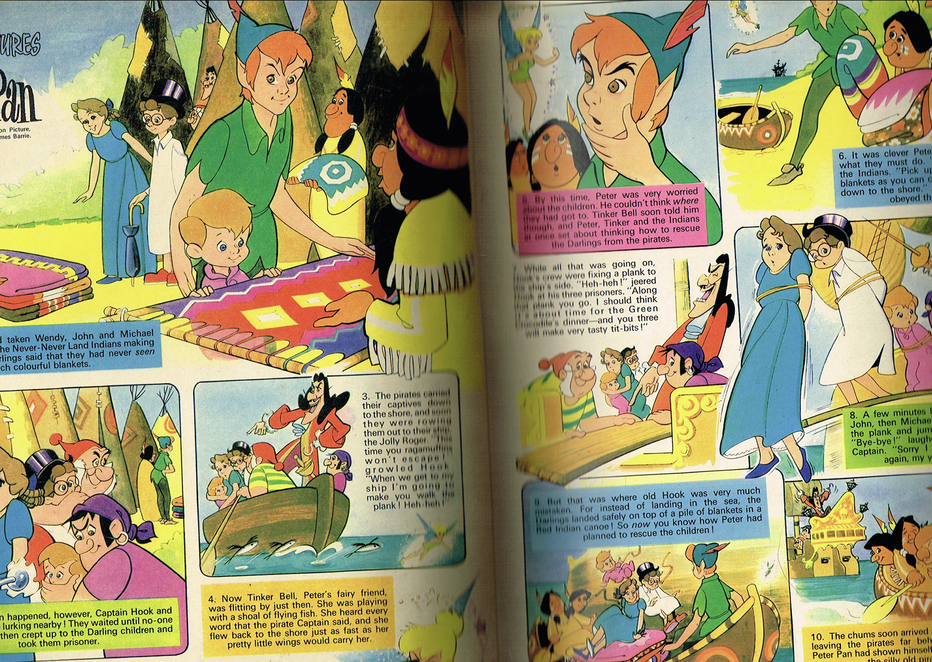
I found this magazine years ago, and I’m still completely obsessed with it. The oversized format, the calligraphic title, the combination of red and yellow, and the playful, cartoon-like illustrations all work together so beautifully. I especially love the red block that separates the lettering, with that little typographic detail tucked between the D and the Y. And the “The World’s Best Love Stories” tagline sitting above the calligraphic title is just incredible. Every detail feels so carefully considered.
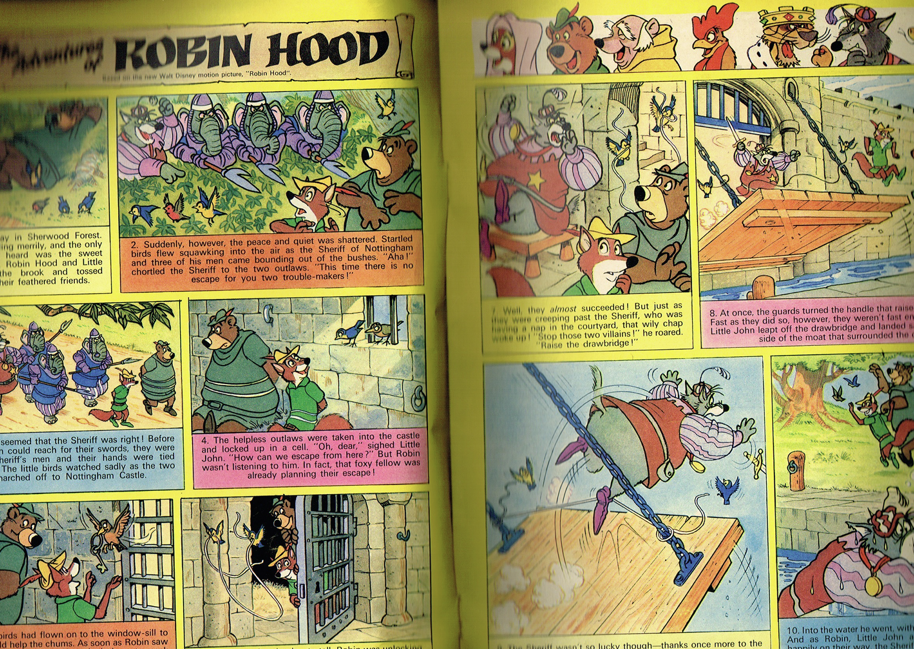
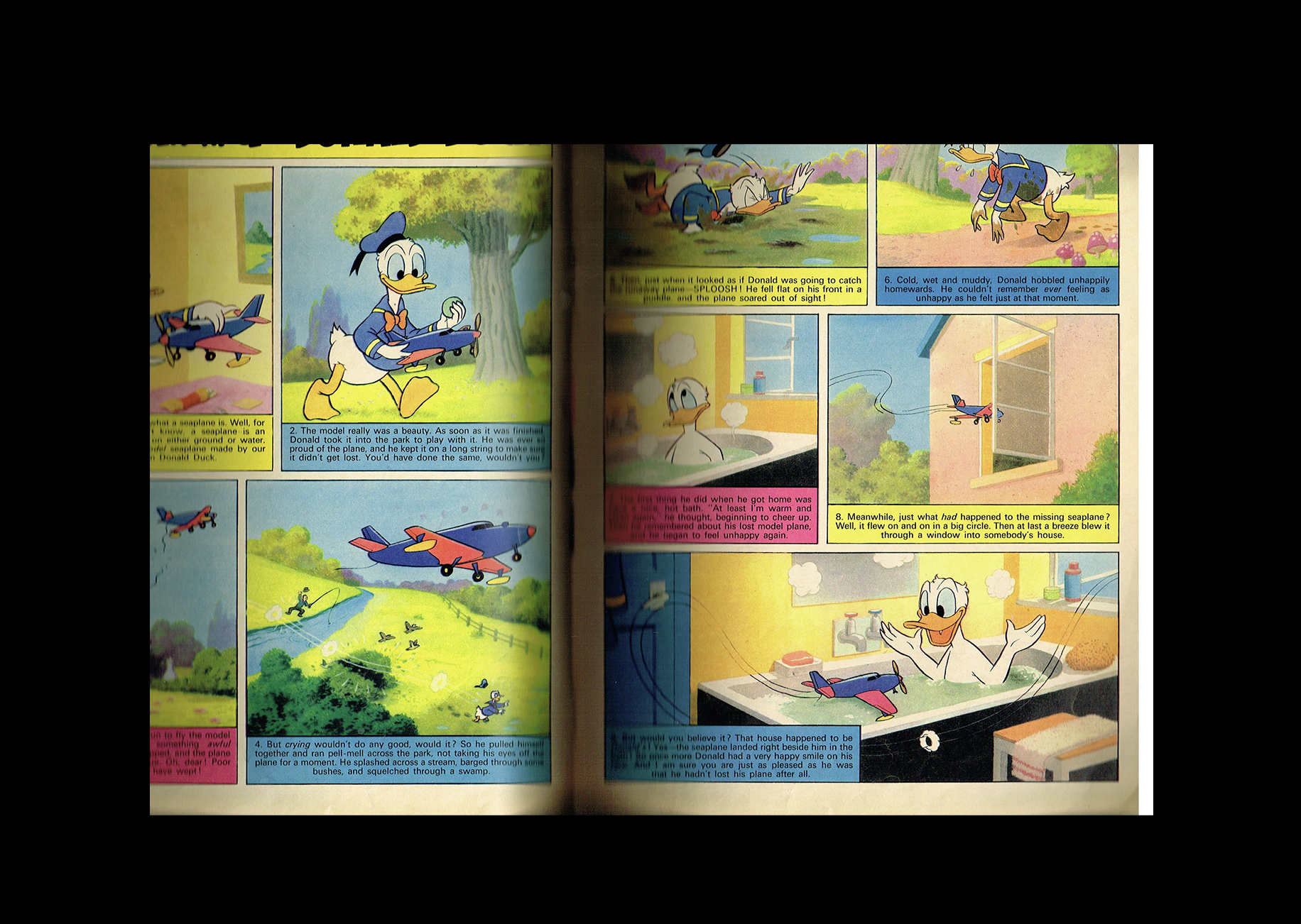
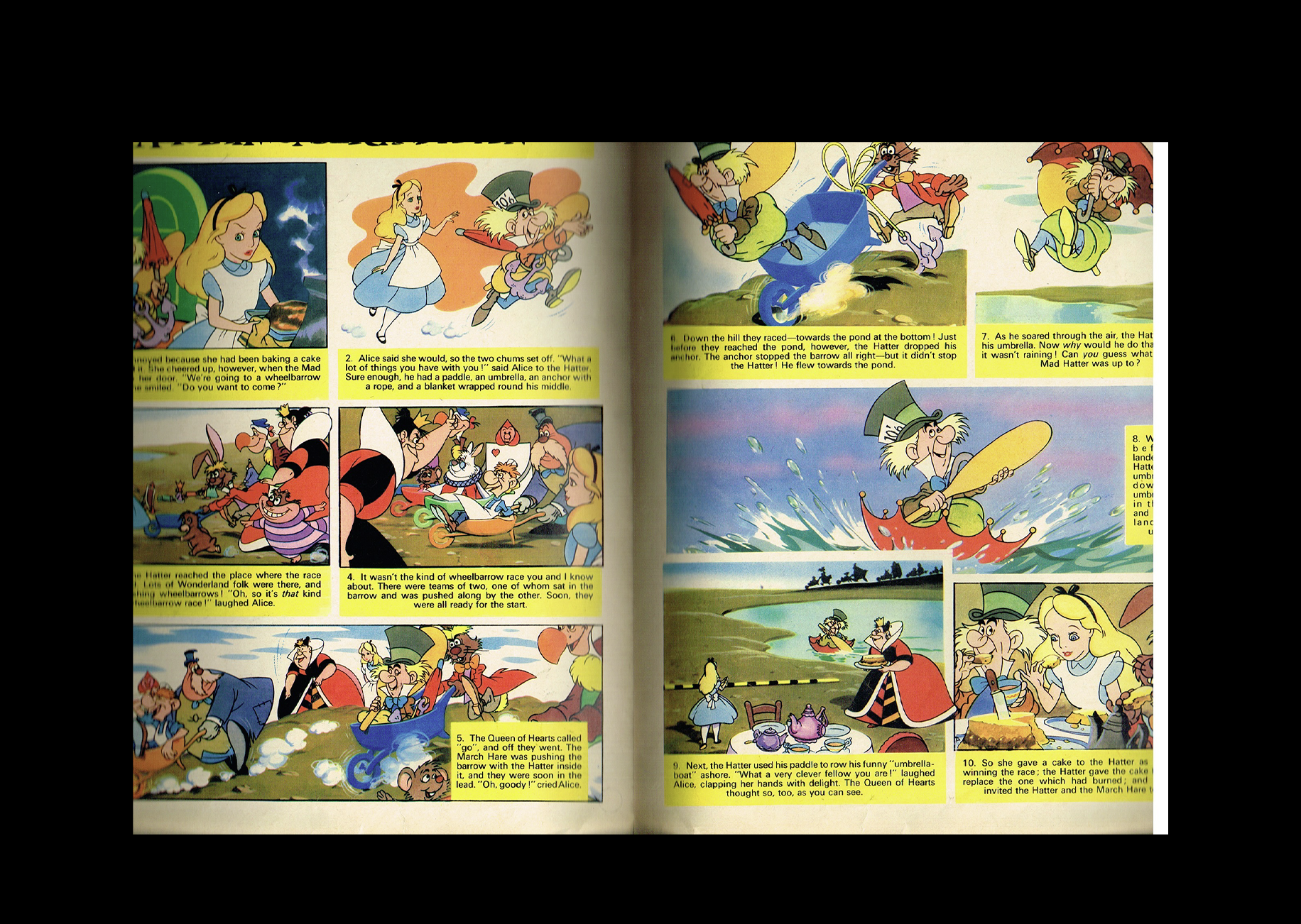
And then you open it! The fluorescent yellow pages, the custom typeface used to introduce each story, the simple Helvetica-like typography throughout, and the bright colour squares that help tell the stories. The balance between all these elements is just amazing. It’s such an incredible example of how typography, illustration, and colour can work together to create something truly special. I can’t get over the colors in this.
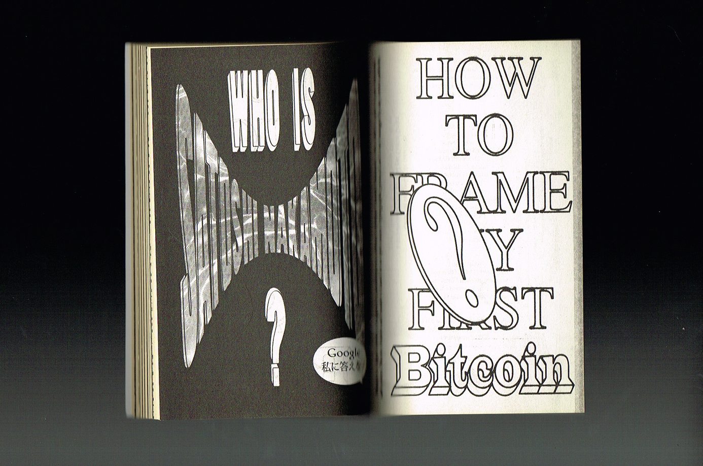
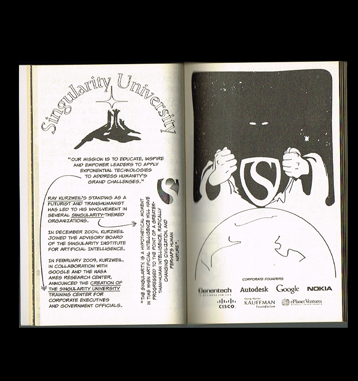
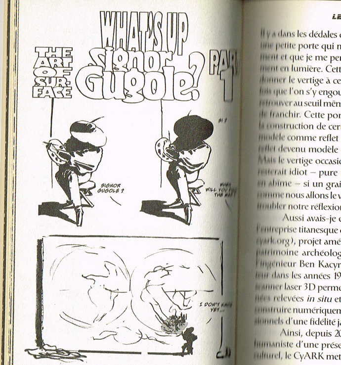
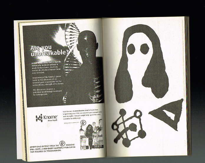
Raconte Google
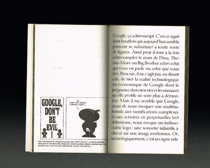
I received this little book at a typography conference called Atypi almost ten years ago, and I’ve been obsessed with it ever since. Designed and laid out by Pierre Vanni, it’s a curious little object that I still find so fascinating.
What I find so interesting is the contrast between its materials. The cover has an almost leather-like feel, while the inside is printed on newsprint, giving it a much more mass-produced quality. It’s a simple, perfect-bound booklet, entirely in black and white, with slightly old-fashioned typography and comic-book-like illustrations mixed with lots of lettering. The typeface itself is a fun detail, too. Designed back in 1982, it’s also used in the Google logo and appears throughout the book (really smart).
There’s something unexpected about the way all these elements come together. It’s such a humble little object, yet so full of character. A small piece of design that I still absolutely love.
Fantasias Llaneras
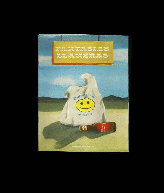
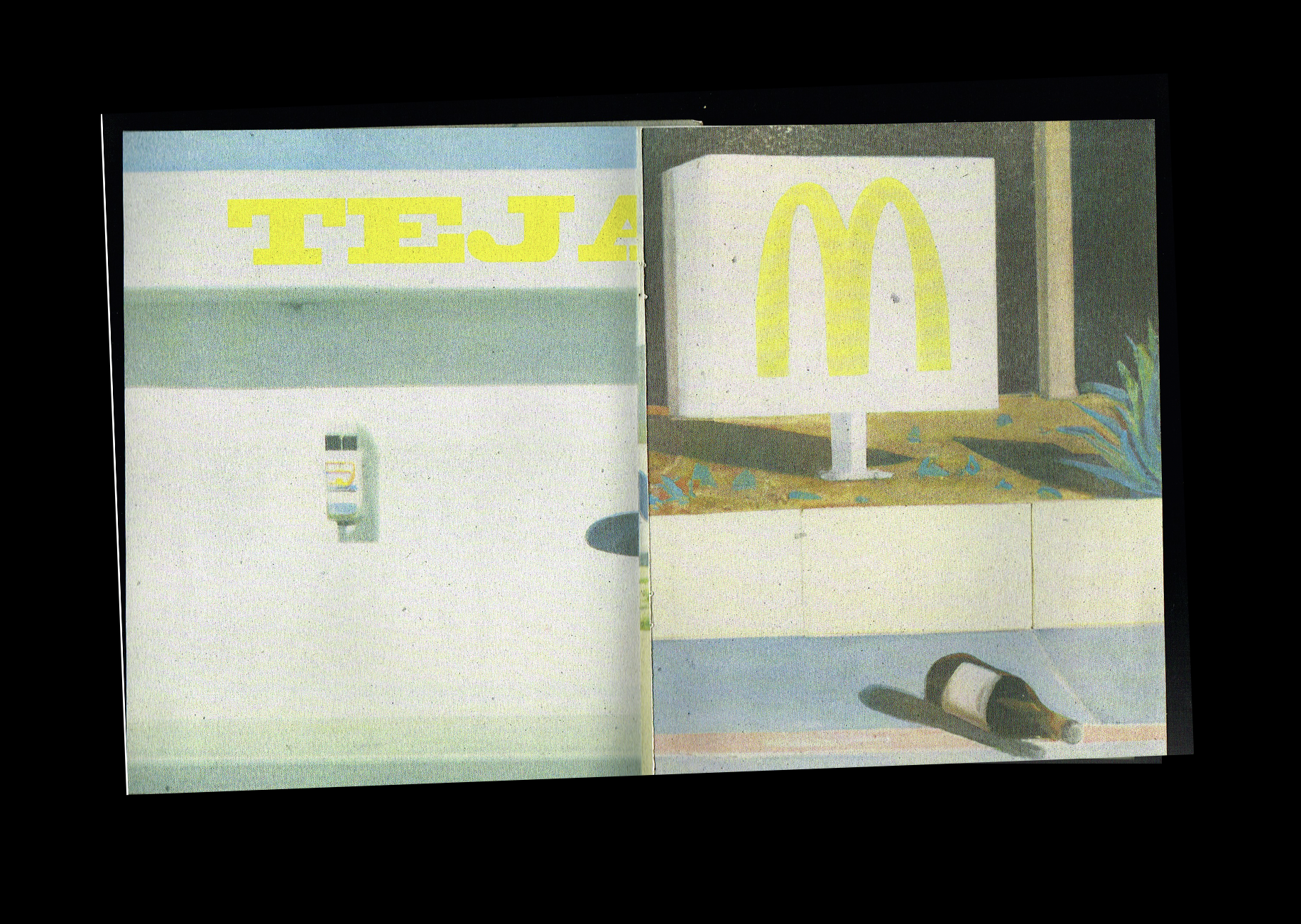
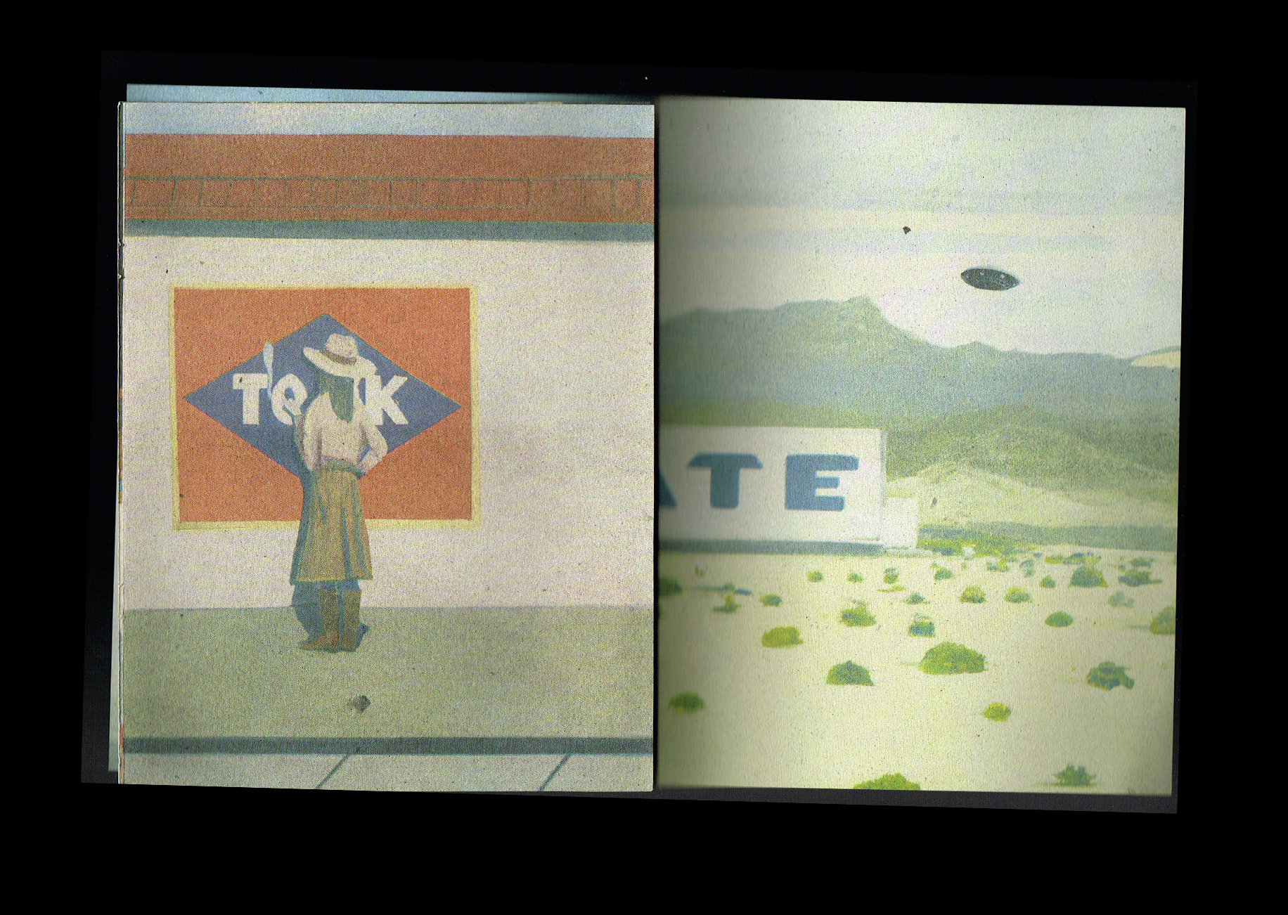
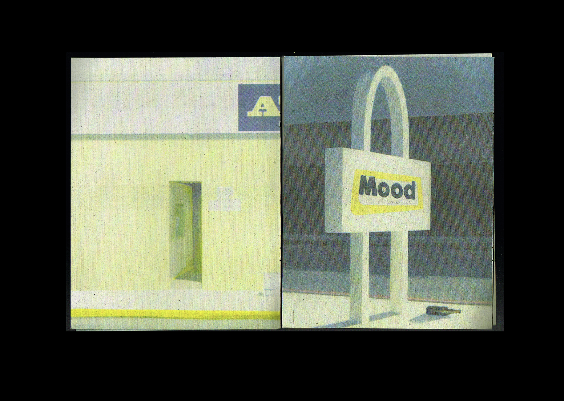
I picked up this oversized zine by Can Can Press during a trip to Mexico City. At 8.5 × 11 inches, it’s a little bigger than what I usually picture when I think of a zine, but I love it just the same. And of course, coming from a risograph studio, it’s beautifully designed and printed in riso.
Inside, you’ll find a collection of stunning illustrations, each one beautiful on its own. I love the colour palette, which feels much more muted than the bright, saturated colours we often associate with risograph printing. The fluorescent yellow running throughout the entire book adds just the right amount of contrast. The illustrations don’t necessarily follow one another, and there’s no real narrative, just a collection of beautiful images brought together in such a simple, thoughtful way.
When I got back home, I actually took the whole thing apart and turned many of the illustrations into posters to frame or give to friends. I still have a few left, and I love that this little publication has found a second life on my walls and in the homes of people I love.
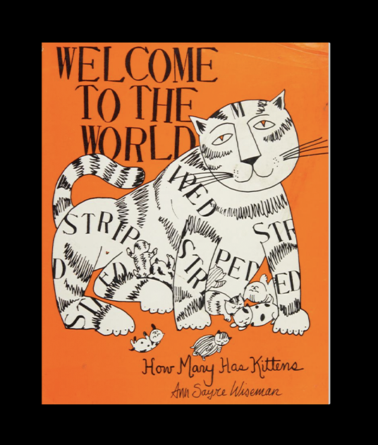
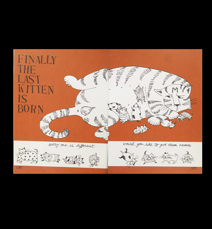
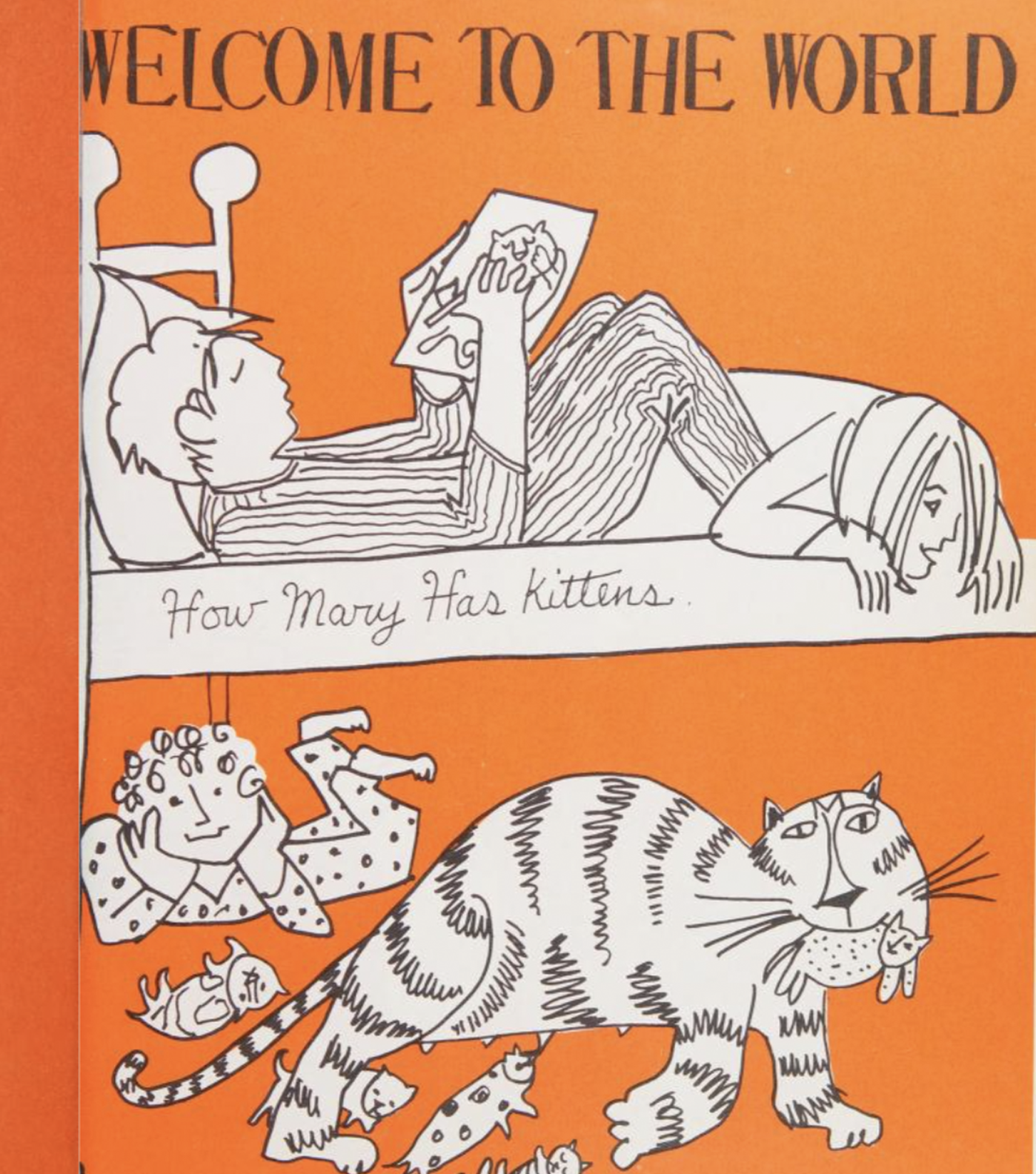
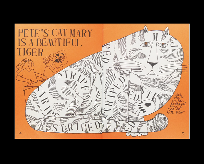
This one is such a fun little book! Welcome to the World is a book designed to help children understand where babies come from, using cats to explain sex, reproduction, and how life begins. I love how playful and approachable the whole thing feels, without compromising on the design.
The illustrations are beautiful, and the fluorescent orange is just incredible. The typography is another thing I’m completely obsessed with, especially the combination of typesetting and hand-drawn lettering. Text blocks become part of the illustrations, while collages and hand-drawn cats help tell the story in such a playful way. Everything feels so thoughtfully put together, from the colours to the typography and the mix of illustration techniques.
Honestly, I love this book so much that I already know I want to have it on my bookshelf for my future kids. It’s such a beautiful, funny, and thoughtful way to introduce a subject that can sometimes be difficult to explain.
Welcome to the World
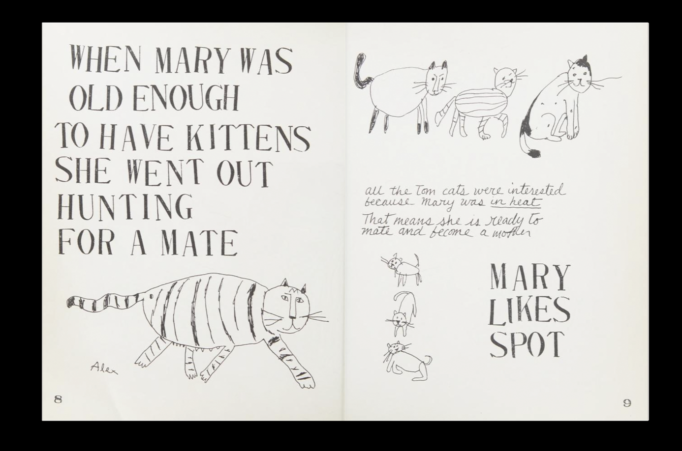
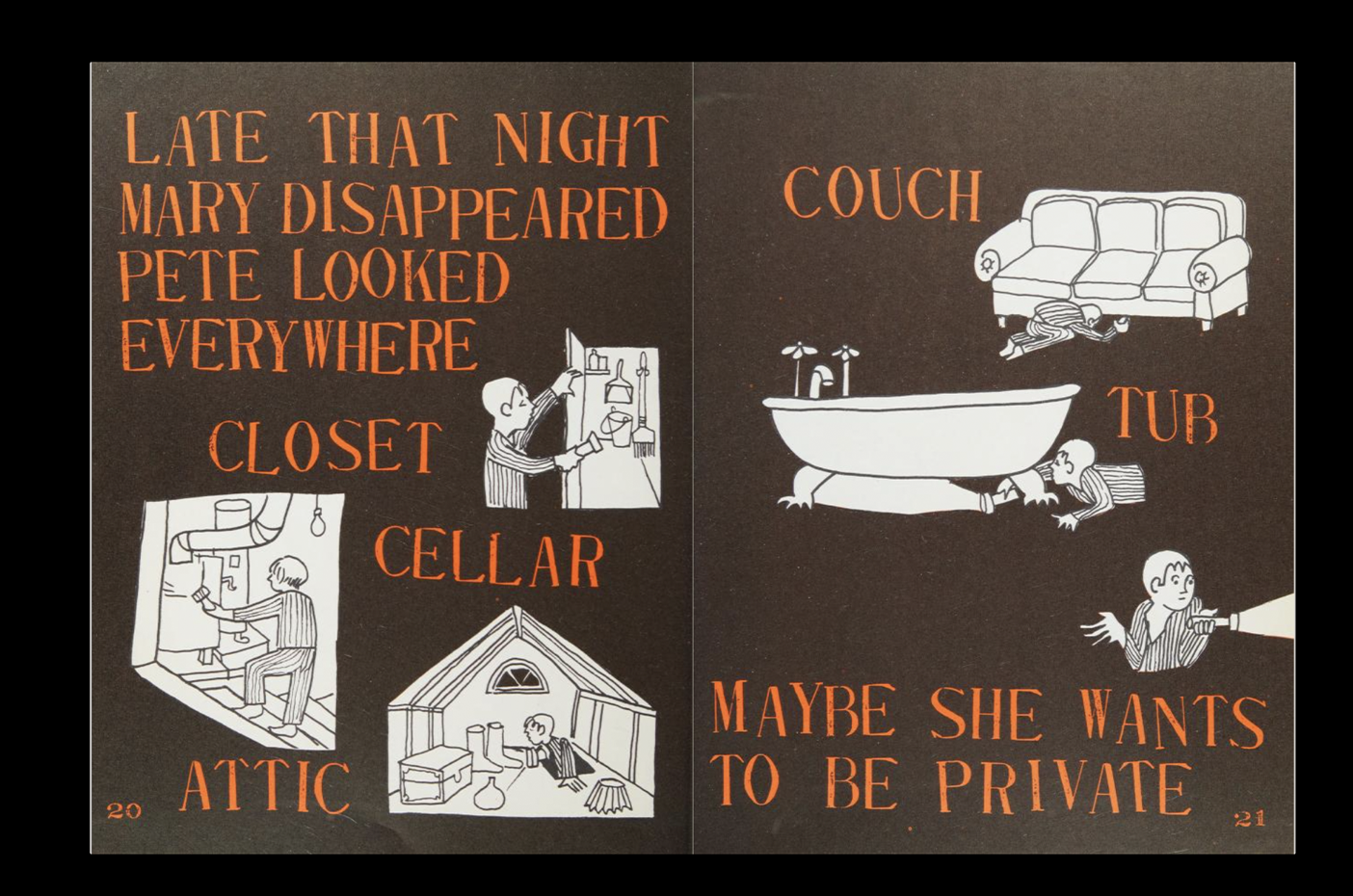
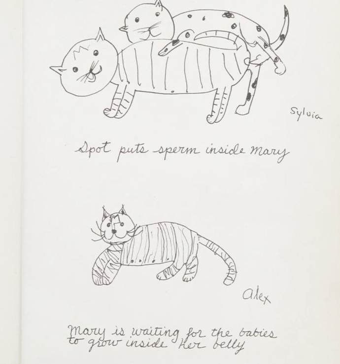
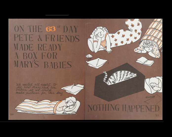
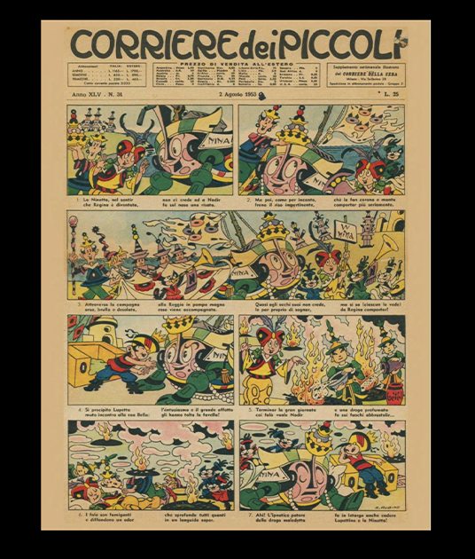
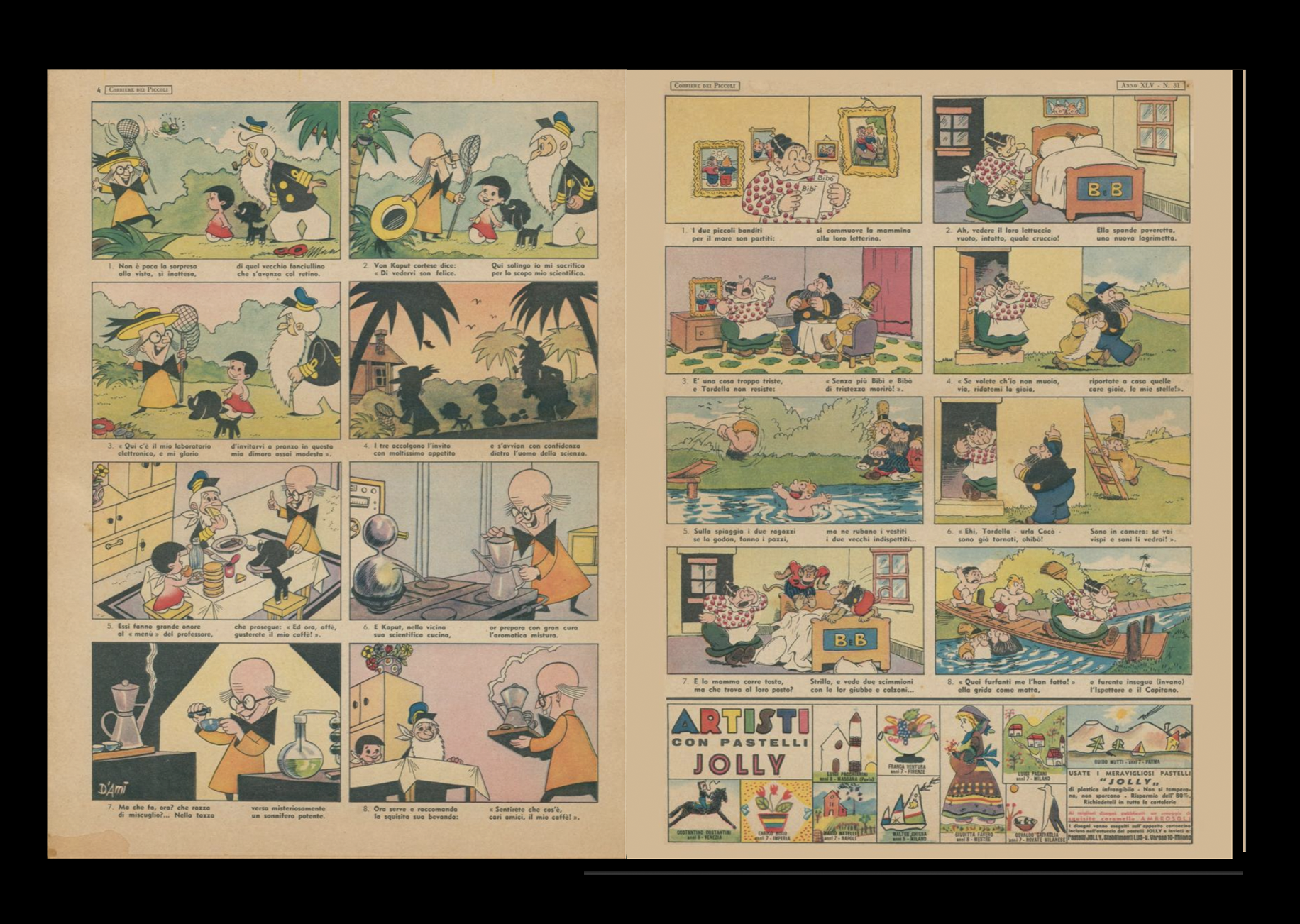
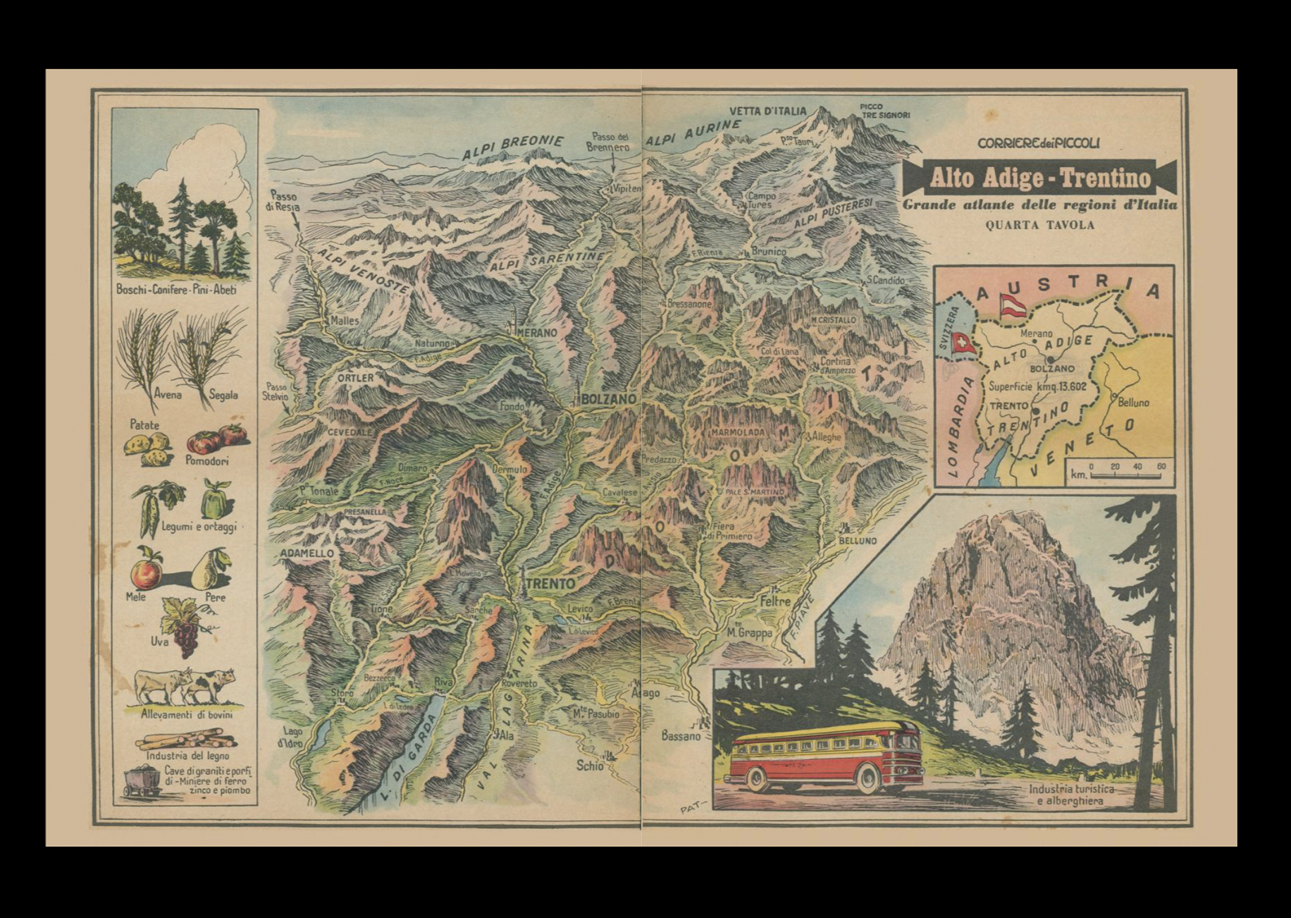
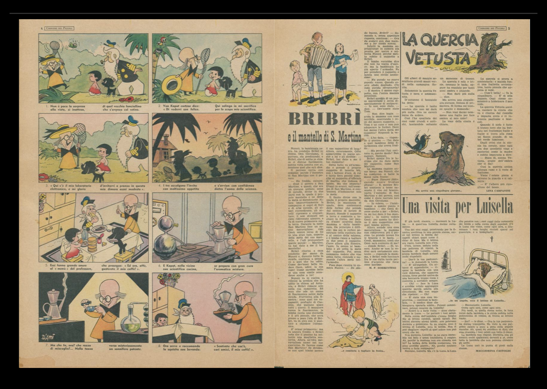
Another little gem shared by Cha, shout out Cha, we love you! We were immediately obsessed with the typography on the comic book cover. The title lettering is just so good, and the inside is just as beautiful. Even the map is incredible!
But I think my favourite part has to be the little typographic blocks, especially the advertisement at the end, with its small squares representing different visual elements. It’s such a clever graphic detail, and I love how everything comes together. The typography, the layout, the little visual elements. Absolutely obsessed.
Corriere dei Picooli
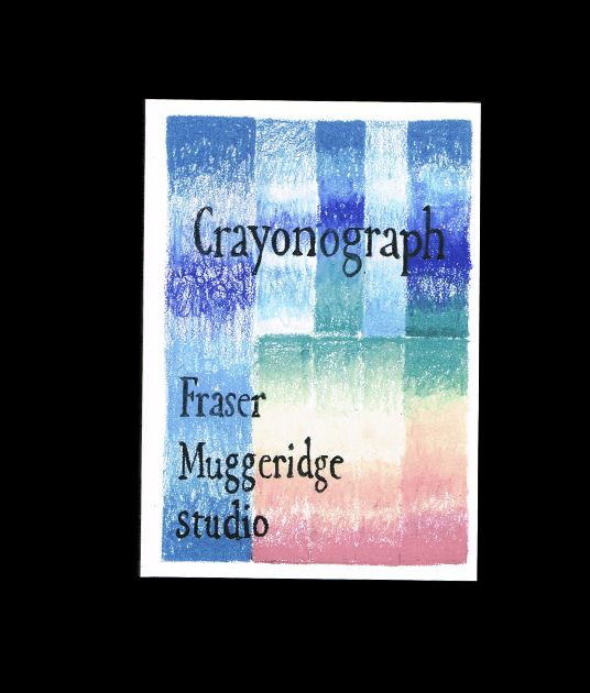
Crayonagraph
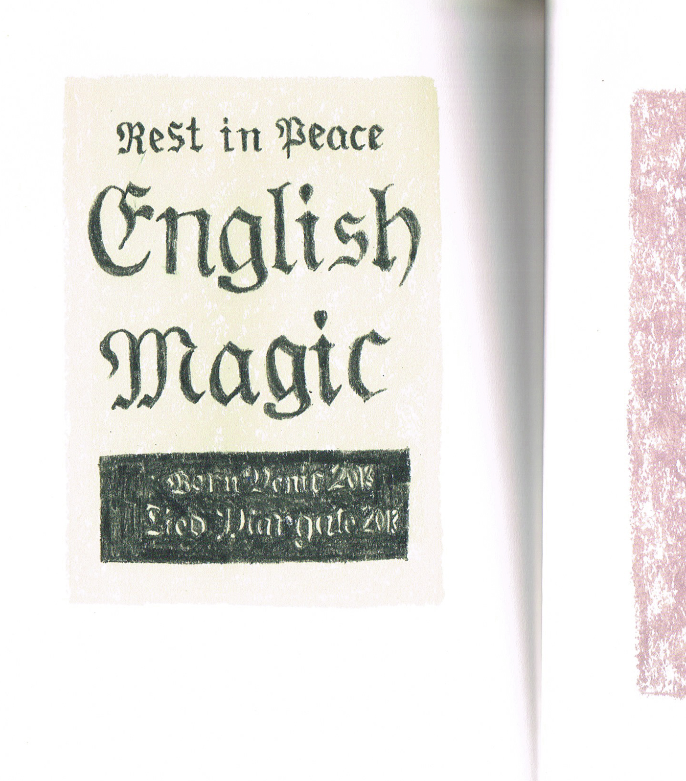
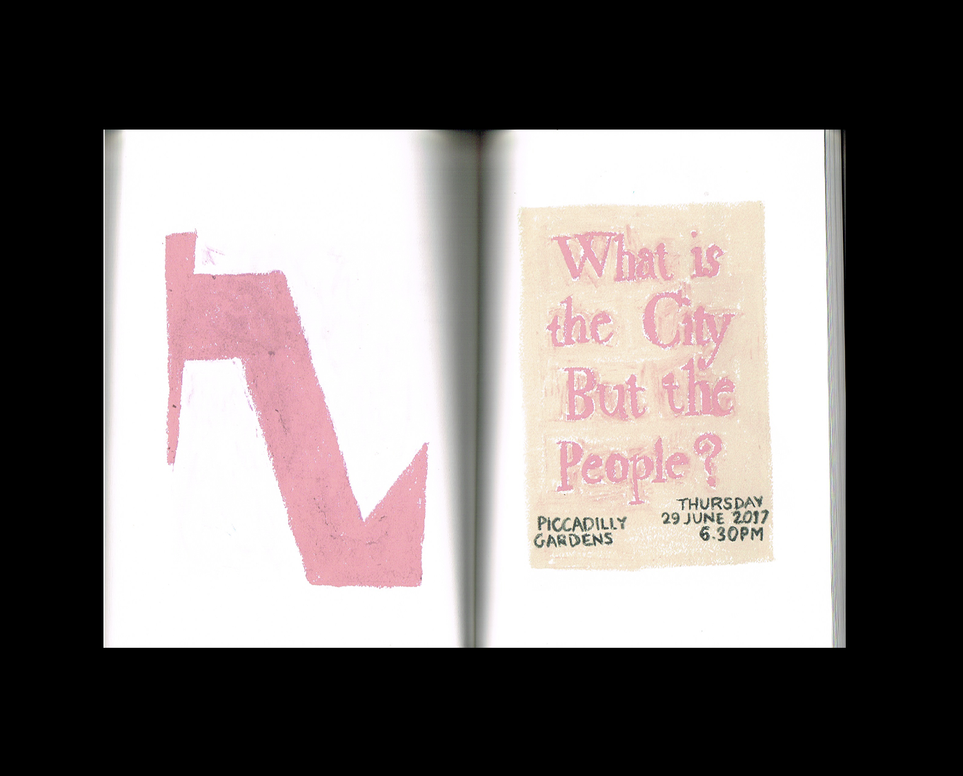
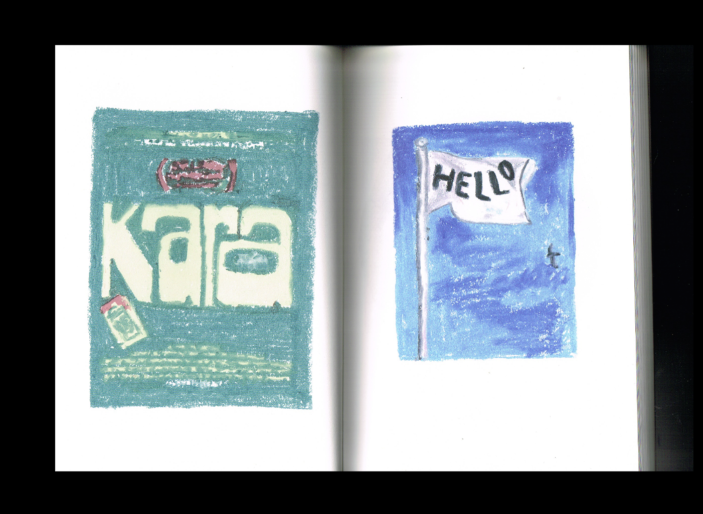
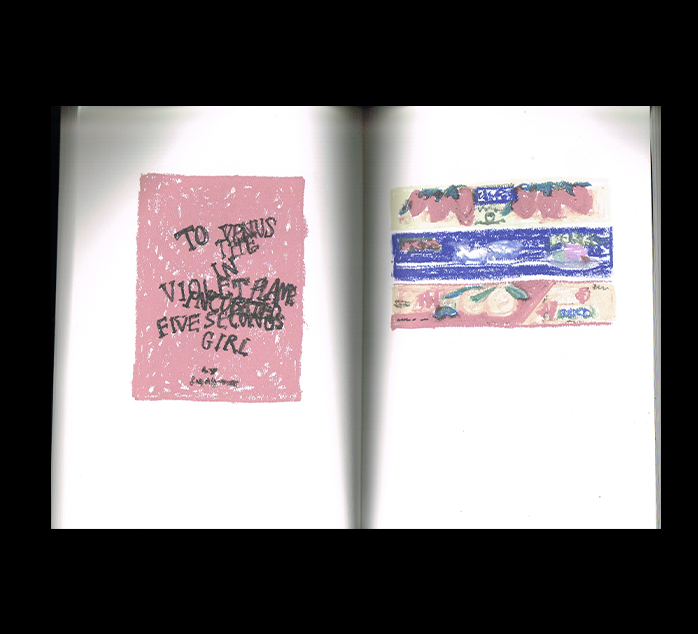
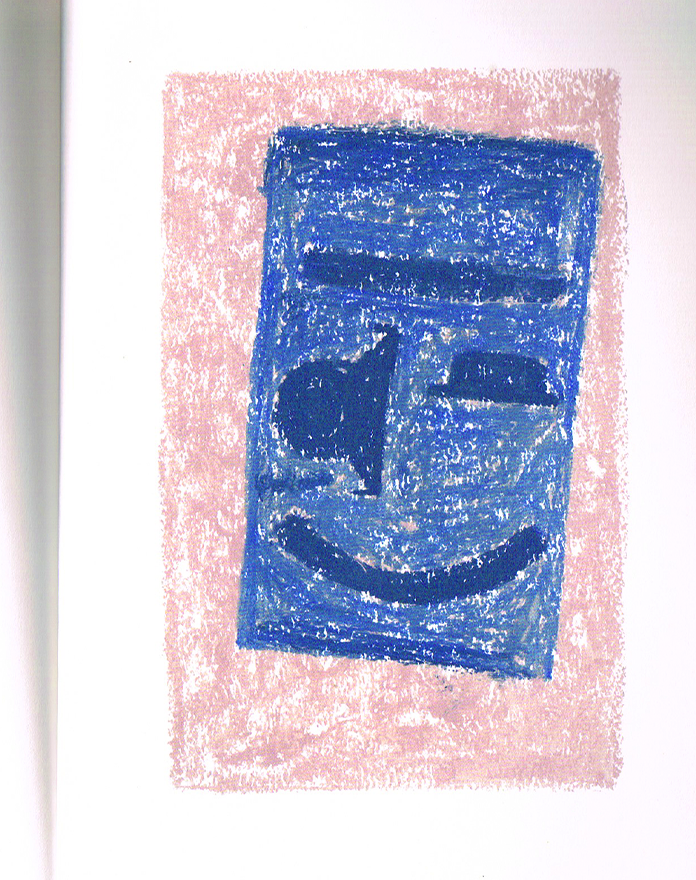
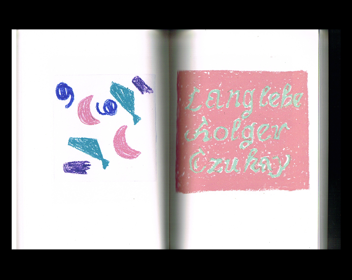
This one isn’t entirely new to Bobbilibris, as Demande Spéciale previously shared it in their curation, but it’s also one of my favourite illustration books. I think it’s one of the most inspiring books for anyone who wants to draw.
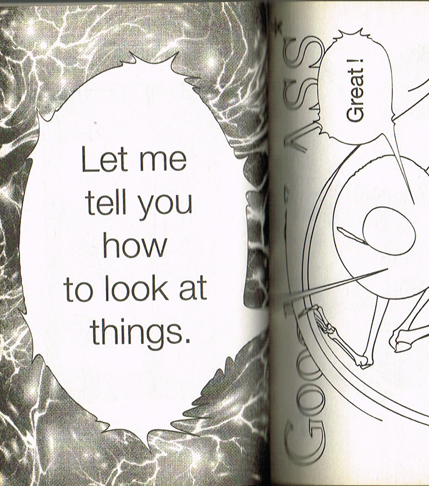
For this month’s curation, I wanted to share things that make us want to pick up a pencil, let our minds wander, and dream a little. And this book does exactly that. It takes everyday things we love, a poster, a book, an image, an object of affection, and reinterprets them through drawing. It’s such a simple yet wonderful exercise. Pick something that inspires you and try to draw it yourself. The result doesn’t have to be perfect. In fact, that’s what makes it so unique and special.
Inside, the illustrations seem to be made with coloured pencils, wax crayons, and pastels, with beautiful contrasts and textures. Unfortunately, the scans don’t quite capture the full richness of the colours, but there’s still so much to love.
Infinite Meditation
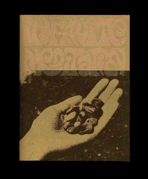
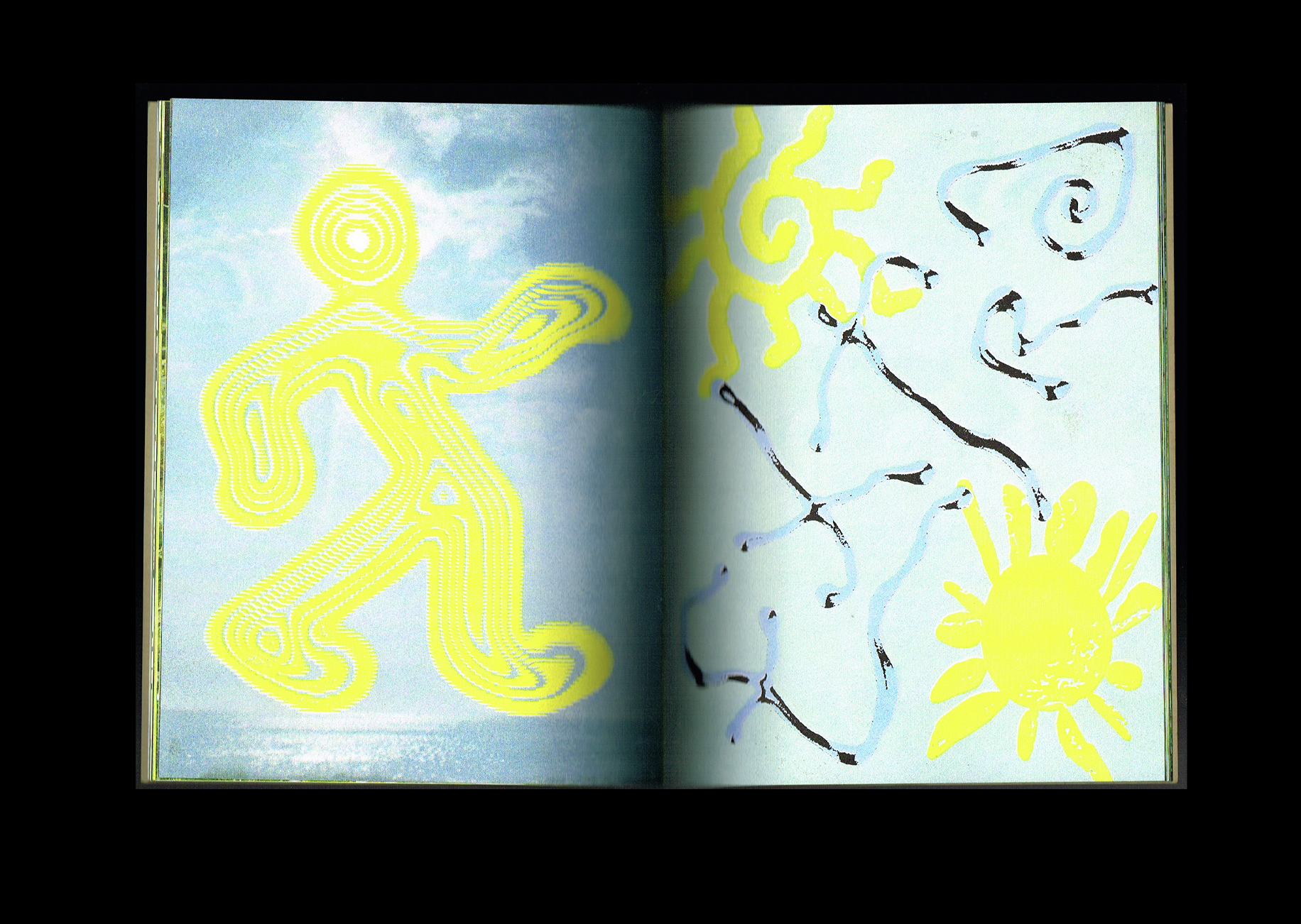
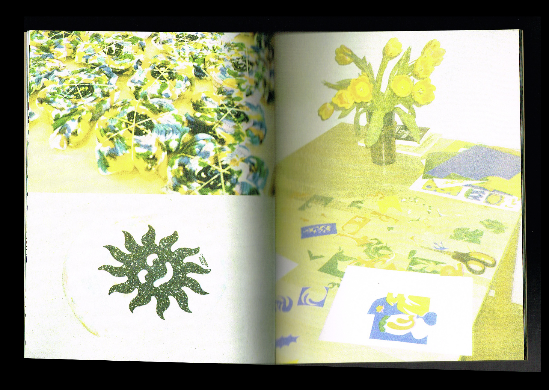
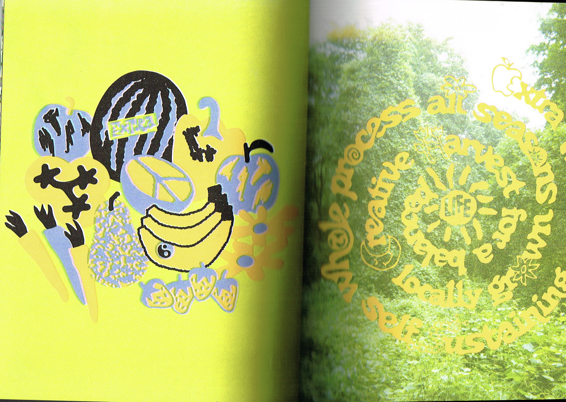
I love this little book by Extra Vitamins, a project known for its artist-made clothing and screen-printed graphics. Instead of making another T-shirt, they put together this book collecting their graphics alongside little quotes that reflect their free-spirited approach to life.
Everything is screen-printed, and I’m in love with the illustrations and the incredible colours. I also love the way the photographs look and feel with the screen-printing, giving the whole book such a distinct character. The quotes and custom typography are a beautiful addition, too.
There’s something so refreshing about the whole project. It feels playful and full of life.
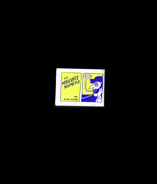
Le mauvais numéro Zine
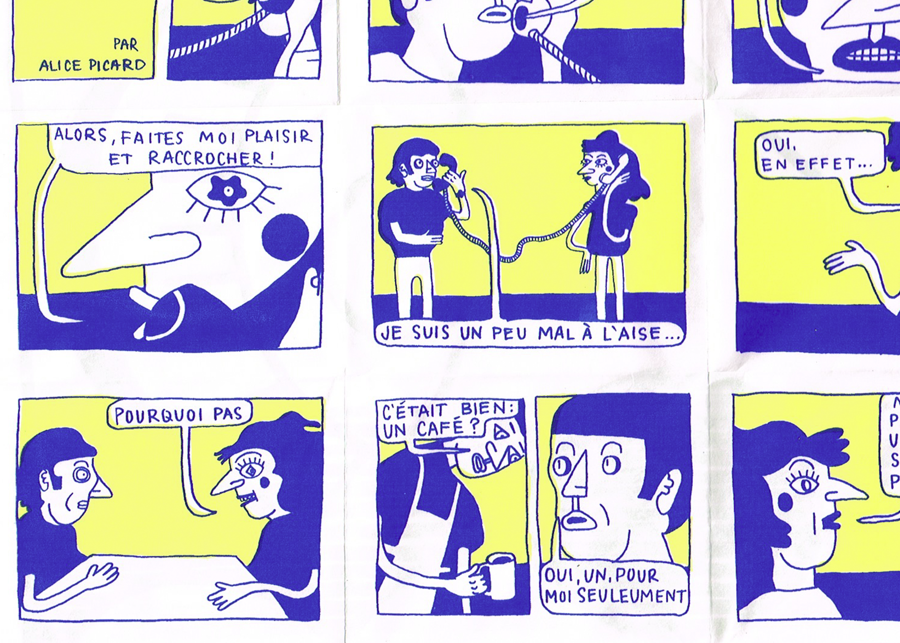
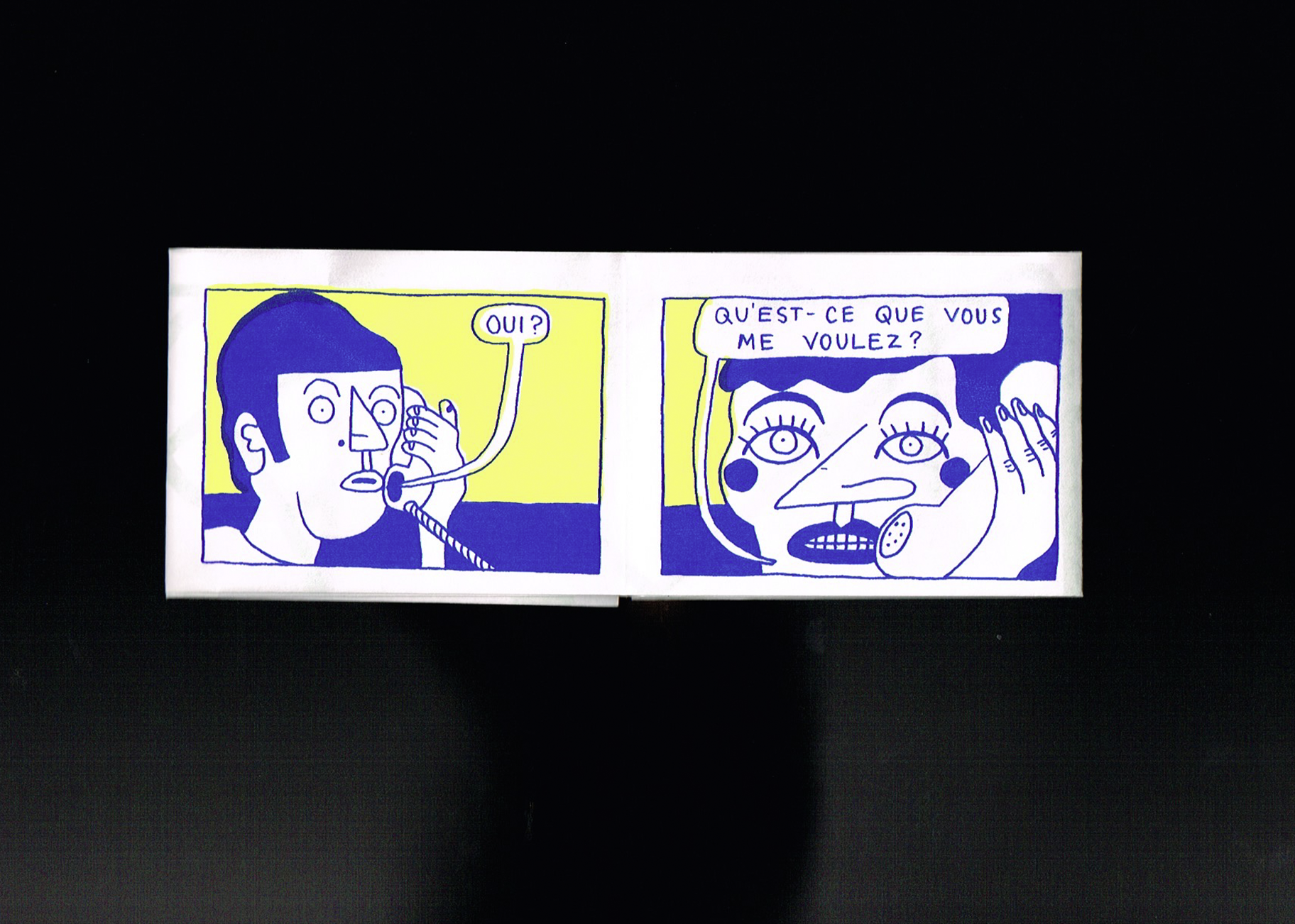
To finish this month’s curation, I wanted to share this tiny zine by Alice Picard, an artist I absolutely love and a friend of mine. I’m always happy to share her work, and this little piece takes me back to our university days.
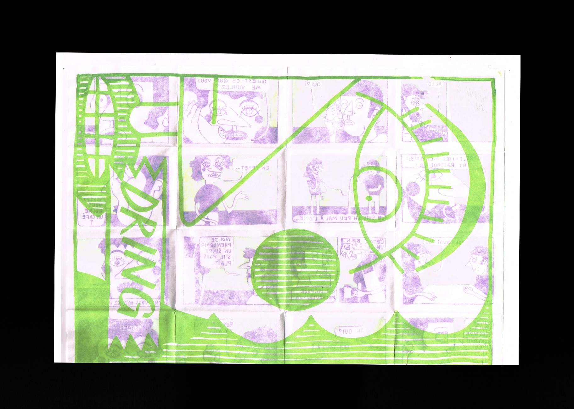
Made from a single 11 × 17-inch sheet folded into a tiny booklet, it tells a wonderfully silly little story through screen printing. Alice uses only three colours, fluorescent yellow, blue, and lime green, but the result is so full of life. I love her drawing style, the playful use of colour, and the paper she chose for the print. When you turn the page, you can really see the traces of the story coming through on the other side, making the whole object feel even more special.
It’s such a small, simple publication, but there’s so much charm in it. A little reminder that you don’t need much to make something beautiful.