Each month, we invite visionaries, designers, and artists to share their ex libris, providing a diverse array of perspectives and inspirations from the creative community.
Guestlibris
Pete Florentini
I first met Pete at an exhibition created by Super Système two years ago by our mutual friend Eveline. We talked a little about Bobbilibris that night, and look at us now, inviting him to be the September Guestlibris.
After the launch, I started following Pete on Instagram and quickly became inspired by his work and his commitment to using design as a tool for change. I also noticed our shared love for typography, and thought he would make for an interesting Guestlibris. I was not wrong.
Pete has a background in design and has been developing his own creative practice, with a particular interest in arts, culture, typography, and the ways design can create space for new ideas. When I received his curation, I found myself completely absorbed in his choices. Each book felt like a little window into his way of thinking, and I loved getting lost in the connections between them.
I’m very happy to share Pete’s curation with you. ✨
Pete’s Work
How would you describe yourself in your creative practice?
I’m a graphic designer and art director, but my practice has been deeply shaped by where I come from and how I've moved through the world. I was born in Peru, grew up in Spain, and am now based in Montreal. Navigating these constant relocations across different societies has heavily impacted my perspectives, shaping a decolonial interest and approach to design and a deliberate break from Western-centric canons. Instead, I can say I am much more interested in disruptive, non-hegemonic aesthetics, from raw illustrations to experimental typography. I would love that my practice reflects this.
To be honest, "It's complicated," 😅. I would say that it tends to be highly physical, meaning I've always wanted a tangible, unified library on my shelves. But I also have to admit that it has been completely fractured. Because I’ve moved so much (Spain, Peru, Canada), I’ve had to accept that life and movement are ultimately more important than belongings. This probably aligns with my low-key resistance to consumerism. In many cases I refuse to buy certain books I really love because I know another relocation is always possible. As a result, my “library” is spread across the ocean between my current home in Montreal and my parents' place in Valencia, Spain. There is definitely a heavy, almost sour nostalgia to this. When I go back to visit my parents and dig into boxes of my old books and magazines, every box marks a moment when a relocation forced a pause on whatever I was researching or collecting at the time. I guess I’ve come to accept that I don't own a traditional library, I rather own a physical but decentralized timeline of my own moves.
What is your relationship with books?
How would you describe the place books/magazine hold in your life?
To me, books and magazines have a special place that intersects my formal design education and my earlier background and interest in DIY print subcultures. Working in small art and culture studios after studying Graphic Design, Engraving and Printing at a public design school in Madrid gave me my foundation. But before that, we had gone back to Lima, Peru for my teen years and I brought with me some graffiti magazines and Straight Edge/HardCore and Punk zines from Madrid, since there was nothing like that in Lima during those years. This small collection was my way into something disruptive, self-expressive and creative, these were publications filled with raw collages, textures and illustrations, which actually set my early fixation on publishing and led me to want to make my own zine. That duality shaped how I view books and magazines today. To me, independent publishing isn't just about producing printed matter; it's an active practice of researching, documenting, and building physical archives for culture that might otherwise be forgotten in our current digital era.
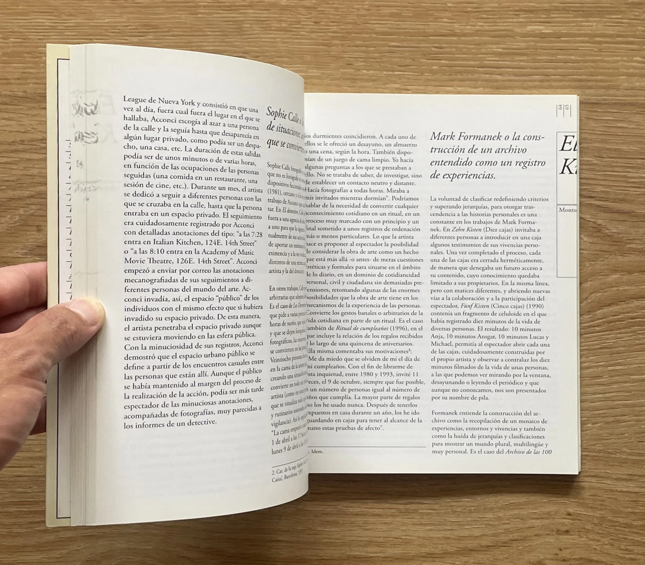
This book was actually the first book project I was ever part of, working in collaboration with Aitor Méndez’s studio in Madrid called Estudio 451 (a nod to Ray Bradbury’s dystopian novel Fahrenheit 451, where books are forbidden artifacts burned by firefighters). Being part of this project and seeing how Aitor tackled it completely shattered my understanding of what a book could be. The publication centered around Jacques Derrida’s concept of Mal de Archivo (Mal d'Archive, or the clash between our urge to archive everything and the natural push toward forgetting.). Because the book itself was a compilation of essays exploring the idea of the archive, Aitor wanted to challenge the traditional anatomy and format of a book by deciding to put the entire index and table of contents directly on the cover. My contribution was designing the cover with custom illustrations of old-school index cards or flashcards, serving as visual mnemonics for archival practices. Twelve of these cards displayed the article titles, authors, and page numbers. Beyond the cover, Aitor’s layout was super clever and felt way ahead of its time for 2006. To mirror the instability of an archive (a digital archive, or file in this case), he built a literal 'glitch' into the layout grid. Instead of ending cleanly, the section title page design repeated and bled off the pages, appearing cropped, offset, and lingering in the text margins of the text pages. Seeing this level of conceptual risk-taking back in 2006 showed me how books could be at once functional, intellectual and well-designed artifacts.
1. A book that got you into books.
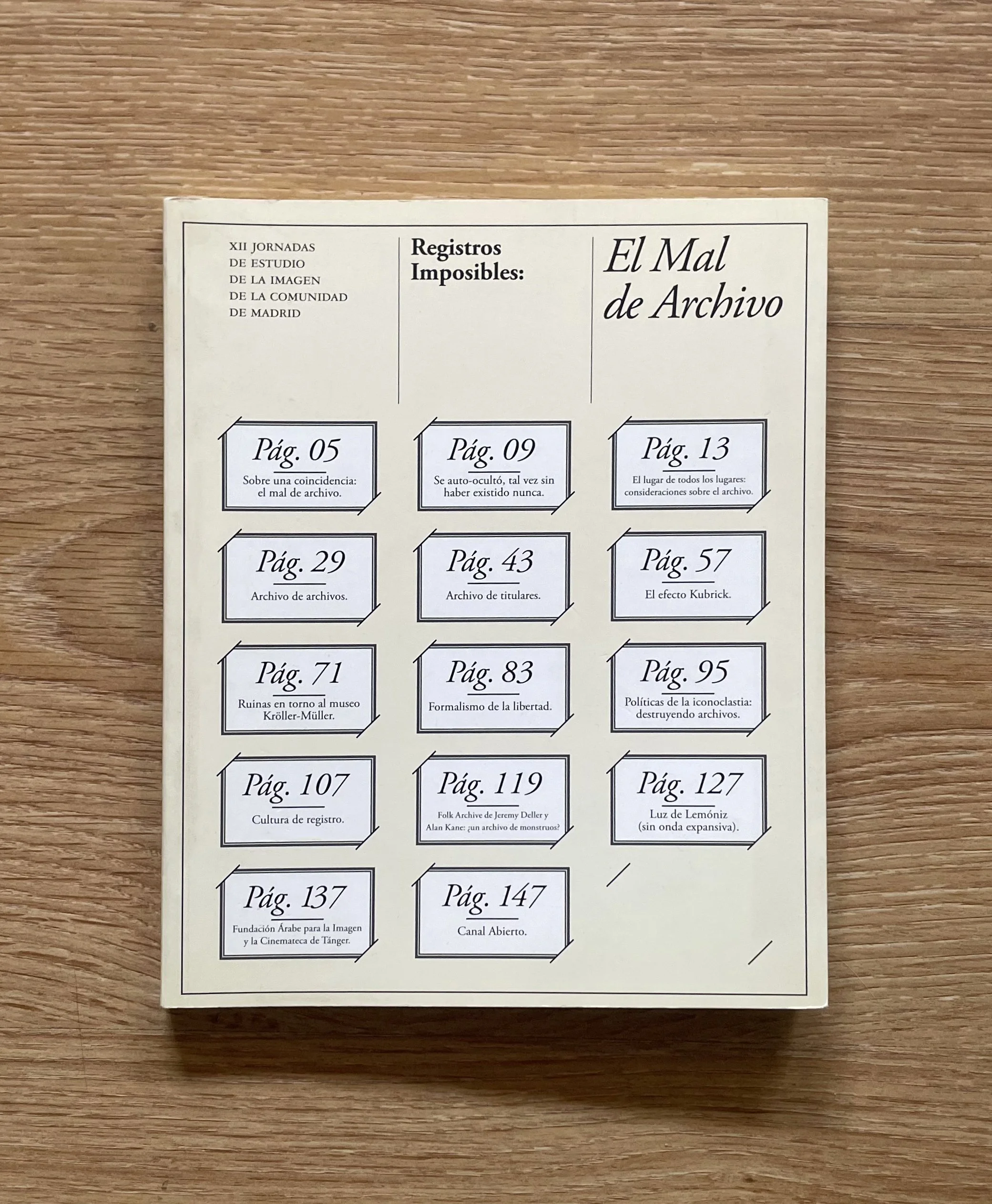
Registros Imposibles: El Mal de Archivo (XII Jornadas de Estudio de la Imagen de la Comunidad de Madrid)
Curated and Edited by: Sergio Rubira
Published: Comunidad de Madrid. Publicaciones Oficiales 2006
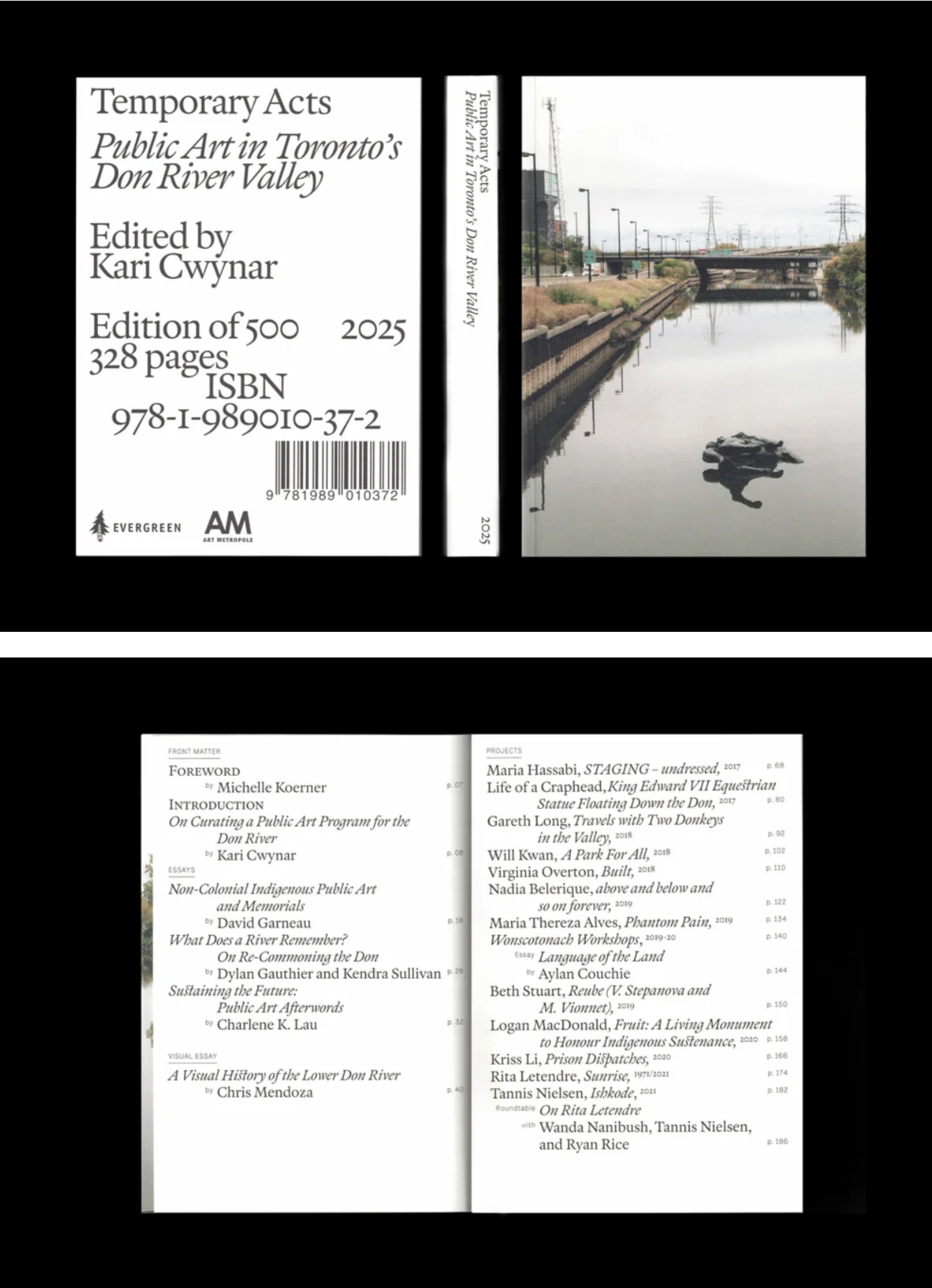
This project is very personal. It documents a public art program curated by my partner – a book we worked on for years and finally finished in 2025. Collaborating together at home was an intense, beautiful process of translating years of site-specific work into a single physical artifact. I hadn't designed a book in over a decade. Early in my career, I worked at a studio specializing in artist books and exhibition graphics, and later served as art director for the Vancouver Art Book Fair for several years. Though my work has since shifted toward branding, print remains my first love, and I was happy to find that muscle memory completely intact. Conceptually, I wanted to challenge how a cover function. Traditional covers act as permanent semi-monuments, labeling and sealing the contents inside. By leaving the front entirely textless and featuring only a full-bleed photograph of a performance, showing a floating replica of a monument in the Don River (performance by the art collective Life of a Craphead, “King Edward VII Equestrian Statue floating down the Don River”, 2017), the cover itself enters a temporary state. A cover that refuses to immediately declare what it is. The title eventually appears when you turn the book over or read the spine, which acts as the structural anchor. We moved all traditional metadata: editor, publisher logos, page count, ISBN, and barcode to the back cover, treating them as massive, expressive layout blocks. This forces the reader to physically manipulate the object: to rotate it, feel the paper, and interact with it before ever opening it. The entire typographic system of the book intends to mirror the nature of the Don River Valley, a wild ravine constantly managed and constrained by human infrastructure. The layout creates a deliberate collision between two typefaces: National Park (Andrea Herstowski, Ben Hoepner and Jeremy Shellhorn), a mechanical, route-carved sans-serif modeled after park signage that handles the rigid, systematic elements of the book: page numbers, project years, and section metadata, etc. And Immortel (Clément Le Tulle-Neyret – 205.tf), a gorgeous, fluid, humanist serif with beautiful italics, ligatures and old-style numerals. Across the pages, these two styles constantly push against each other. We used exaggerated paragraph indents to build a classic yet modern rhythm. In the index and title pages, these layers collide and overlap, capturing the exact point where human infrastructure tries and fails to fully contain the natural landscape.
2. A book that you’re currently obsessed with (new)
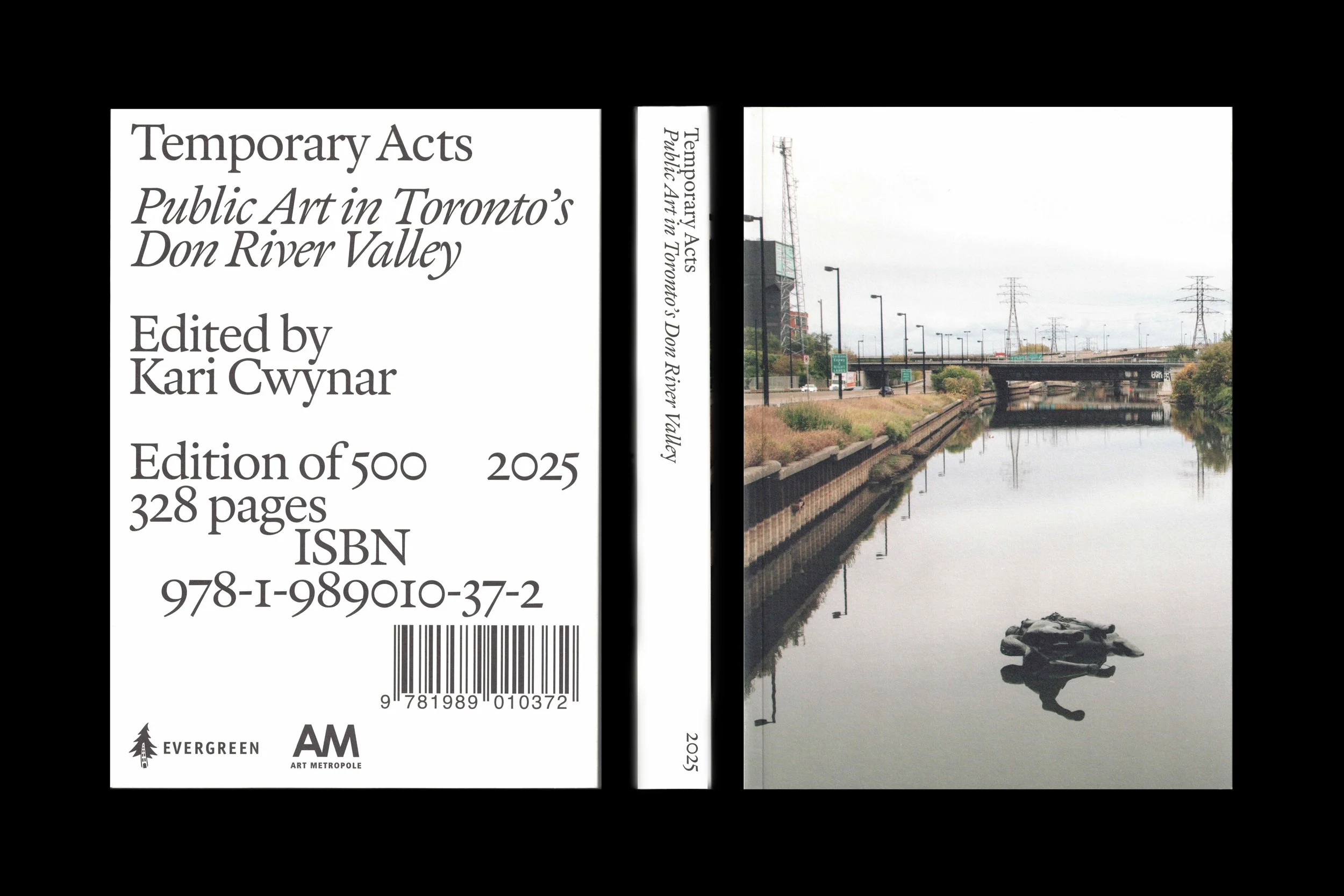
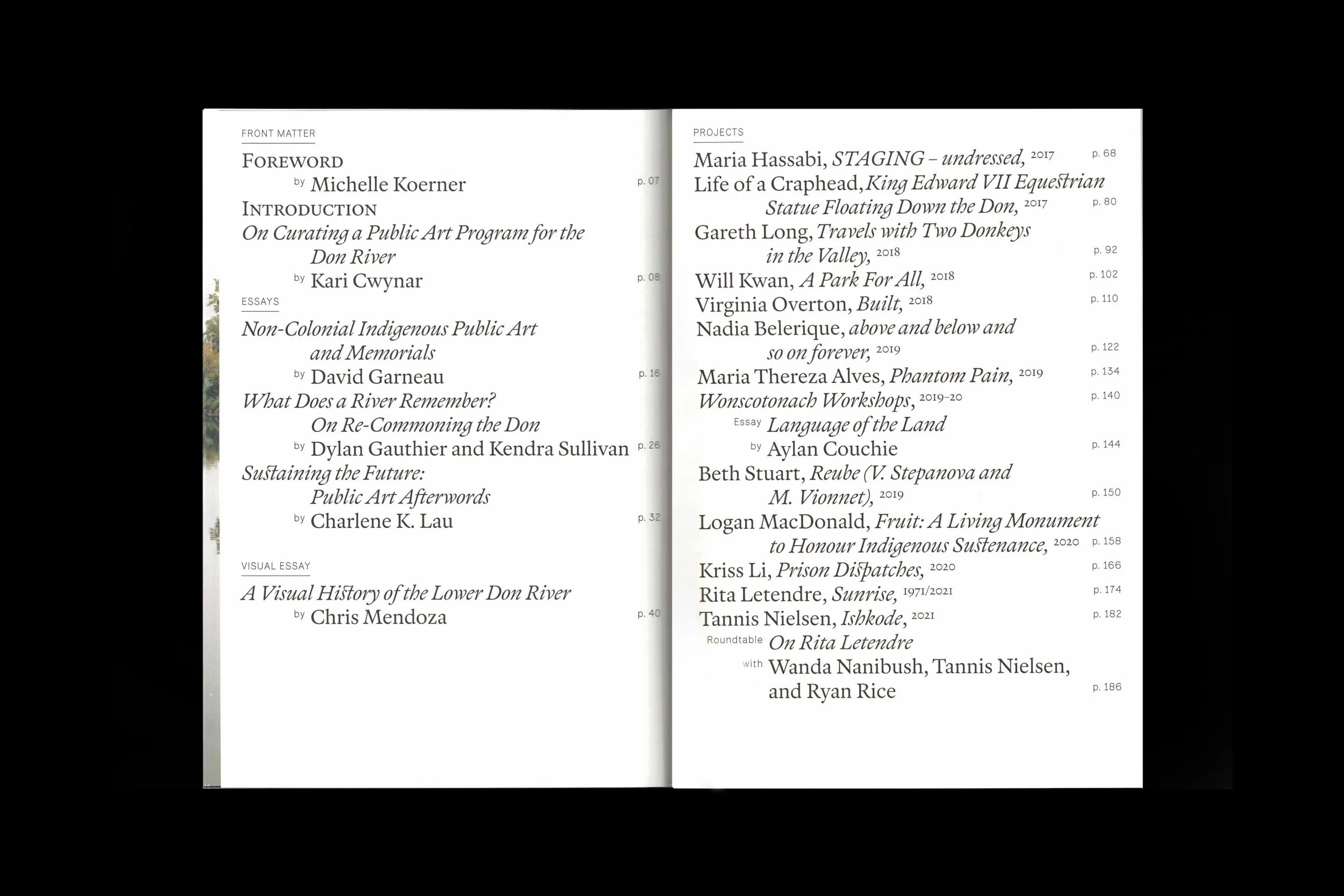
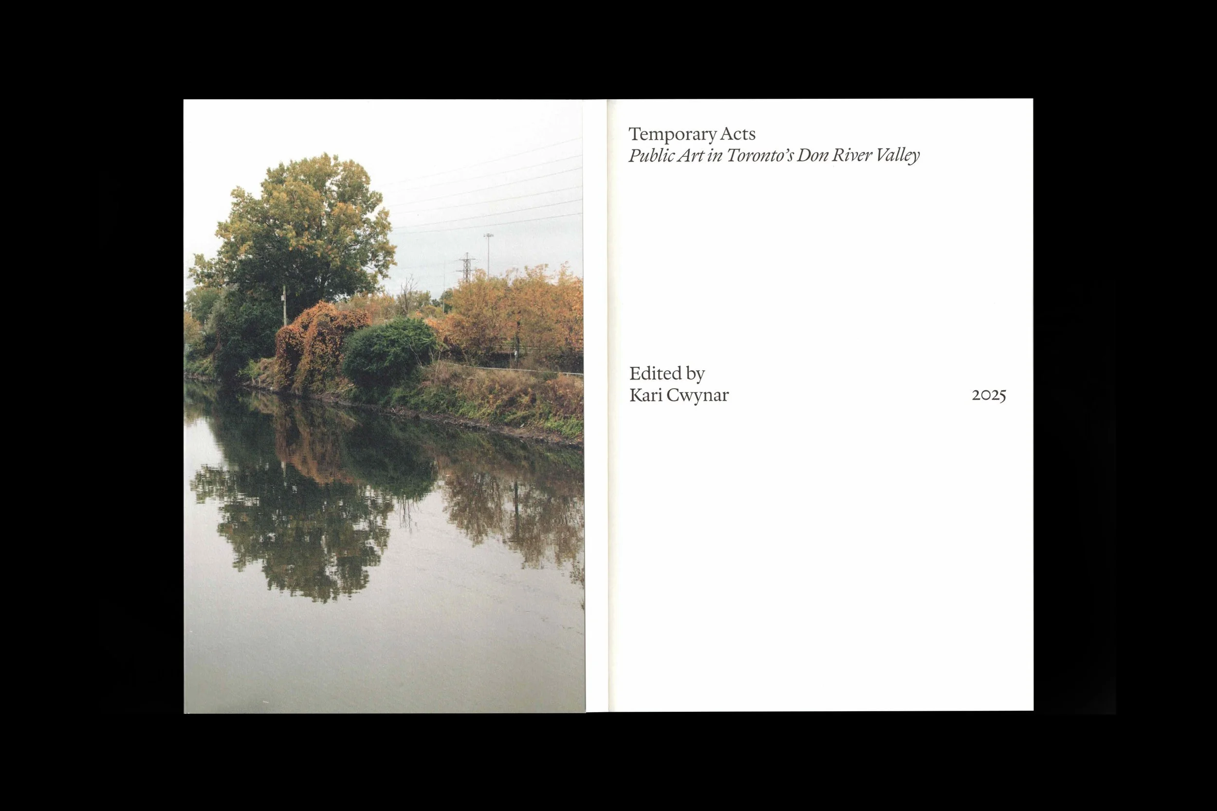
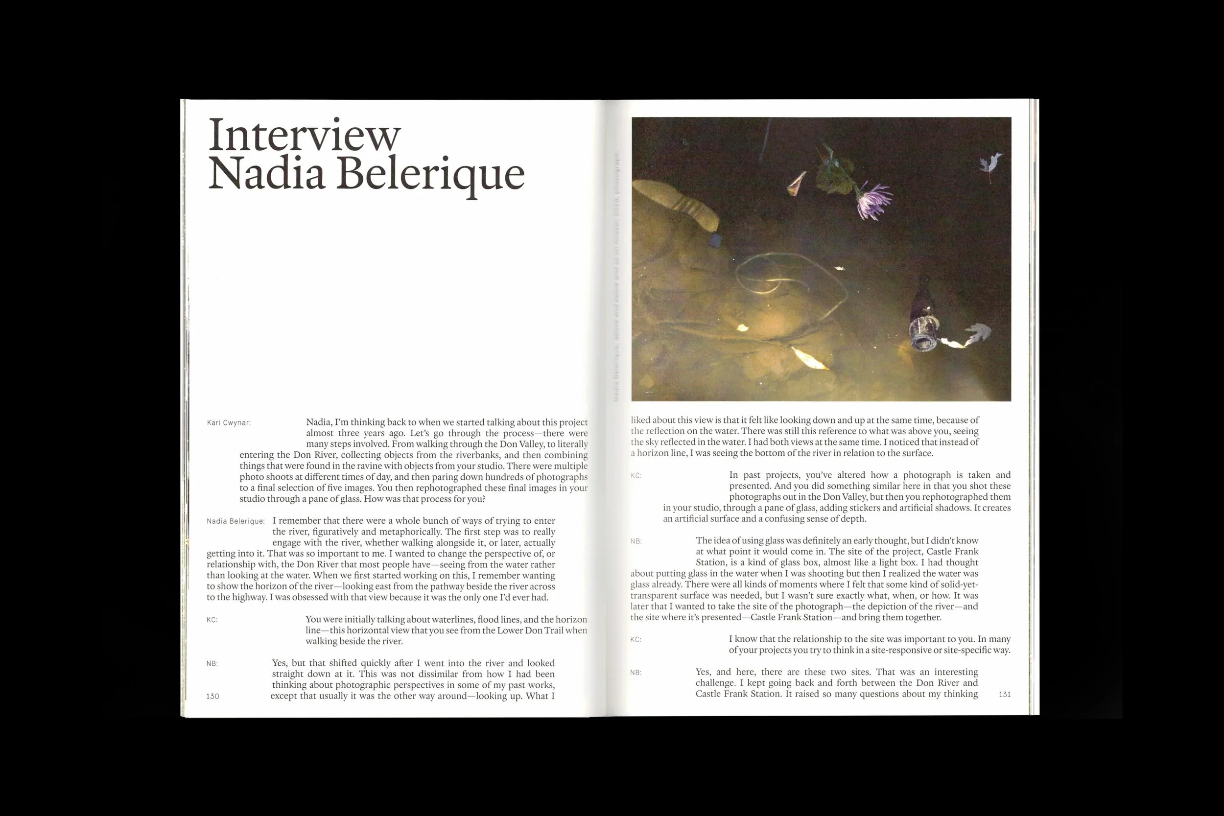
Temporary Acts: Public Art in Toronto's Lower Don River Valley
Edited: Kari Cwynar Art Metropole and Evergreen 2025
What I love most about BOOKS! is that it’s a book that teaches you how books work, why they exist, and how you can make one yourself. It almost feels like a manifesto. The very first time I saw it was a decade ago at a party in Brooklyn hosted by my friend Gabi Lamontagne, an amazing Montreal illustrator and designer based in NY who has an incredible collection of vintage books and ephemera(https://www.instagram.com/albumsetdessins/). The cover, with the giant uppercase title BOOKS! beautifully showcasing this letterpress-era woodblock typography and the illustration below it, caught my eye instantly. The book itself instead of sticking to rigid grid layouts, has these playful compositions filled with illustrations, signs, hand-drawn wood type texts all mixed in vibrant fluorescent spot inks that I think it helps to demystify paper, ink, composition, and this idea of rigorous publishing rules for young readers. After that first encounter, I kept thinking about it for years until I finally found a 2013 reprint copy at BMV Books in Toronto. By then, Kari and I were already in this new dynamic of buying kids' books regularly for our son. Ever since becoming parents, we’ve dreamed of making or publishing children's books together. Books! is probably the best reminder that the best way to inspire someone to love books is by showing the intentionality, care, and choices you put into making a book possible in its final form.
3. A book that you’re obsessed with (old).
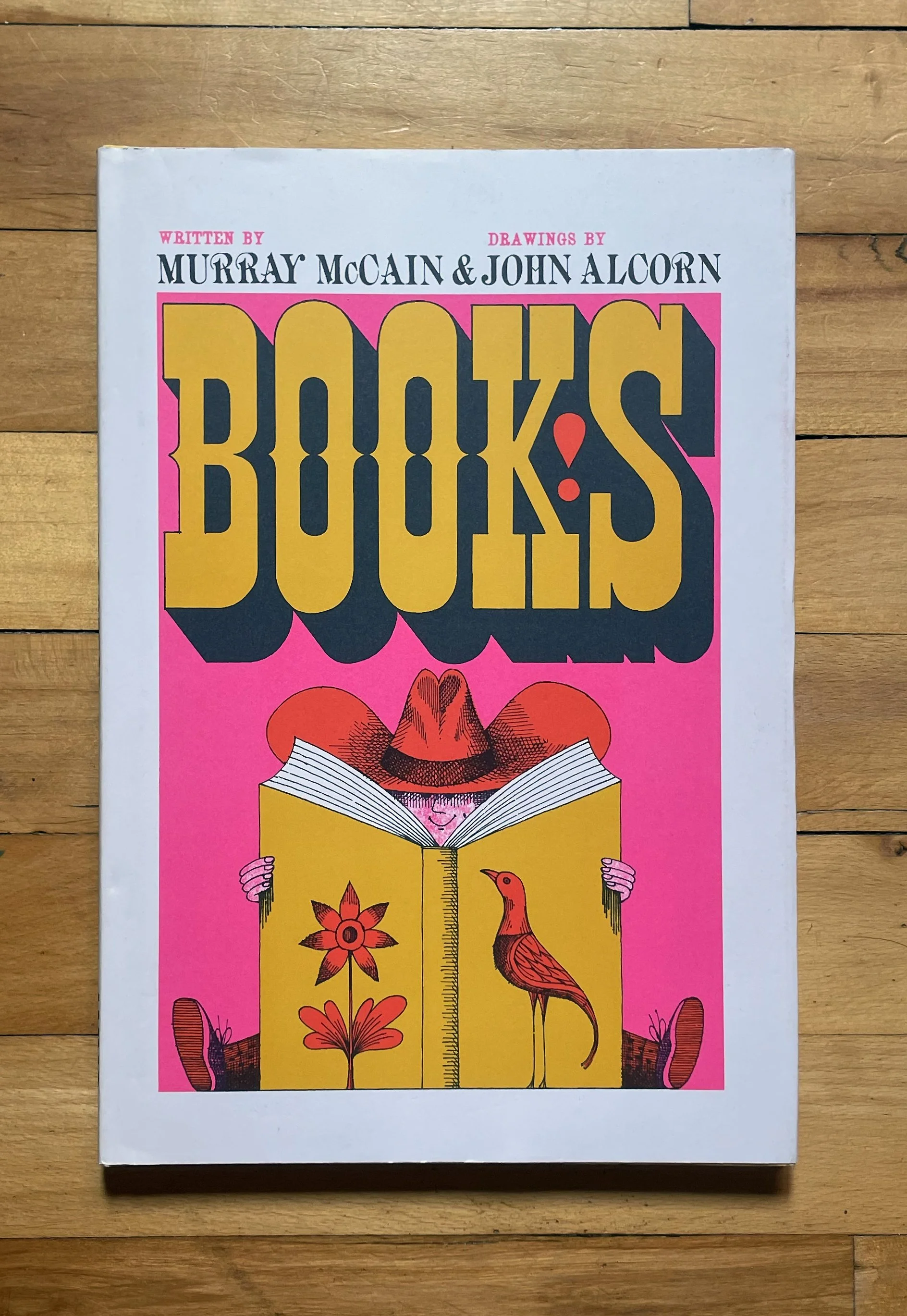
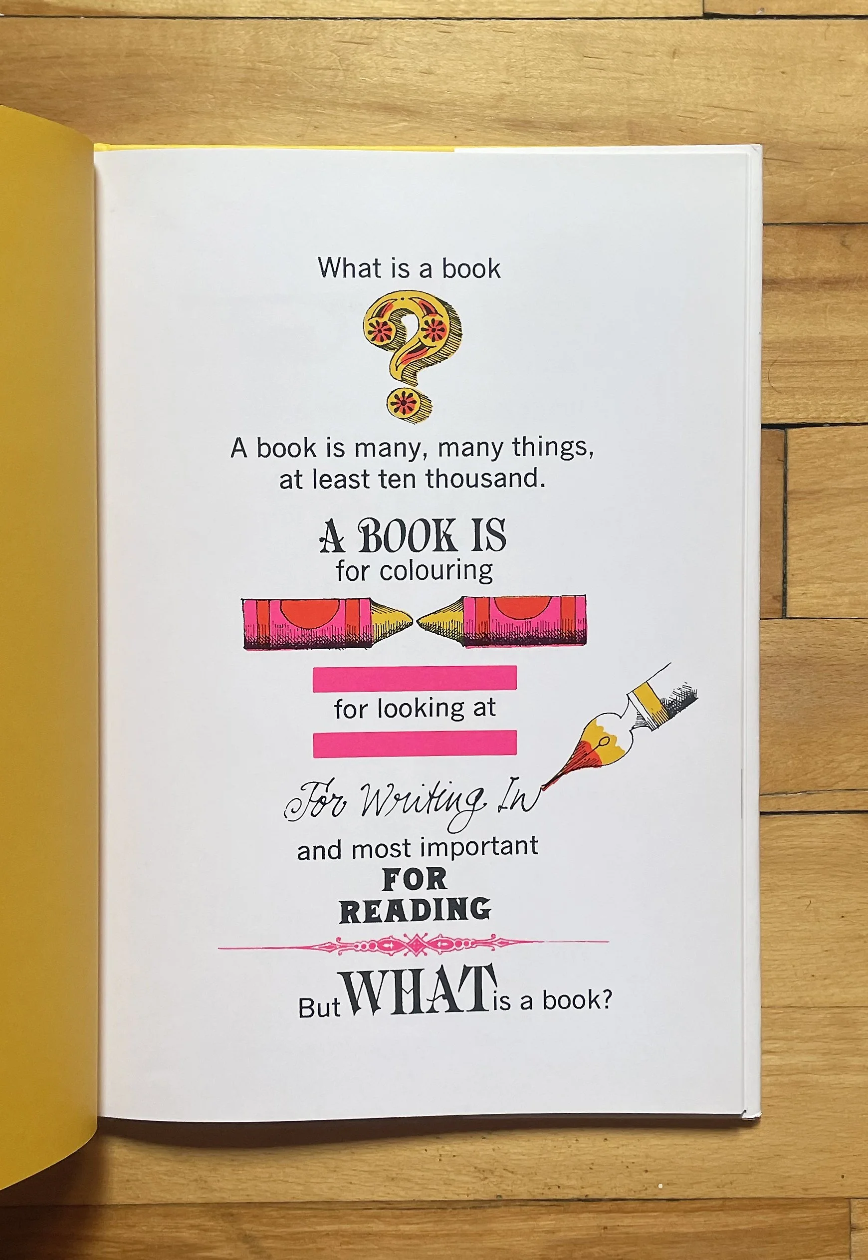
BOOKS! Murray McCain
Illustrator/Designer: John Alcorn (Originally
Published: Simon & Schuster
Date: 1962
4. A book that has the most unexpected design in your library.
I have to admit that I am choosing this book because of its intentional desire to be un-designed. The copy on my shelf is the 1977 revised paperback. It’s small. Something close to A5, a format I’ve always loved. The layout design and typesetting feel amateurish, but the authors intentionally wanted it this way; they wanted something stripped of any pretension. The most amazing part, though, is why this little paperback exists in the first place: it was a direct rebellion against its 1972 first edition. (I’m attaching an image I found of these two editions because it’s worth seeing) That first edition is kind of a ridiculous design flex. It was a huge hardcover with gold foil text on the cover, wrapped in a semi-transparent dust jacket printed with slick, minimalist Swiss typography (Helvetica or Univers) all over it. Muriel Cooper, the art director at MIT Press, basically designed this “heroic monument” of a book. It’s beautiful, honestly, perfect Tumblr/Instagram content for design nerds to discover. But the authors absolutely hated it. I mean, their whole book argues for the "ugly and ordinary" everyday landscape over grand monuments (a counterpoint to the "heroic and original," referring to the contrast between self-aggrandizing monuments and functional vernacular buildings), yet here was this almost coffee-table book. Denise Scott Brown, one of the co-authors of Learning from Las Vegas, even wrote an essay about it called "The Tyranny of the Template," criticizing how Cooper’s rigid grid left massive gaps of white space, forcing their text to adapt to the layout rather than the images, with weird triple-spacing and caption blocks to line up with the photos. So, they fought the publisher to get this small paperback made instead, which is the version most of us know today. I love it because it’s like, again, it’s a great reminder that design execution should always serve the true purpose of the content.
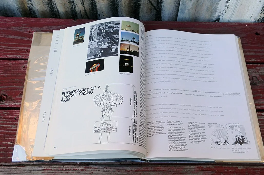
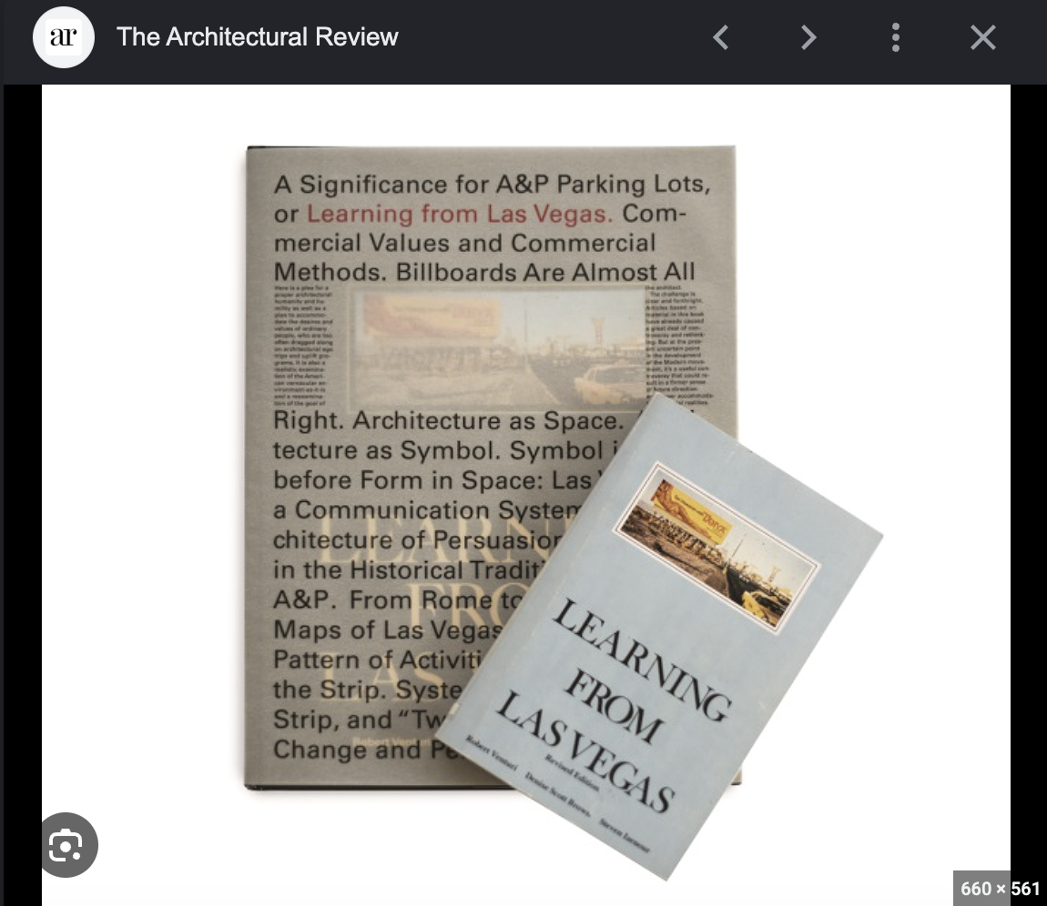
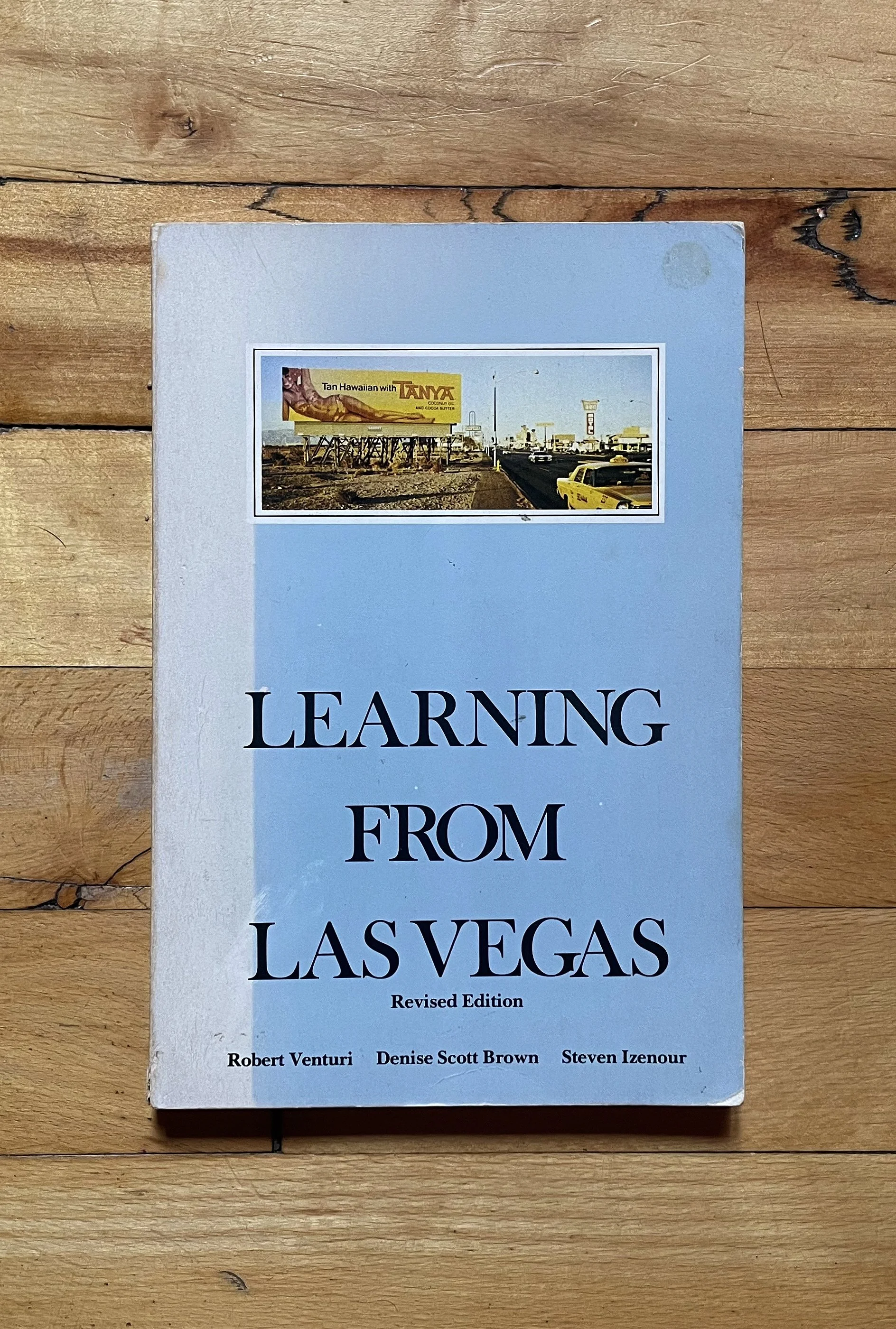
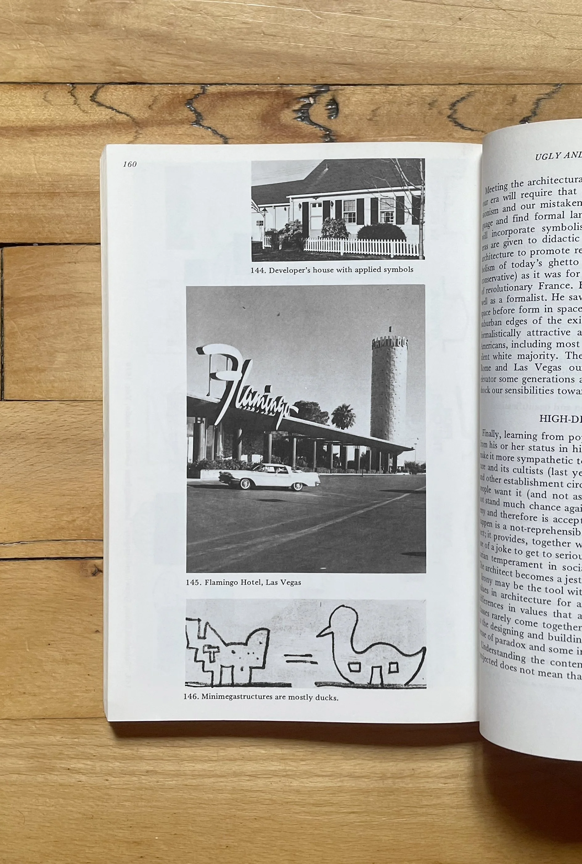
Learning from Las Vegas Robert Venturi, Denise Scott Brown, and Steven Izenour MIT Press 1977 (Revised Paperback Edition)
5. A book that you wish you had?
This is a really special and absurd piece of Fluxus performance art. Alison Knowles had a routine where she ate the exact same thing almost every day at a diner in Chelsea: “a tuna fish sandwich on wheat toast with lettuce and butter, no mayo, and a large glass of buttermilk or a cup of soup.” Eventually, she turned this personal habit into a formal performance score, inviting her artist friends to join her or recreate it. The book she published in 1971 is a document of those meals, collecting photographs, diner receipts, and typed or handwritten performance logs from guest diners. I only own a low-res PDF I found, but I love how this book is not just a container for an artwork, but as the art piece itself, the book as document, and archive of highly specific, mundane interactions turned into art.
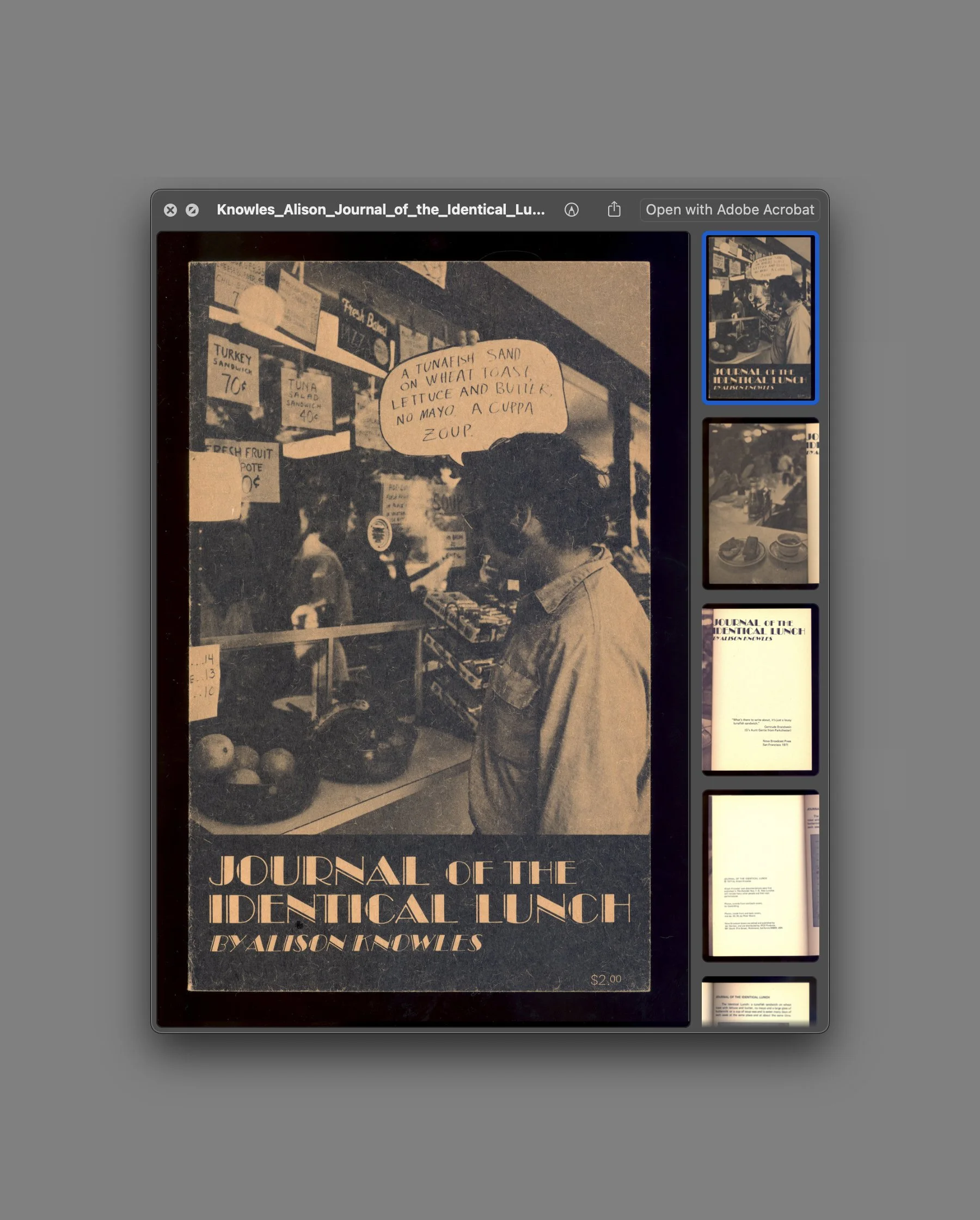
Journal of the Identical Lunch Alison Knowles Nova Broadcast Press (San Francisco) 1971
I don’t really have one specific design book for this question, to be honest. By now, it’s probably pretty obvious how much I find inspiration and appreciation in vernacular, unintentional design approaches. I love a book that has been treated as an open container, a living archive, or a raw document of human interaction – it can be a poorly photocopied punk zine, or a weirdly structured vintage community cookbook found in a thrift store. I guess I prefer looking at spaces where there is no self-conscious design intention, but rather a pure, urgent necessity to put something on paper and share it.
6. A book that you constantly draw inspiration from.
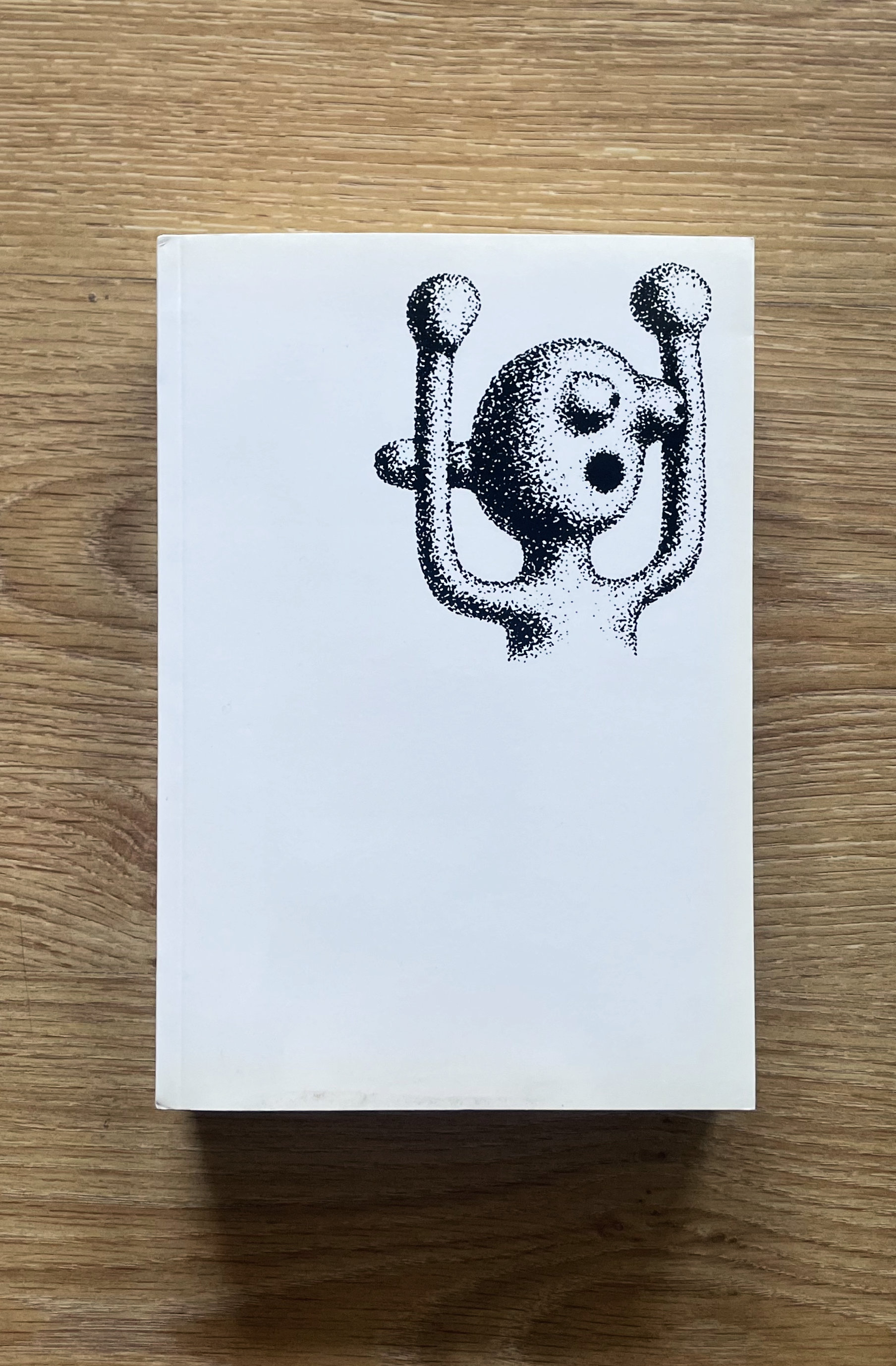
I don’t know if it is my of all time favorite, and I think I consider it one of my favorites because I actually don’t have it anymore. But in my mind, it grew into this. I found it completely by chance more than ten years ago, just browsing the shelves at Librería París Valencia in Spain and this specific book has absolutely everything I love: the vernacular, the DIY, the object as a raw document. The book was tied to an exhibition curated by Uli Marchsteiner, tracking a research on five continents to look at how different cultures solve the exact same basic human needs. While I was thinking about how to answer this question, I went online to look for it. It’s incredibly rare (even Google barely gives you any results) but by some miracle I even found a decent PDF of the entire book. Reviewing the pages again and refreshing my memories was amazing. It’s this stunning visual archive of the ingenious ways humans resolve and manufacture tools, everything from basic spoons and chairs to fly swatters from all corners of the world. I have to admit though looking at it again today also made me feel a little bit awkward. There is this thin line of cultural voyeurism, this fascination that we in the so-called first world have for the raw, unpolished vernacular of other cultures. I have to assume my own flaws in sharing that exact fascination. But at the same time, because I come from the Global South myself, I like to think I look at it with a broader, more empathetic perspective rather than just fetishizing it as an exotic design artifact. It’s a beautiful, maybe complicated book, and I'm so happy to have found my way back to it.
7. Your favorite book.
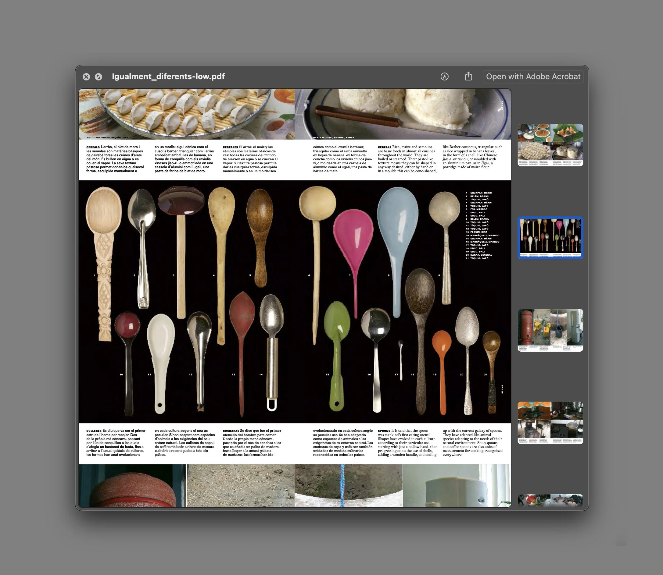
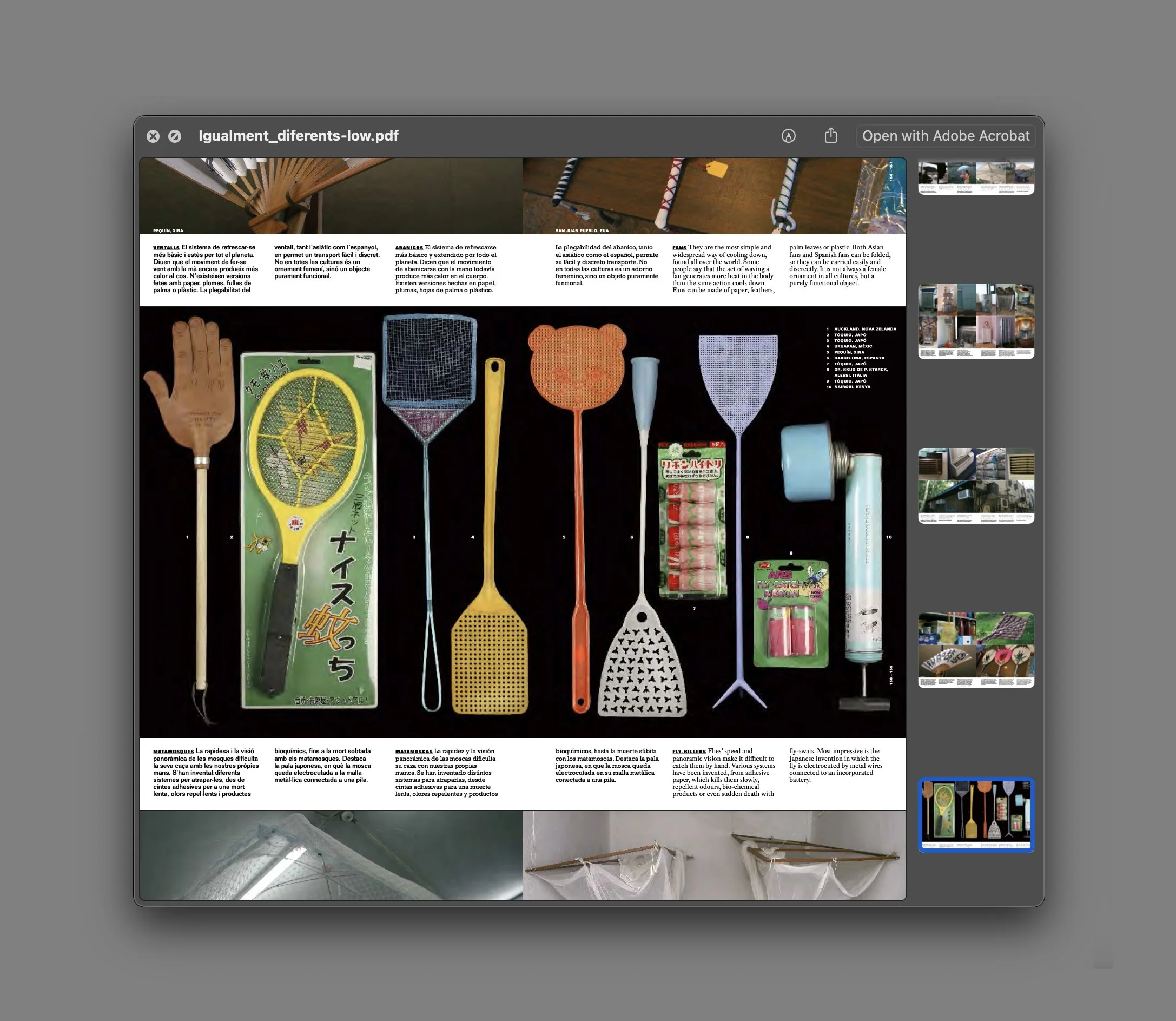
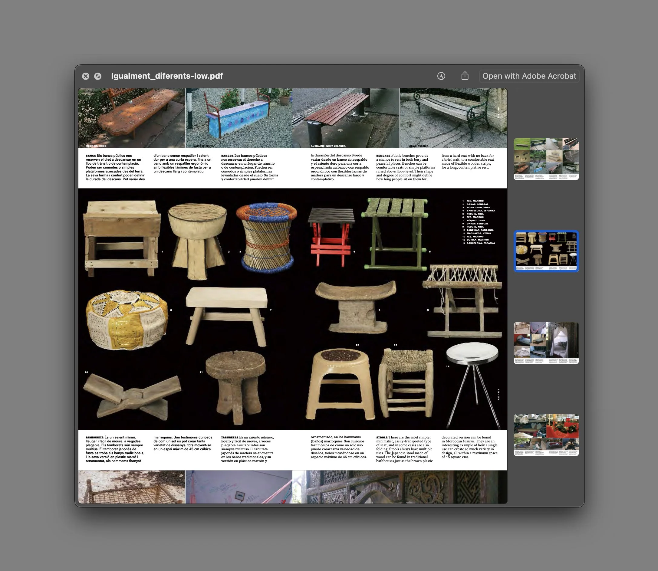
Igualmente Diferentes: Objetos cotidianos de todo el mundo (Equally Different: Everyday objects from around the world) Editor/Curator: Uli Marchsteiner (Intro by Ettore Sottsass) Publisher: Lunwerg 2004
8. Enough with the books, what's your favorite magazine?
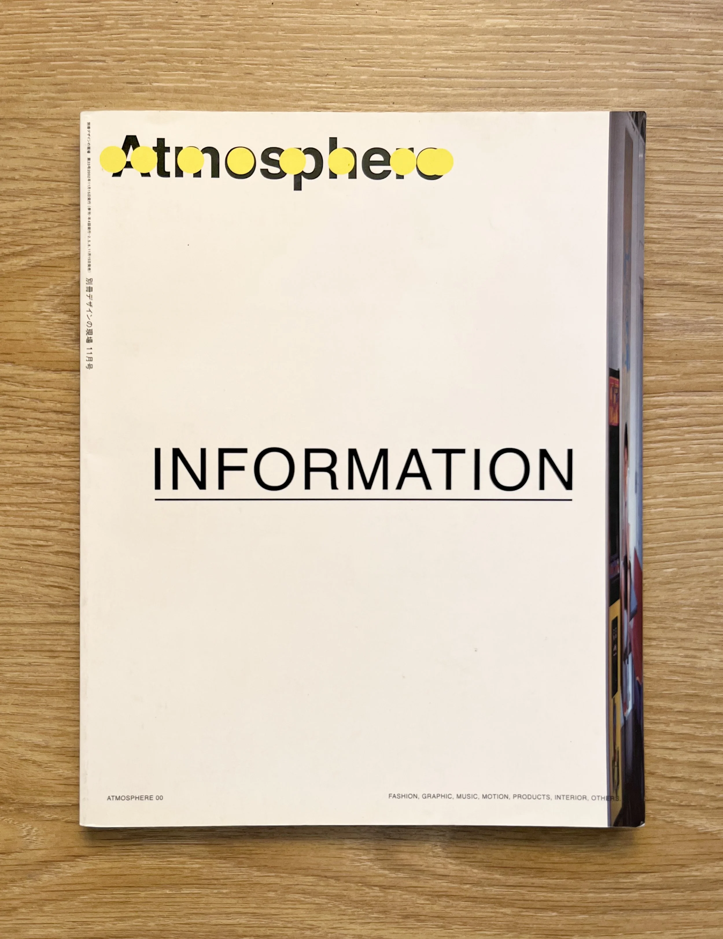
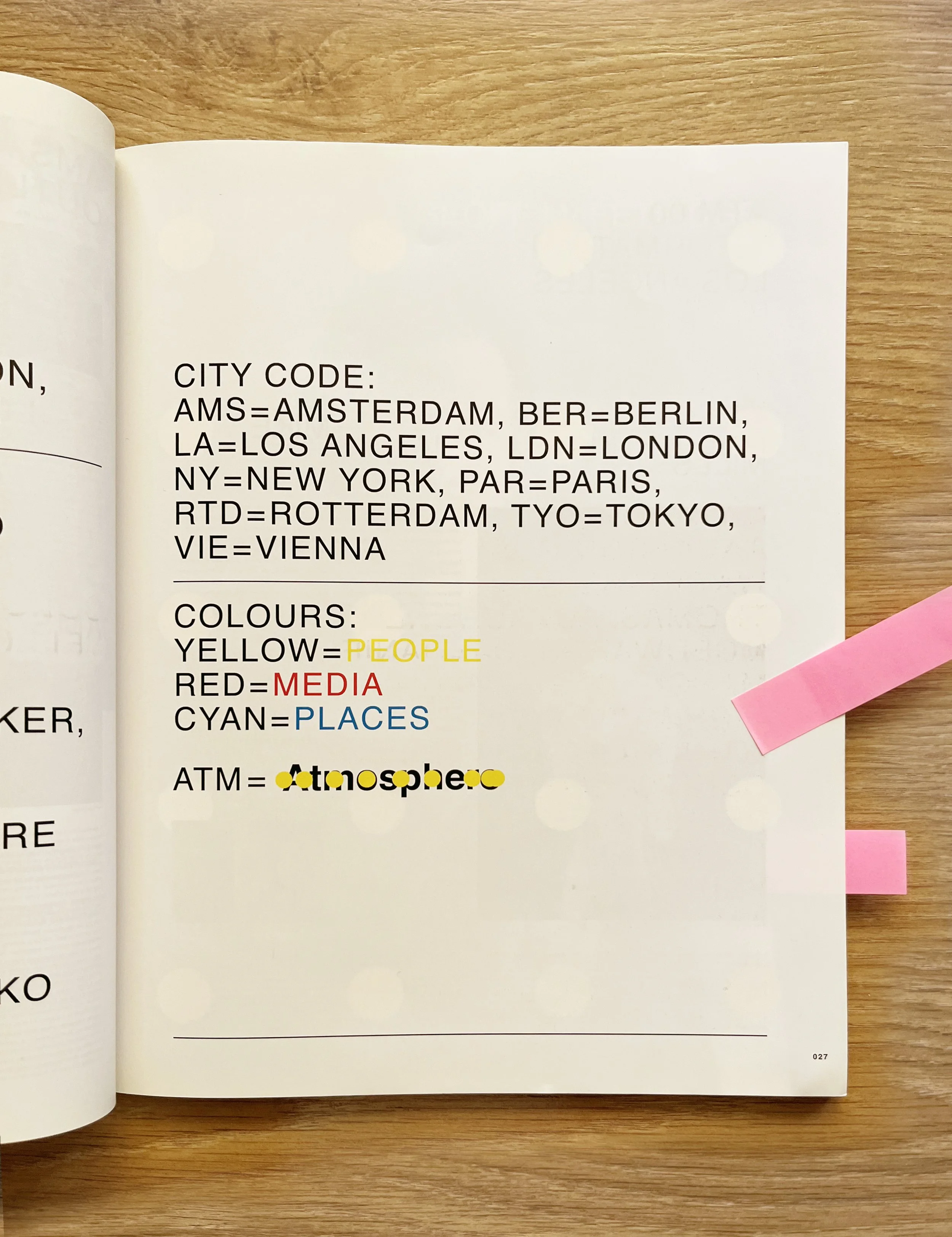
I’m not really a magazine consumer but I do recall one in particular that made an impact on me back when I was getting into books. In 2003 I was studying graphic design in Madrid. Back then, Madrid wasn’t what it is now, it was way behind Barcelona in terms of design resources, and coming from a working-class immigrant background, buying expensive imported design publications or traveling just wasn't an option. If you wanted to know what was happening globally, you had to be resourceful. One of my teachers recommended a small, specialized architecture and design bookstore in the city, and that’s where I found it: the very first issue of a Japanese publication called Atmosphere Magazine, the first of only three issues(https://www.theprintarkive.co.uk/products/3311-atmosphere-magazine), titled INFORMATION, published in 2002. The magazine was edited by Toru Hachiga, who was connected to the iconic +81 magazine and the Gas Book series, and the layout design by Masanori Izumi was incredible. It featured this insane, microscopic typography and an experimental layout with textures layered over text blocks and overlapping type. But it was actually the content that changed everything for me. It was a dense, global compilation of what independent collectives, artists, designers, shops, galleries, and underground publishers were doing at that exact moment in cities like New York, Los Angeles, Paris, and Berlin. In a pre-ubiquitous-internet era, it showed me a level of international, independent creative energy that I eventually got to access myself.
If I had to pick one, I would come back to that 1962 children's book I mentioned earlier: BOOKS! by Murray McCain and John Alcorn. It treats typography as an active, living character on the page rather than just a passive vehicle for reading. The text dances, stretches, changes scale, and interacts directly with the illustrations and collages. It communicates the sheer joy of language, punctuation, and letterforms in a way that feels incredibly human, tactile, and expressive. It reminds you that typography can be fundamentally playful, energetic, and unbound by overly serious design dogma.
9. The book with the most beautiful typography.
10. The book with the most beautiful photography.
I really love how unpretentious this book is the preface and content skip the usual formal intro pages and start directly on the front cover. It’s an extensive, non-academic archive of everyday human creativity across the UK, capturing vernacular expressions removed from the high-art gallery system. The photography inside documents everything from prison drawings, homemade protest banners, block party massive sound systems, to local cake-baking competitions. It treats photography as a humble container and document of real life, celebrating the chaotic, beautiful visual artifacts that people produce as they find their own ways of expressing themselves.
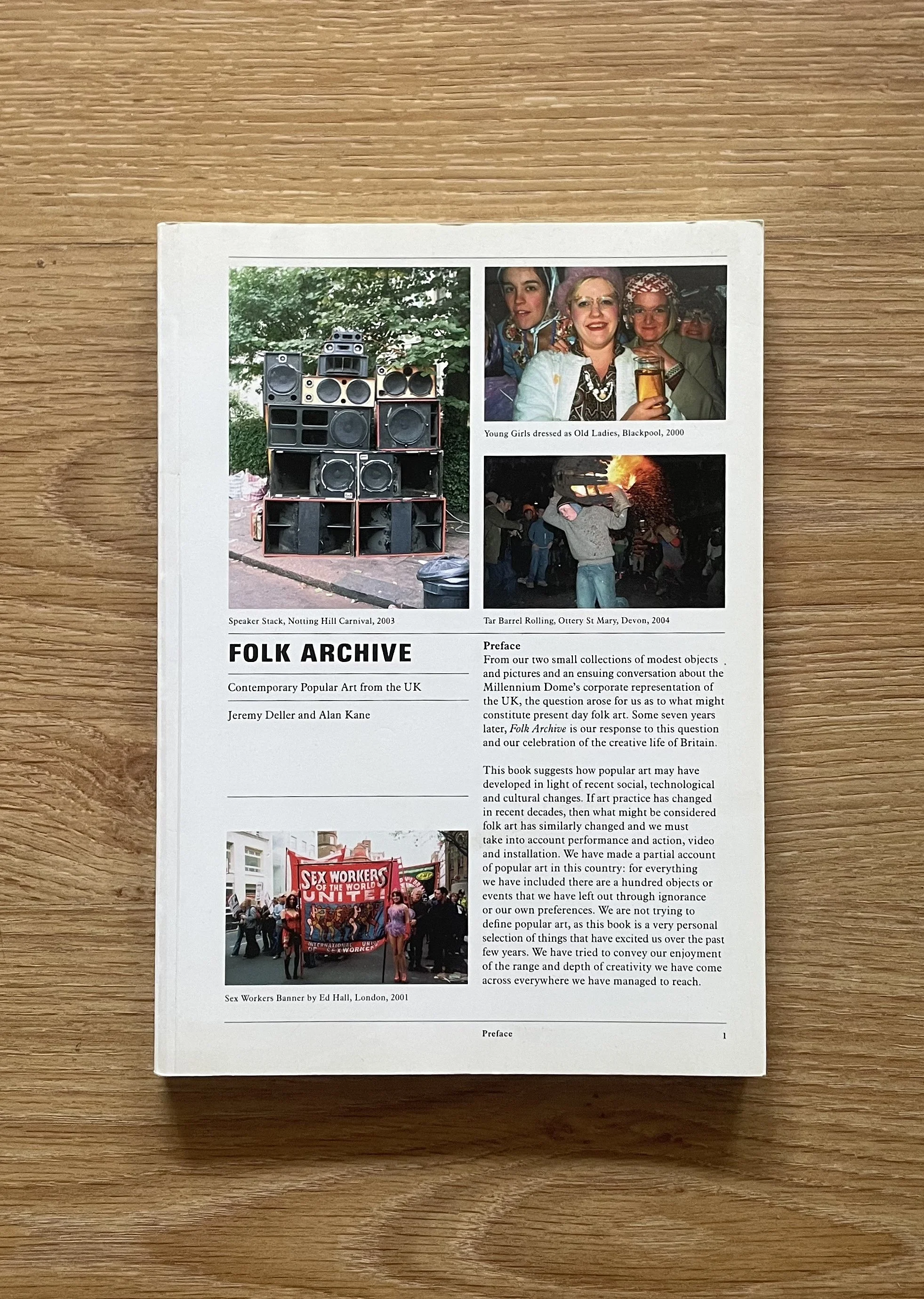
Folk Archive: Contemporary Popular Art from the UK Jeremy Deller and Alan Kane Book Works 2005
Pete’s Curation
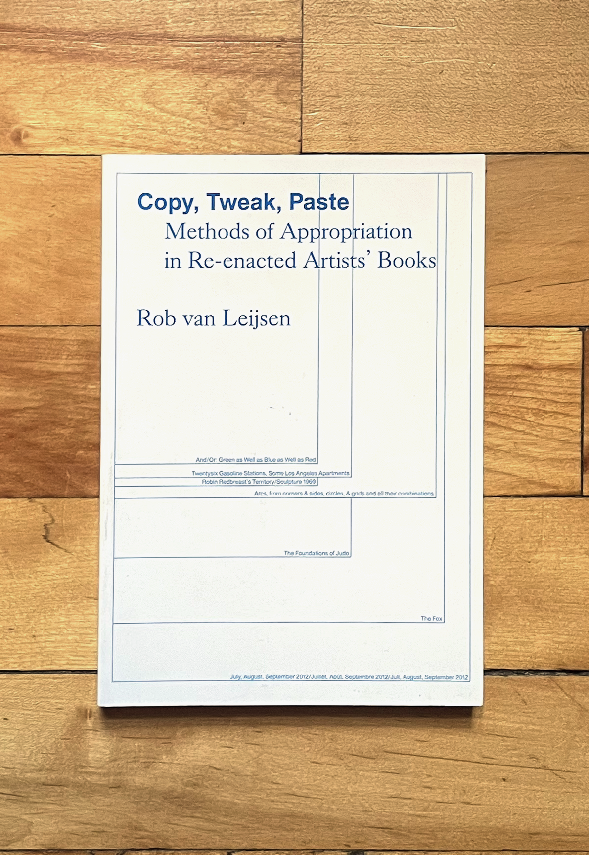
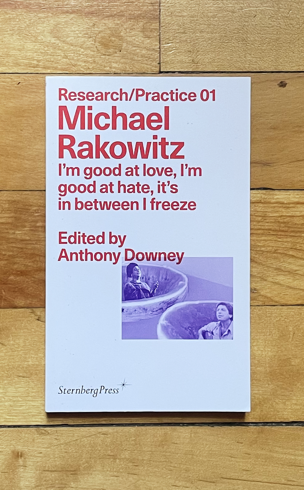
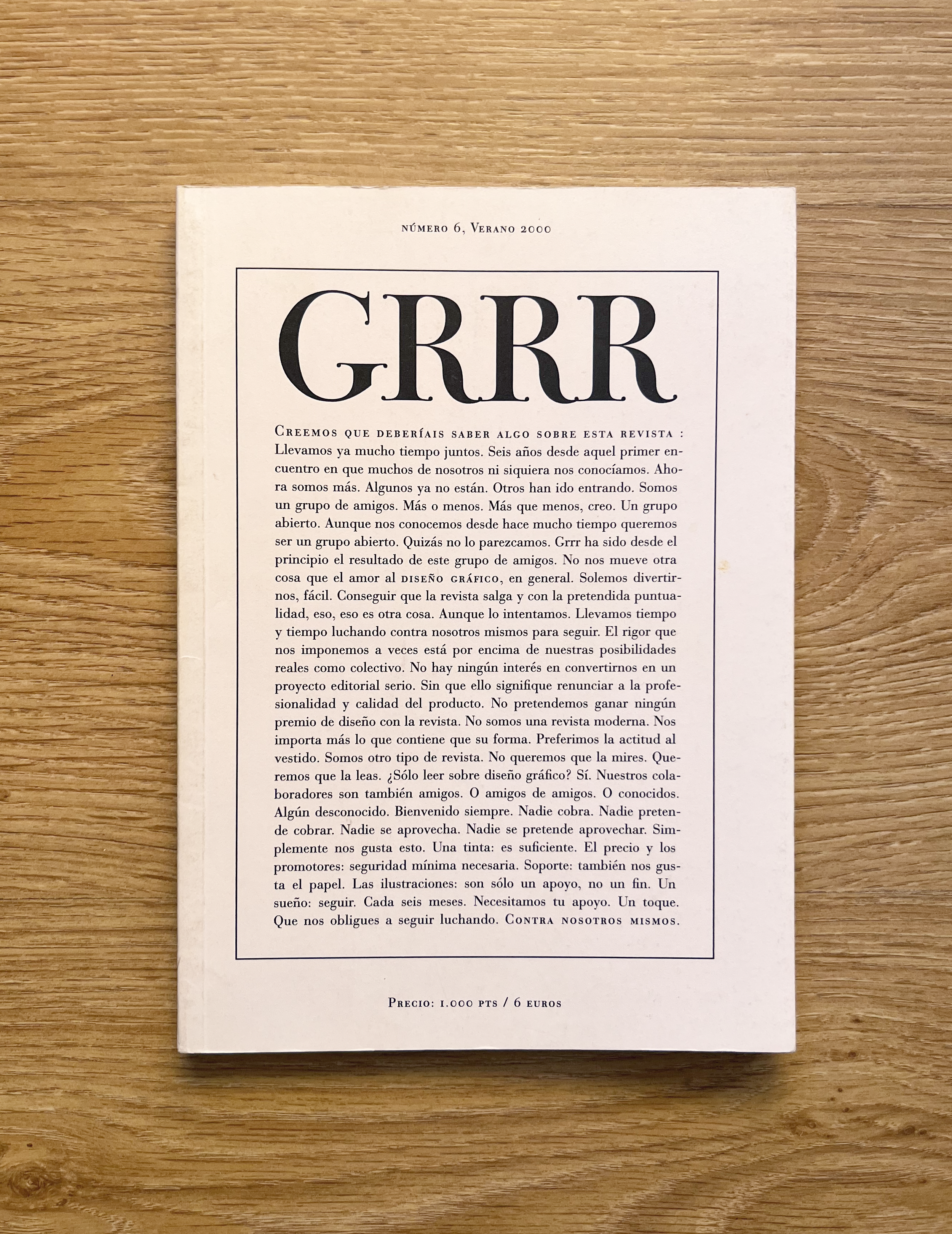
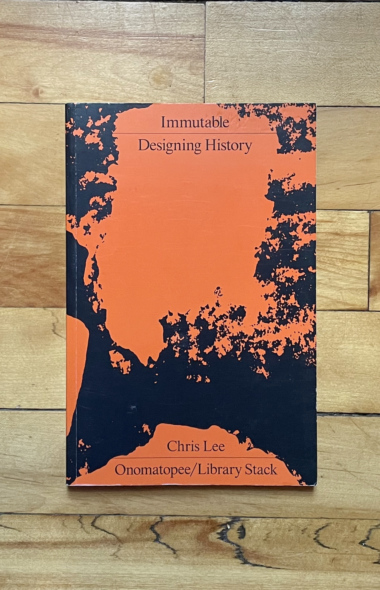
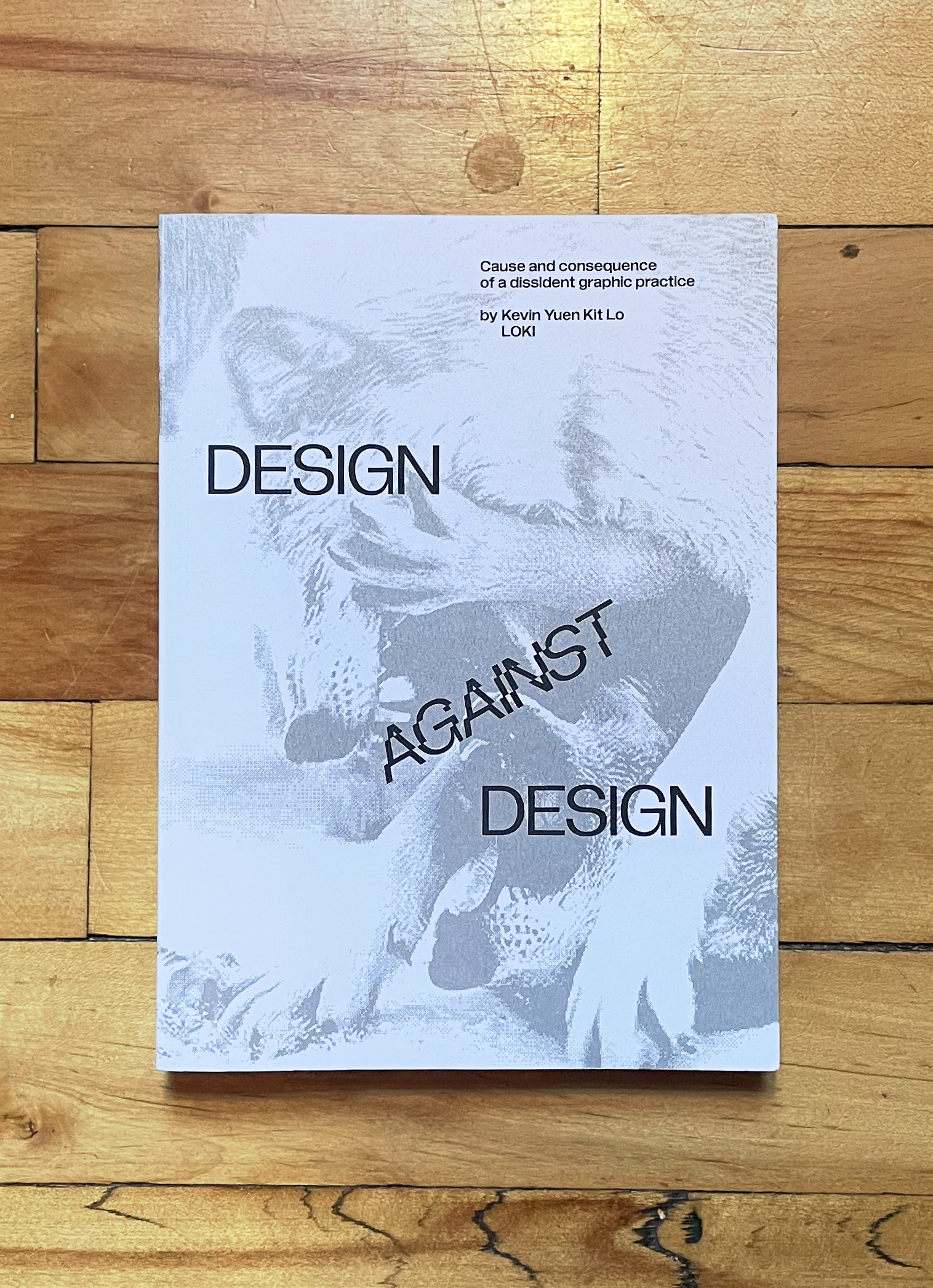

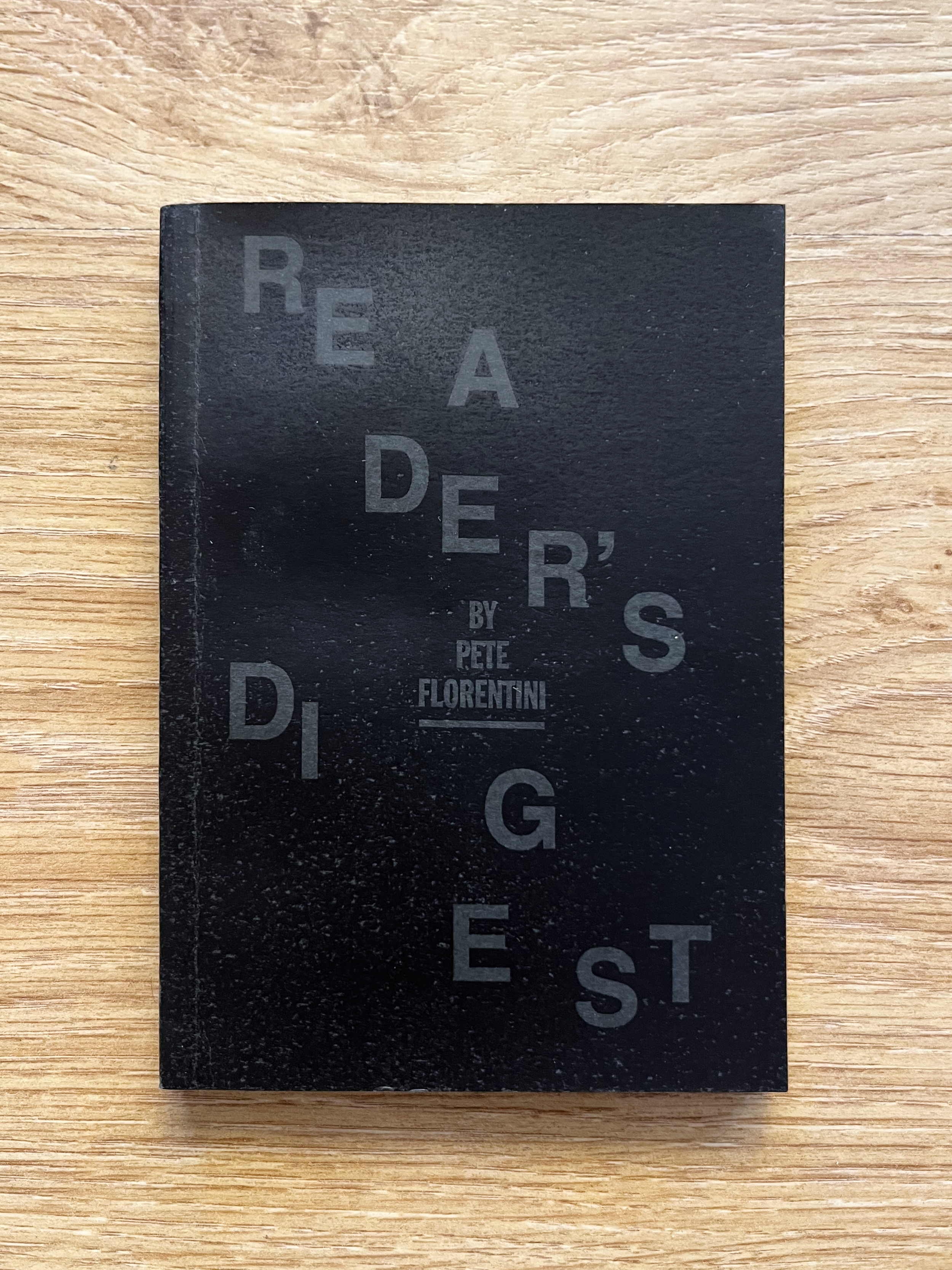
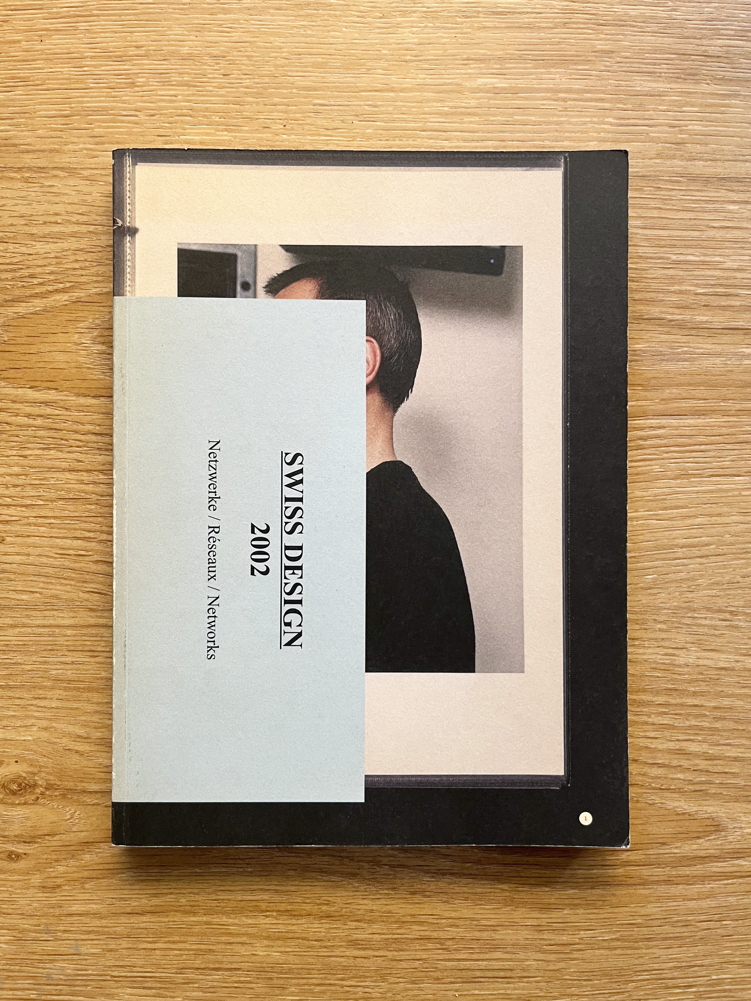
Special project at the moment?
Right now, I’m laying the groundwork for a Master’s research-creation project centered around Speculative Typography. My primary focus is exploring how custom font design and letterform engineering can become active tools to subvert algorithmic censorship and automated content policing. This comes after years of advocating for Palestine, where I, along with countless allies, artists, activists, and marginalized creators have encountered massive systemic shadowbanning, suppression, and digital erasure. Corporate platforms operate under an aggressive American exceptionalism and a Western-centric, imperialist framework that dictates what content is permissible and whose narratives get muted. I’m interested in the research and practice of creating letterforms that intentionally resist machine readability and automated scraping while maintaining a level of human comprehension, drawing on Édouard Glissant’s concept of the Right to Opacity to push back against forced platform transparency. To bridge theory and execution, I’m actually currently learning to code. I want to build custom software or web-based toolsets so this work moves beyond academic theory into functional design praxis. Working on my wife’s book last year also renewed my love for book design. I’d love to design more books - artist’s books, cookbooks, kid books.
–
A good book is one where the design and the content are in an inseparable conversation. It’s when the physical object, the paper weight, the grid tension, the typography system, doesn't just 'decorate' the text, but actively reinforces the core idea.
What make a book good?
I appreciate structural honesty and paper choice. For example, I love exposed-sewn bindings when their explicit function is to allow a book to lay completely flat, regardless of format. I also love when you can tell the designer deliberately chose different paper stocks for specific sections—meaning there was a clear intention behind the signature page counts, paired with unconventional paper weights that shape the reader's experience through tactile drag. I love a book where manufacturing details are treated thoughtfully as conceptual choices rather than mere decorative execution steps, transforming the book from a simple printed object into a functional, experiential artifact.
What special details do you always look for in books?
Definitely narrow-ish, vertical proportions, anything close to B5. I guess I’m drawn to formats that fit comfortably in one hand, feel balanced, and use paper sheets efficiently without adding unnecessary bulk. My second choice is the classic paperback. A format defined as much by its manufacturing constraints as its dimensions. I love the lightweight, and specially the porous paper stock that naturally restricts deep ink saturation and forces images into visible halftones. These technical limitations give paperbacks a tactile, low-fidelity quality, much like a photocopied zine, that keeps the object unpretentious and accessible.
What is your favorite format?
If I am looking for a book online, I usually check the store run by the good people and friends at Actual Source. https://actualsource.org/collections/books
Where do you find your best books?
Toronto: ABC Books 662 Yonge St, Toronto, ON M4Y 2A6 BMV (my fave locations) 10 Edward St, Toronto, ON M5G 0C5 471 Bloor St W, Toronto, ON M5S 1X9
Presse Internationale - Magazine Super Store (for magazine this is the best kept secret spot in Toronto revealed to me by my good friend Josh Pong https://www.instagram.com/papipong/)
Valencia: Medio pan y un libro (Half a loaf of bread and a book) The name is a direct tribute to Federico García Lorca’s legendary 1931 speech, where he said that if he were starving in the street, he wouldn't ask for a whole loaf of bread; he would ask for half a loaf of bread and a book. Antonio Ballesteros(https://www.instagram.com/antonioballesteros_formo/), a good friend of mine, is the designer behind La Documental Edicions(https://www.instagram.com/ladocumental_ed/), he handles their complete visual identity, book designs, and now spatial branding.
Avinguda de Pérez Galdós, 94, bajo izquierda-B, Extramurs, 46008 València, Valencia, España https://www.instagram.com/medio.pan_y_un.libro/ Paris Valencia (my fave locations) C/ de Pelai, 7, Extramurs, 46007 València, Valencia, España Plaça d'Alfons el Magnànim, 13, Ciutat Vella, 46003 València, Valencia, España Barcelona: Terranoba Carrer del Comte Borrell, 99, Eixample, Eixample, 08015 Barcelona, España Bookstore, publisher, and gallery run by my friend and filmmaker Luis Cerveró alongside Lucía Boned https://www.instagram.com/terrranova/